José Campeche Master Palette
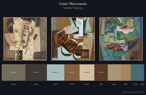
Veiled Tawny
Veiled Partially obscured light - mid-dark with a hazy, scrim-filtered quality.
Tawny Warm orange-brown - a traditional term for the color of tanned leather or lion fur.
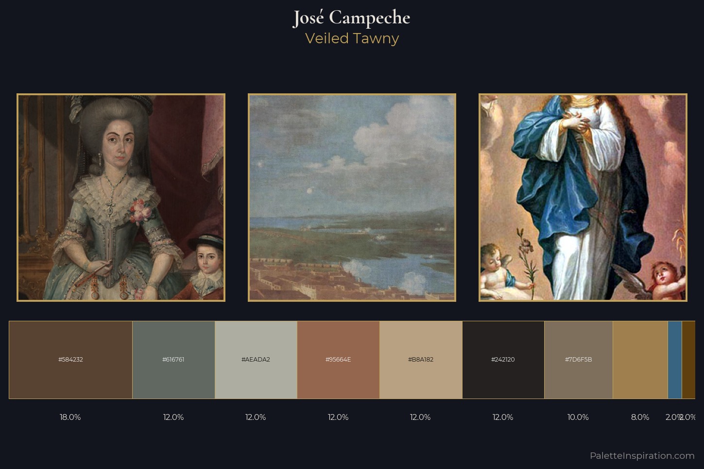
Palette Analysis
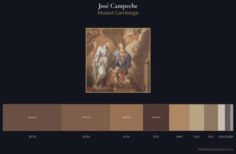
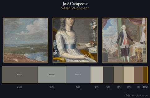
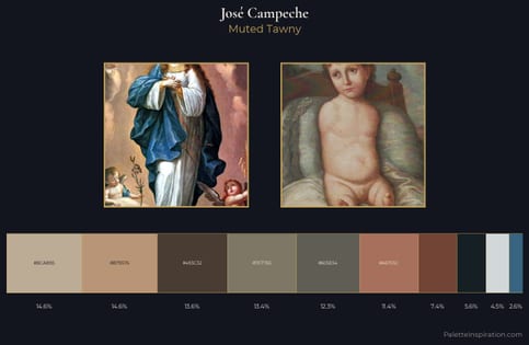
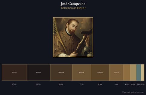
Values in José Campeche rest in the mid-range - neither dramatically lit nor steeped in shadow. Neither warm nor cool has the upper hand here; the equilibrium between the two generates the palette's visual energy. The absence of saturated colour is itself an expressive choice: this is a palette of restraint and atmosphere. The saturated accent, #A07F4E, registers at 8.0% - sparse enough to feel like a deliberate surprise. 50 units of value spread create a palette that is varied but unified - contrast in the service of harmony. This is the light José Campeche preferred, made measurable.
Example use cases
- exhibition design
- foundation branding
- estate management
- art education
- museums & galleries
I Love This!
Use This Palette
Copy, export, or download for your project
Copy, export, or download for your project
Copy:
Download:
Share: