John Simpson Palette 6

Palette Analysis
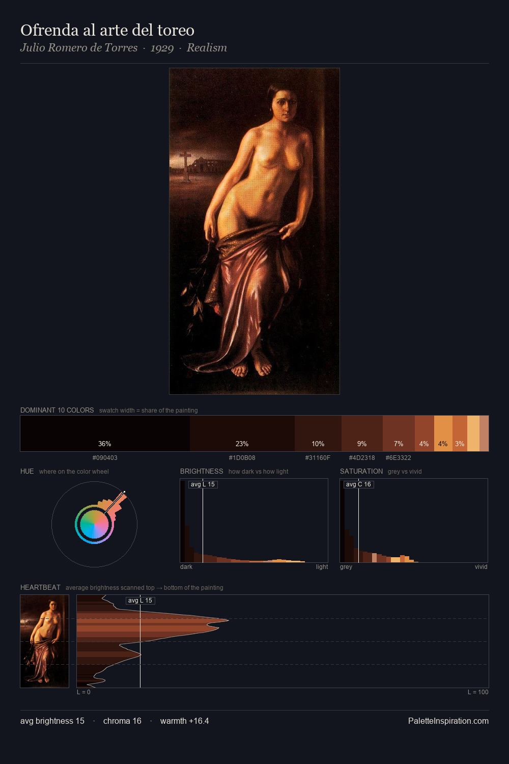
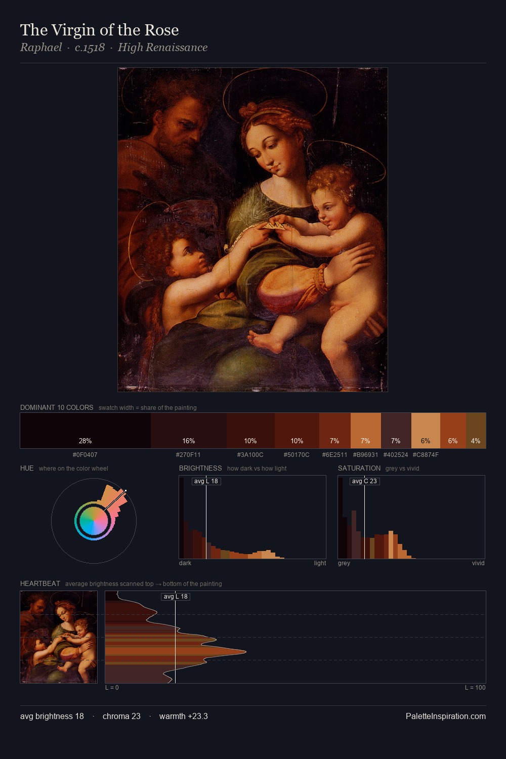
John Simpson works almost entirely in the lower half of the value scale, privileging depth over brilliance. John Simpson orchestrates warmth above all else - reds, ambers, and siennas take the lead. Saturation is deliberately withheld - the beauty here lies in the near-monochromatic gradations rather than colour difference. The dominant colour, #030102, takes 68.9% of the total area, establishing the overall mood before any other hue is introduced. The saturated accent, #92461A, registers at 1.4% - sparse enough to feel like a deliberate surprise. From deepest dark to palest light, the palette traverses 56 units of the value scale - a span that creates natural depth. Together these qualities place John Simpson firmly in the tonal tradition - concerned with mood and atmosphere rather than chromatic display. In the context of John Simpson's full range of palettes, group 6 represents one movement in an ongoing chromatic dialogue.
Example use cases
- music labels
- luxury hospitality
- editorial photography
- leather goods
- premium streaming
I Love This!
Copy, export, or download for your project