John Ruskin Master Palette

Palette Analysis
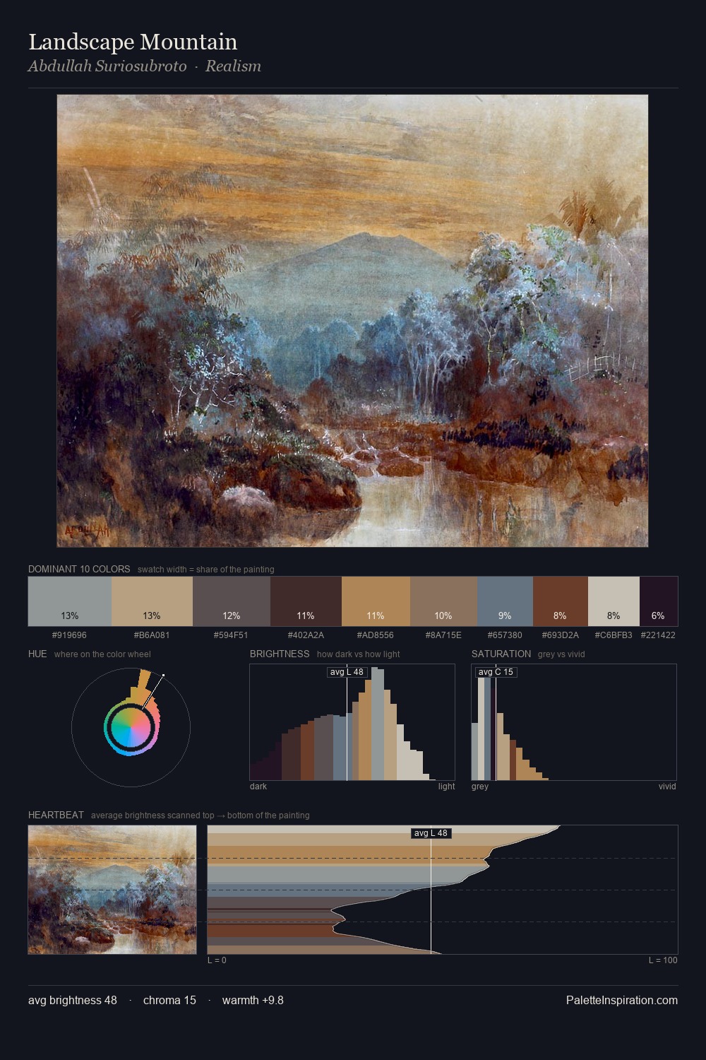
John Ruskin occupies the comfortable middle of the value scale, avoiding both extremes to hold the eye in a sustained middle grey. John Ruskin tilts toward cool - blues and silver-greys carry the structural weight. Every colour is desaturated; the palette proceeds through near-neutrals and gently-coloured greys. The saturated accent, #734A30, registers at 8.6% - sparse enough to feel like a deliberate surprise. 63 units of value range underpin the palette's structural clarity: the eye always knows where light falls. The mid-to-high key, cool bias, and moderate chroma point to outdoor observation - sky and diffused daylight as the dominant light source. John Ruskin arrived at this balance through long practice; the palette carries the weight of that experience.
Example use cases
- museums & galleries
- academic publishing
- heritage brands
- auction houses
- exhibition design
I Love This!
Copy, export, or download for your project