John Ruskin Palette 9

Palette Analysis
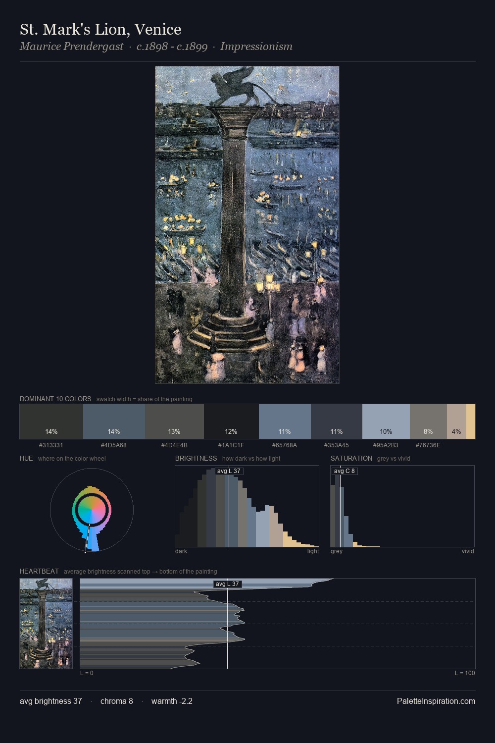
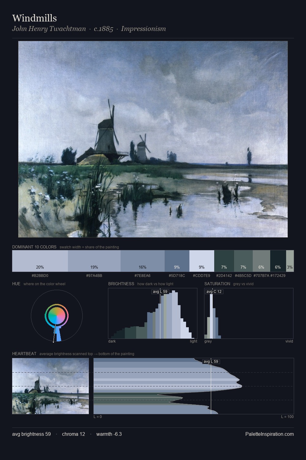
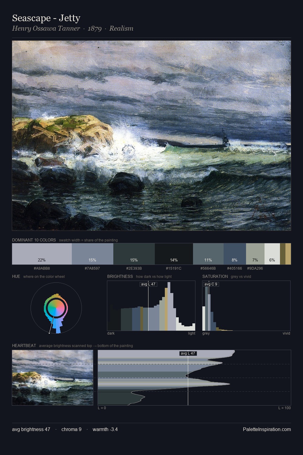
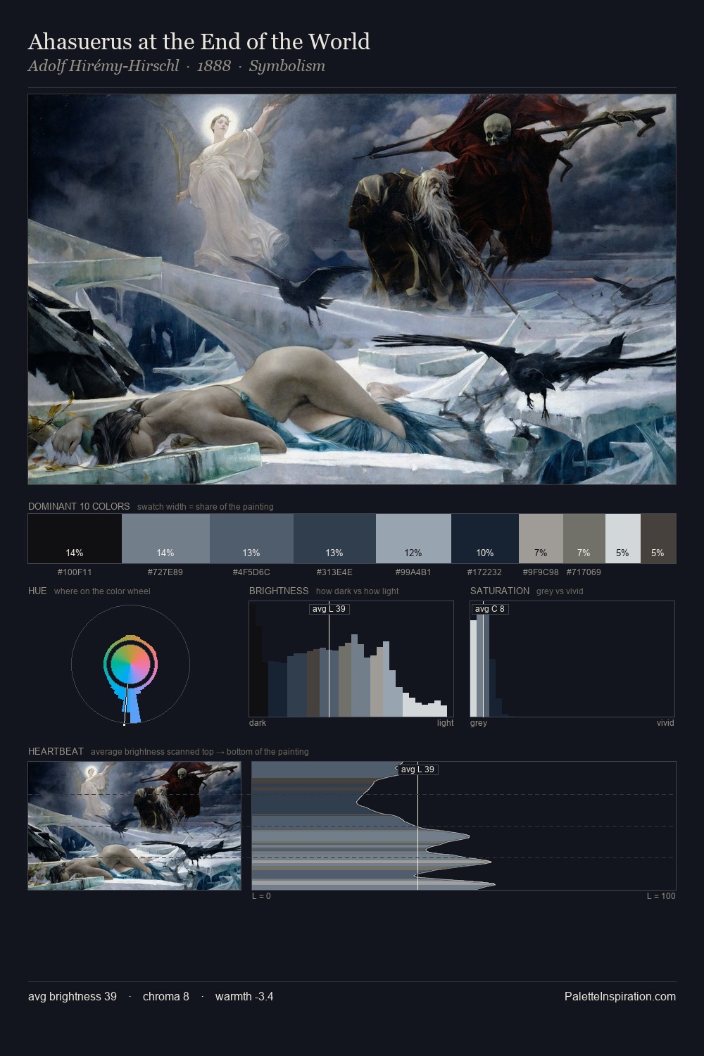
John Ruskin occupies the comfortable middle of the value scale, avoiding both extremes to hold the eye in a sustained middle grey. John Ruskin tilts toward cool - blues and silver-greys carry the structural weight. Muted throughout, the palette achieves its effects through value and temperature rather than chromatic force. #B2BCD0 delivers the chromatic peak at only 4.4% - a small shot of colour with outsized visual impact. At 58 units of value range, the palette has the tonal breadth to sustain complex spatial readings. The mid-to-high key, cool bias, and moderate chroma point to outdoor observation - sky and diffused daylight as the dominant light source. Palette 9 sits within the larger chromatic argument that John Ruskin's complete body of work advances.
Example use cases
- exhibition design
- foundation branding
- estate management
- art education
- museums & galleries
I Love This!
Copy, export, or download for your project