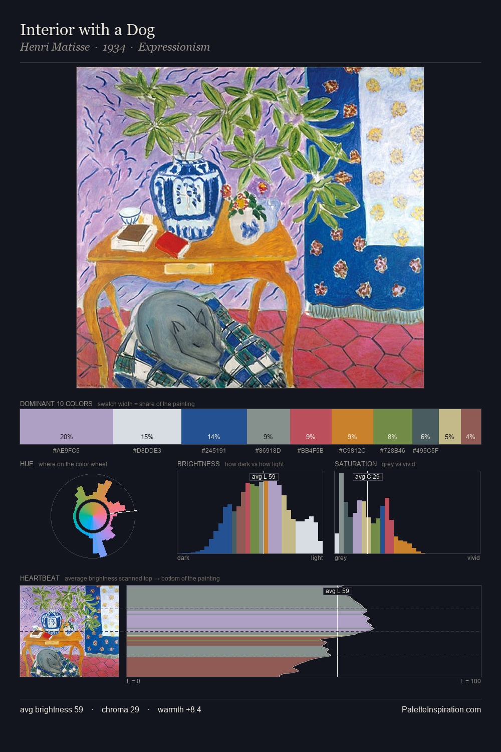
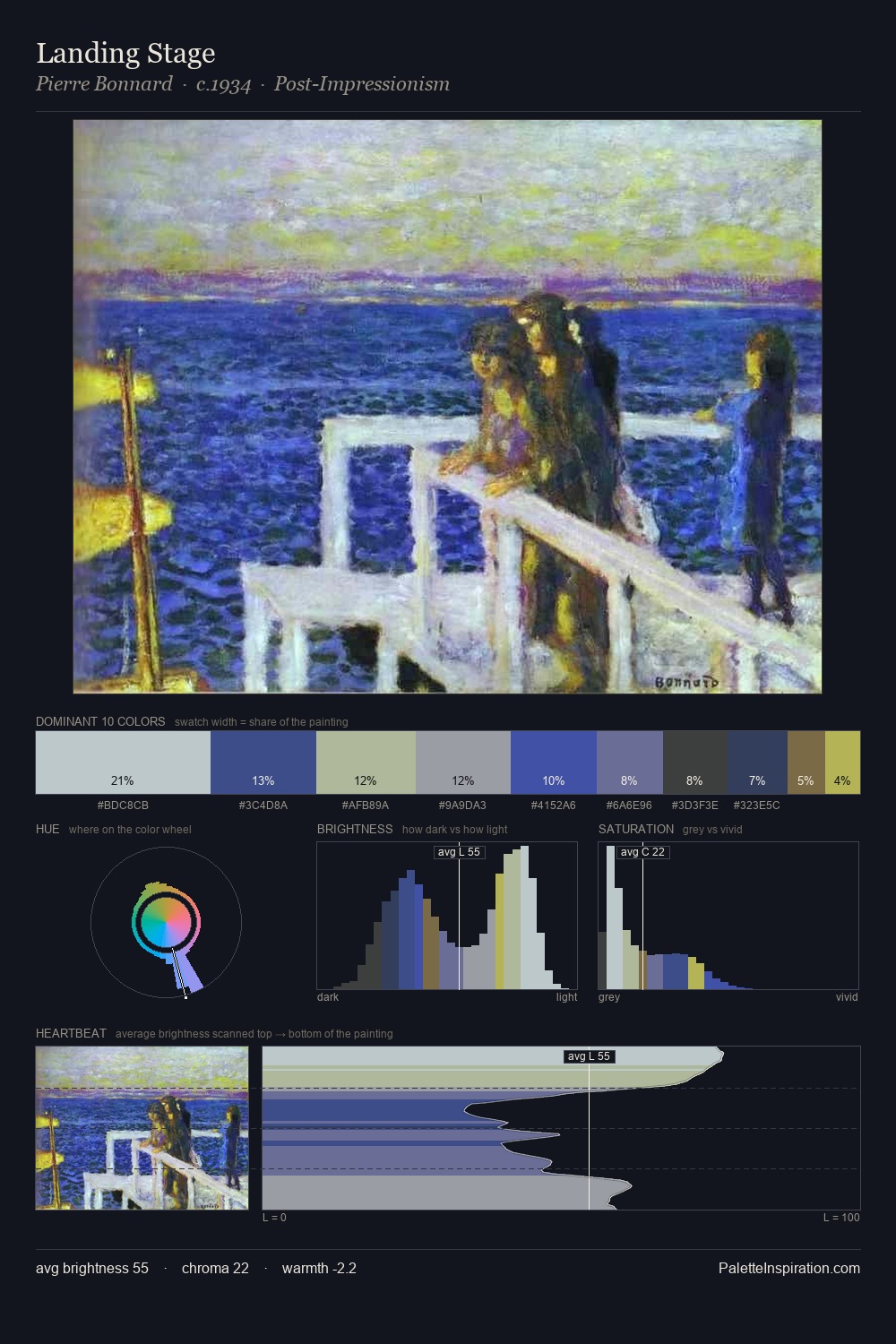
John Marin Palette 3

Palette Analysis
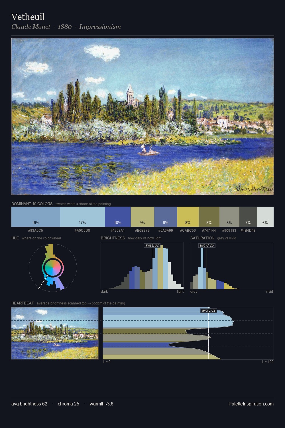
John Marin works in the upper reaches of the value scale, creating an atmosphere of brightness and expansiveness. Blues and teal-greys govern the palette, lending it an aquatic or atmospheric quality. Saturation is deliberately withheld - the beauty here lies in the near-monochromatic gradations rather than colour difference. A single dominant - #DFDEDB at 41.1% - sets the character of the whole composition. #89A050 delivers the chromatic peak at only 5.4% - a small shot of colour with outsized visual impact. 48 units of value spread create a palette that is varied but unified - contrast in the service of harmony. The palette has the character of outdoor light: cool, mid-bright, with colour rendered faithfully rather than expressively. This is palette 3 of John Marin's sequence - a single chapter in a chromatic story told across many works.
Example use cases
- print magazines
- beauty brands
- real estate
- high-end packaging
- editorial design
I Love This!
Copy, export, or download for your project