John Henderson Master Palette
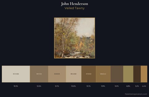
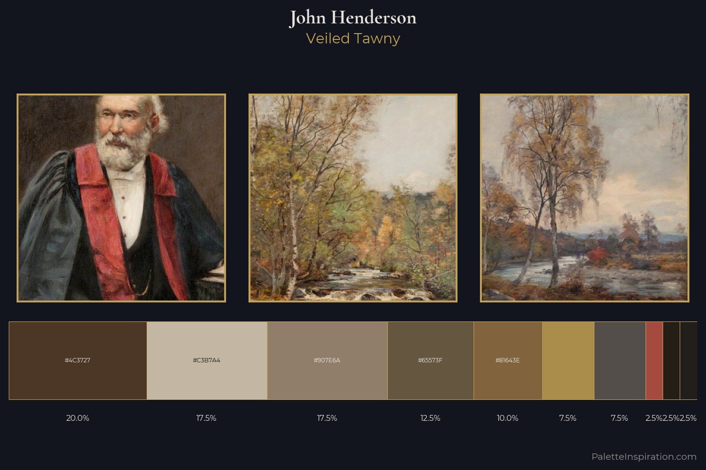
Veiled Tawny
Veiled Partially obscured light - mid-dark with a hazy, scrim-filtered quality.
Tawny Warm orange-brown - a traditional term for the color of tanned leather or lion fur.
Palette Analysis
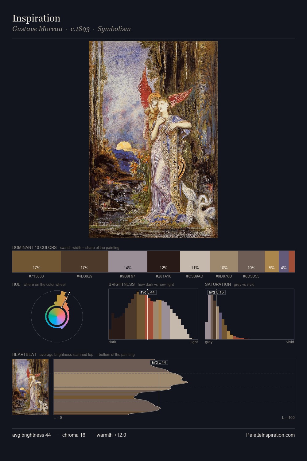
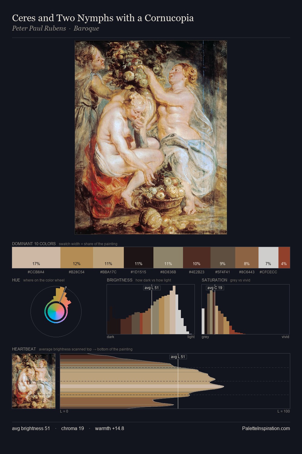
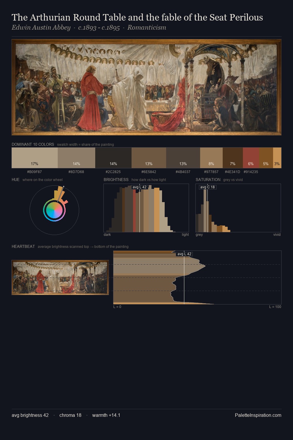
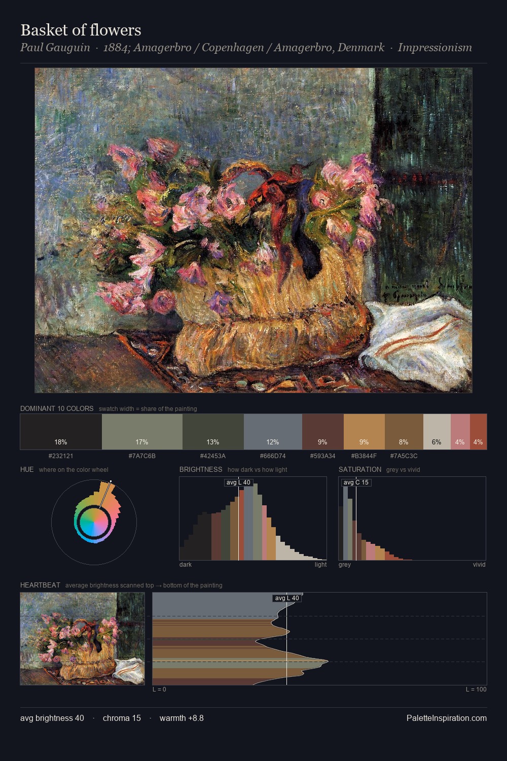
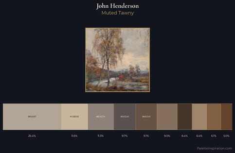
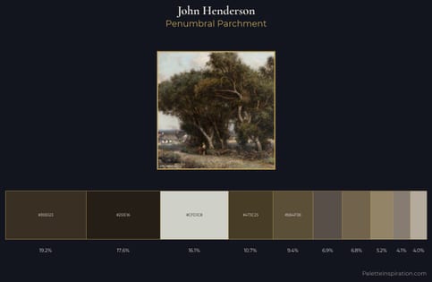
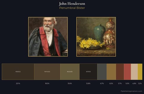
Values in John Henderson rest in the mid-range - neither dramatically lit nor steeped in shadow. Heat pervades this palette; warm chromatic identities outweigh cool ones at almost every weight. The absence of saturated colour is itself an expressive choice: this is a palette of restraint and atmosphere. The highest-chroma note - #A54A3F - appears at just 2.5%, deployed as a precision accent against the quieter ground. At 54 units across the value scale, the palette keeps contrast readable without letting it dominate. This is the light John Henderson preferred, made measurable.
Example use cases
- ceramics & pottery
- boutique hospitality
- menswear
- heritage food brands
- craft & artisan brands
I Love This!
Use This Palette
Copy, export, or download for your project
Copy, export, or download for your project
Copy:
Download:
Share: