John Glover Master Palette
Palette Analysis
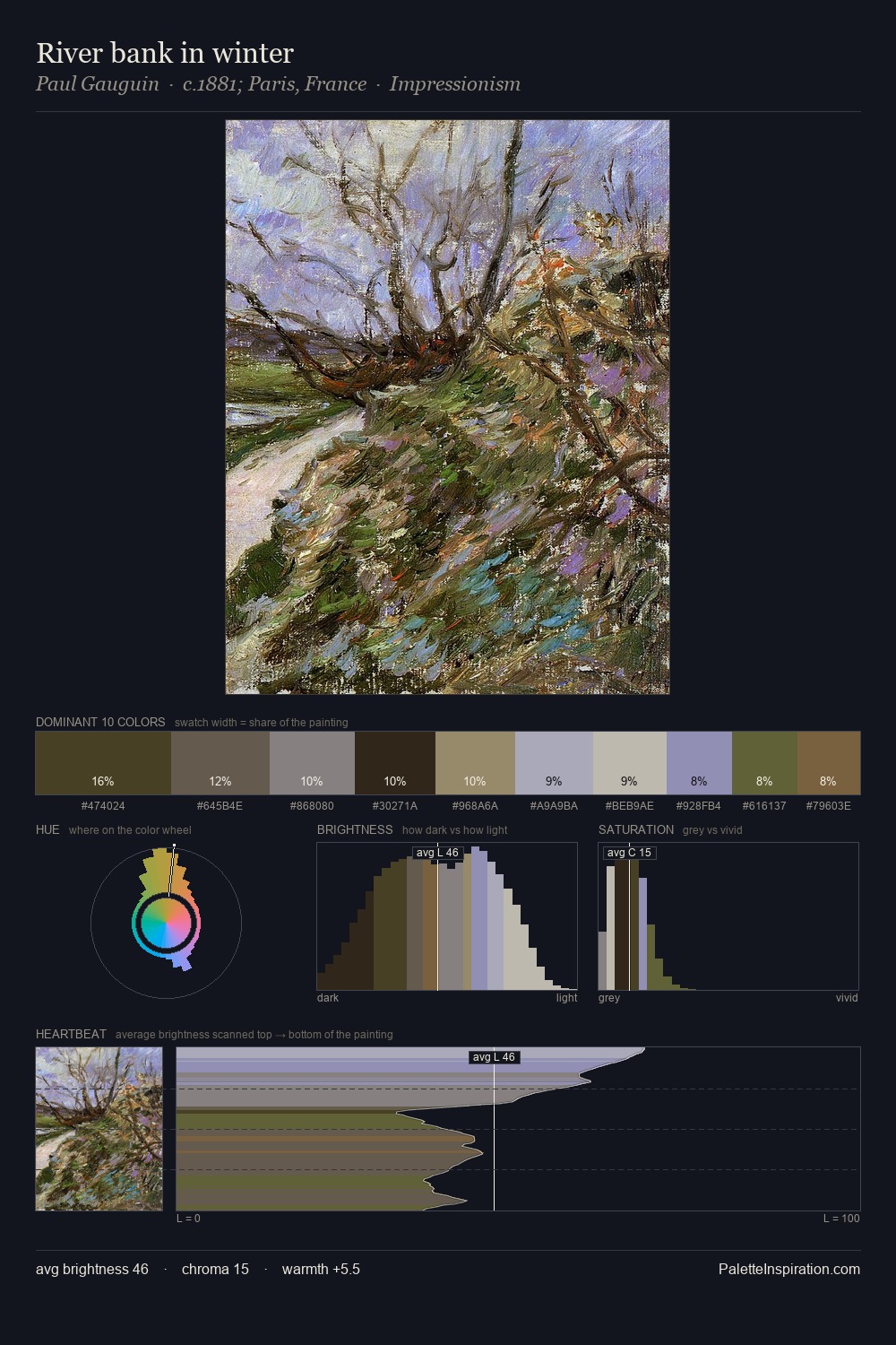
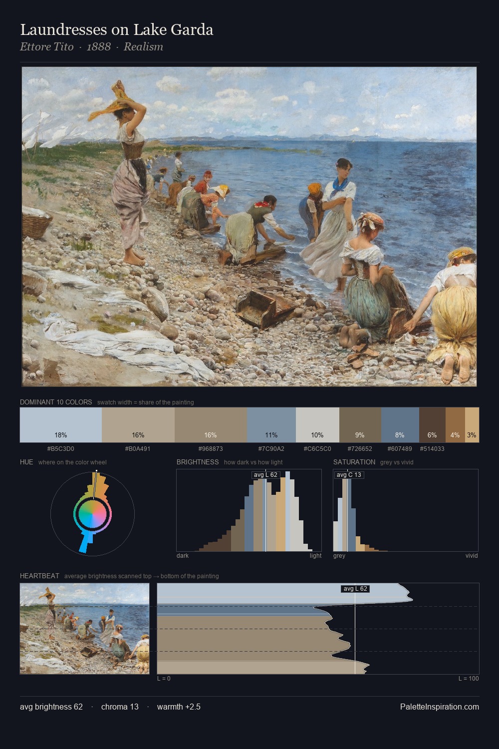
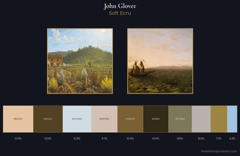
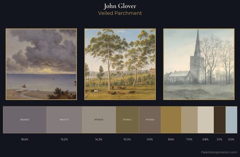
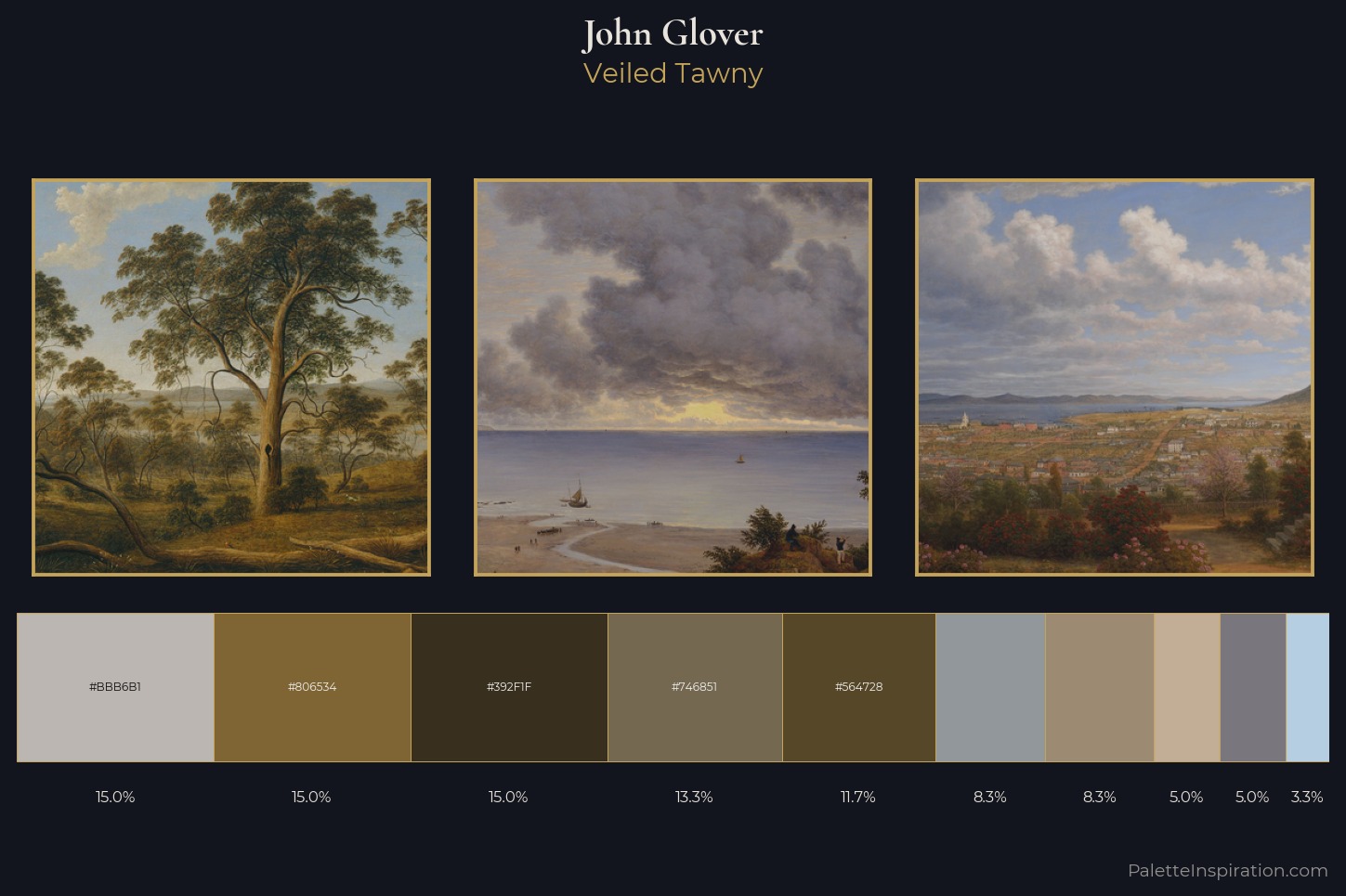
Mid-key values give John Glover its characteristic quietness - nothing blazes, nothing disappears. Cool tones set the register here - the blues and greens easily outweigh any warm accents. All colours lean toward grey, building depth through value rather than colour punch. The most saturated colour, #B5CEE2, covers 3.3% of the surface: too much to call an accent, too strong to ignore. The value range of 53 units sits in the comfortable middle: enough depth, enough light, neither extreme. The mid-to-high key, cool bias, and moderate chroma point to outdoor observation - sky and diffused daylight as the dominant light source. The palette is recognisably John Glover's own: particular in its temperature, chroma, and the economy of its brightest note.
Example use cases
- ceramics & pottery
- boutique hospitality
- menswear
- heritage food brands
- craft & artisan brands
I Love This!
Copy, export, or download for your project