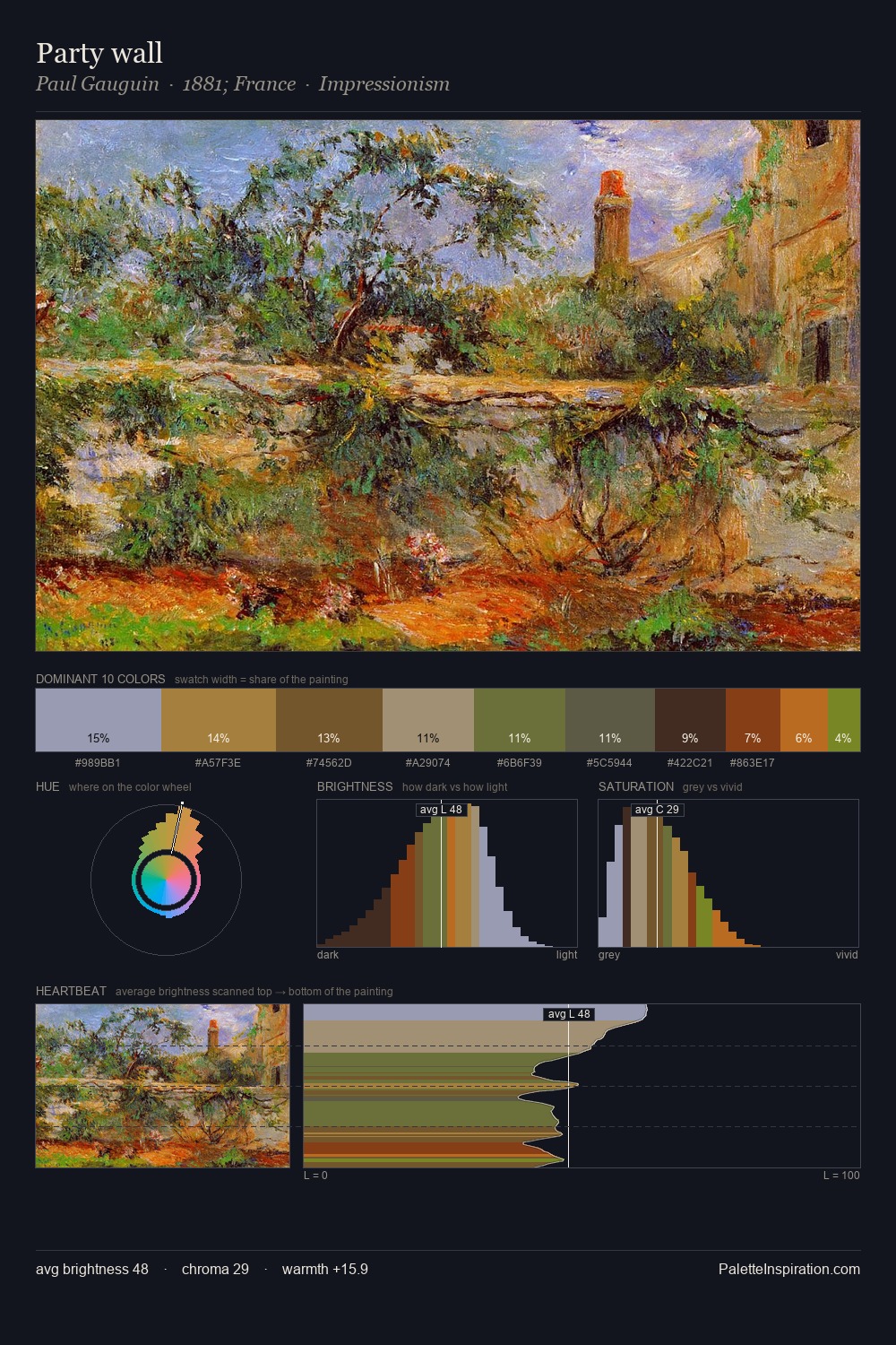
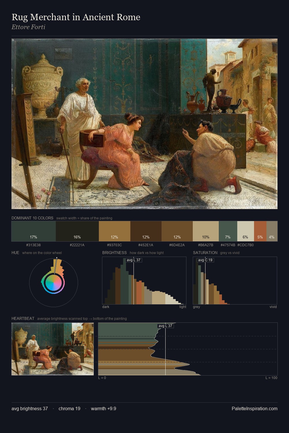
John Frederick Herring Sr. Palette 9
Veiled Caramel
Veiled Partially obscured light - mid-dark with a hazy, scrim-filtered quality.
Caramel Warm mid-brown - the color of cooked sugar, smooth and amber-toned.

Palette Analysis
John Frederick Herring Sr. occupies the comfortable middle of the value scale, avoiding both extremes to hold the eye in a sustained middle grey. The palette achieves thermal balance - reds and blues, ochres and greens, each holding the other in check. Every colour is desaturated; the palette proceeds through near-neutrals and gently-coloured greys. The highest-chroma note - #6A4823 - appears at just 6.7%, deployed as a precision accent against the quieter ground. 42 units of value spread create a palette that is varied but unified - contrast in the service of harmony. Palette 9 sits within the larger chromatic argument that John Frederick Herring Sr.'s complete body of work advances.
Example use cases
- theater design
- jewelry brands
- tobacco-adjacent retail
- event branding
- film & entertainment
I Love This!
Use This Palette
Copy, export, or download for your project
Copy, export, or download for your project
Copy:
Download:
Share: