John Duncan Fergusson Palette 2

Palette Analysis
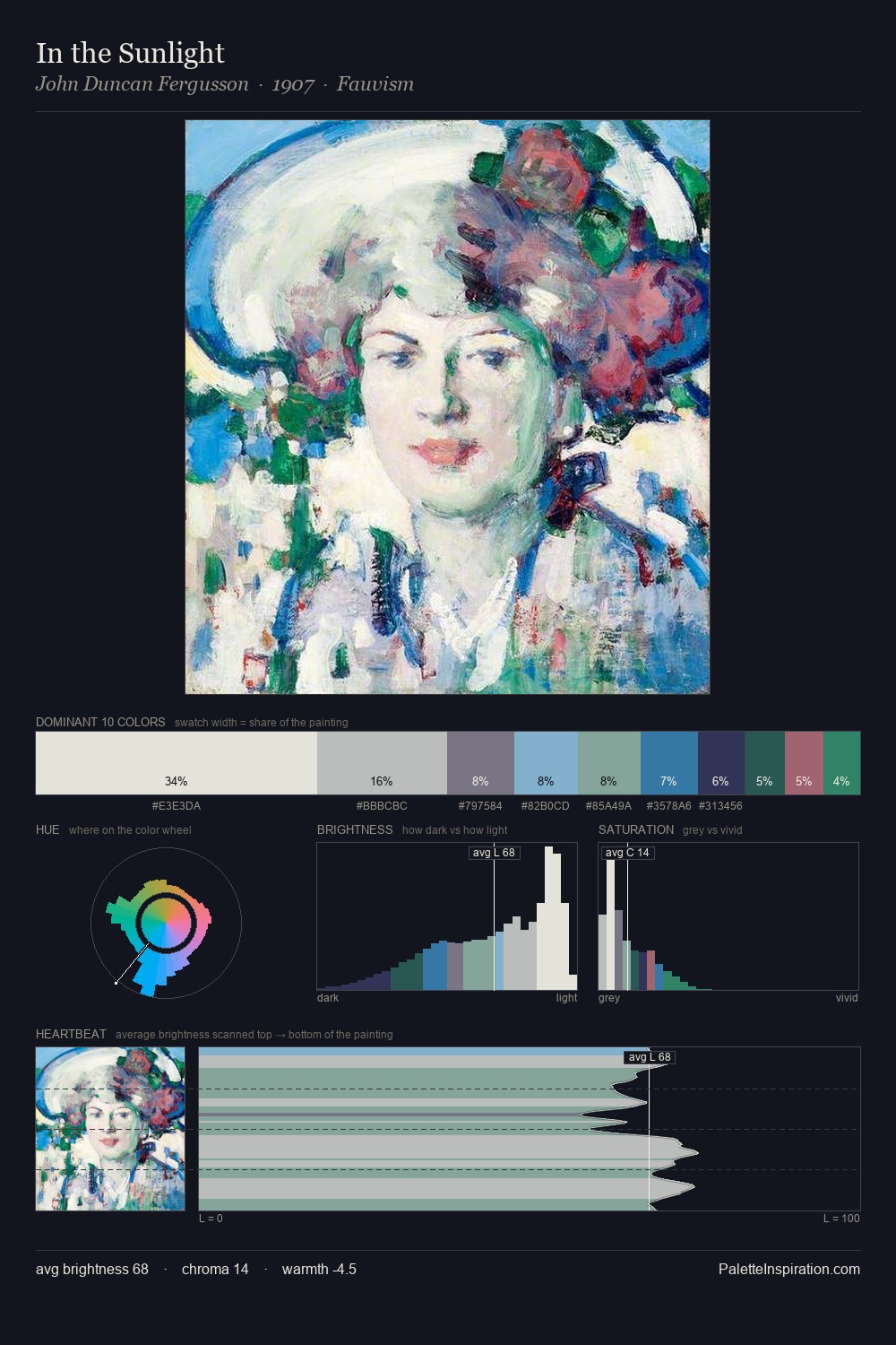
Light floods John Duncan Fergusson; the palette keeps values pale and airy across its range. Temperature is cool-dominant, with blue and green families claiming the largest areas. Muted throughout, the palette achieves its effects through value and temperature rather than chromatic force. 31.6% of the palette belongs to #DADCD5, a concentration that makes it the unmistakable visual centre. The saturated accent, #2B735D, registers at 3.4% - sparse enough to feel like a deliberate surprise. The full value range is 57 units: broad enough to build convincing three-dimensional form. High luminosity and cool temperature suggest the plein-air condition: unfiltered daylight and open sky. John Duncan Fergusson's palette 2 carries its own internal logic while remaining in conversation with the artist's broader colour intelligence.
Example use cases
- print magazines
- beauty brands
- real estate
- high-end packaging
- editorial design
I Love This!
Copy, export, or download for your project