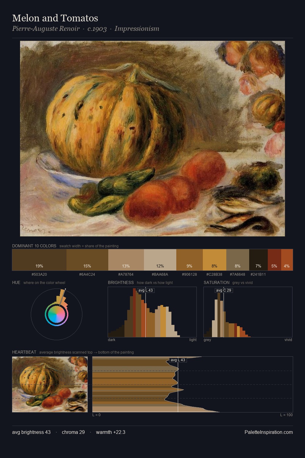
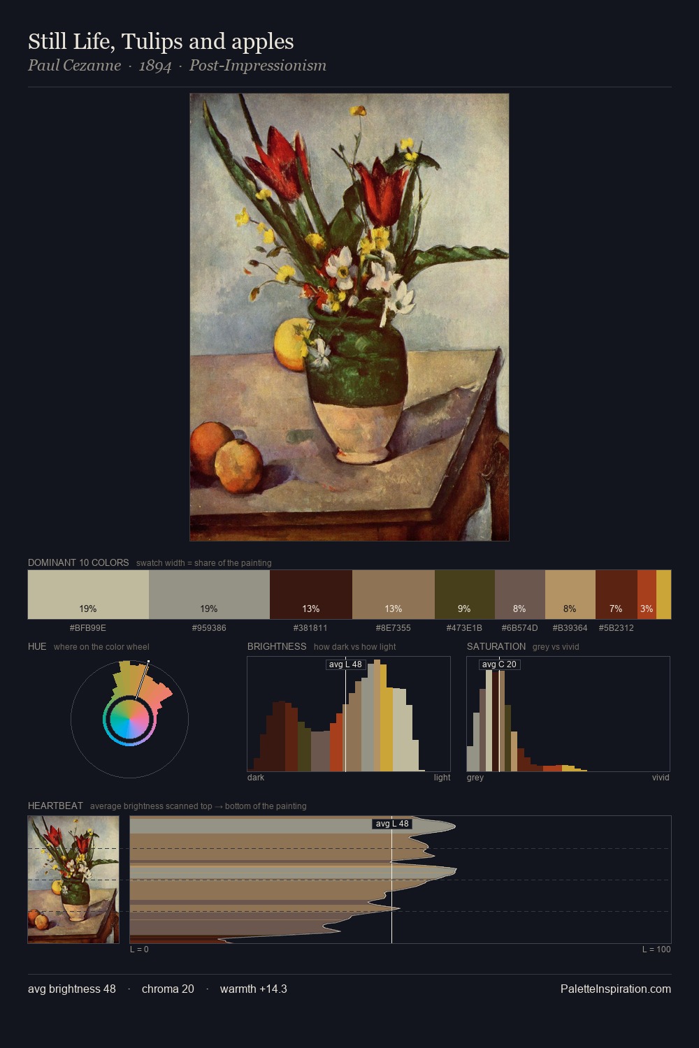
John Boultbee Palette 5

Palette Analysis
John Boultbee sits in the centre of the value range, lending the palette a sense of even, sustained light. Cool tones set the register here - the blues and greens easily outweigh any warm accents. Chroma hovers near zero; colour declares itself through subtle shifts in hue rather than outright saturation. The most saturated colour, #A7401B, is reserved to 2.5% of the surface, where it acts as a focal punctuation. 61 units of value range underpin the palette's structural clarity: the eye always knows where light falls. High luminosity and cool temperature suggest the plein-air condition: unfiltered daylight and open sky. John Boultbee's palette 5 carries its own internal logic while remaining in conversation with the artist's broader colour intelligence.
Example use cases
- craft & artisan brands
- specialty coffee
- home goods
- lifestyle retail
- ceramics & pottery
I Love This!
Copy, export, or download for your project