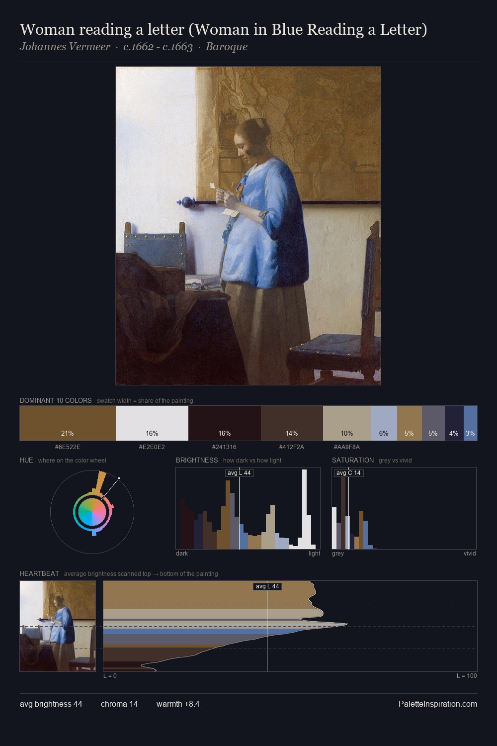
Johannes Vermeer Palette 2
Muted Parchment
Muted Deliberately desaturated - chroma pulled toward gray, the restraint of tonal painting.
Parchment Aged warm neutral - the color of old manuscript parchment, tan and slightly yellowed.

Palette Analysis
Johannes Vermeer sits in the centre of the value range, lending the palette a sense of even, sustained light. Temperature reads distinctly warm: the reds and earth tones from Johannes Vermeer carry the compositional weight. The absence of saturated colour is itself an expressive choice: this is a palette of restraint and atmosphere. Only 12.3% is devoted to #241418, yet that small allocation delivers the palette's entire chromatic tension. The value range spans 70 units across the palette, providing the full gamut from deep shadow to near-white and ensuring clear tonal hierarchy. Palette 2 sits within the larger chromatic argument that Johannes Vermeer's complete body of work advances.
Example use cases
- ceramics & pottery
- boutique hospitality
- menswear
- heritage food brands
- craft & artisan brands
I Love This!
Use This Palette
Copy, export, or download for your project
Copy, export, or download for your project
Copy:
Download:
Share: