Johann Nepomuk Passini Palette 3

Palette Analysis
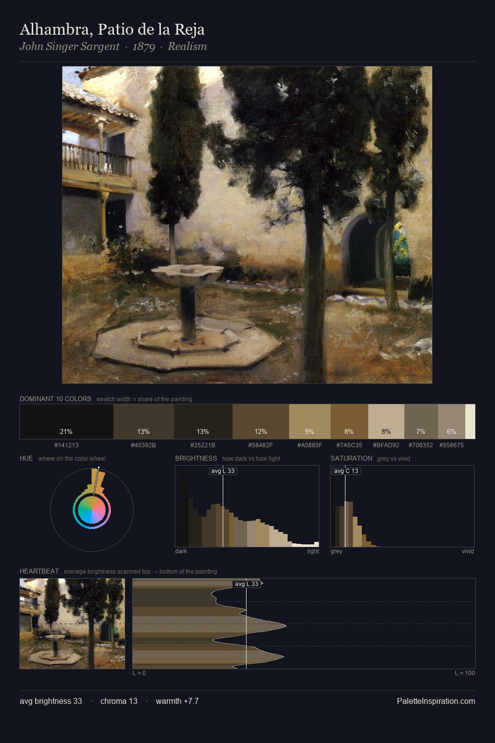
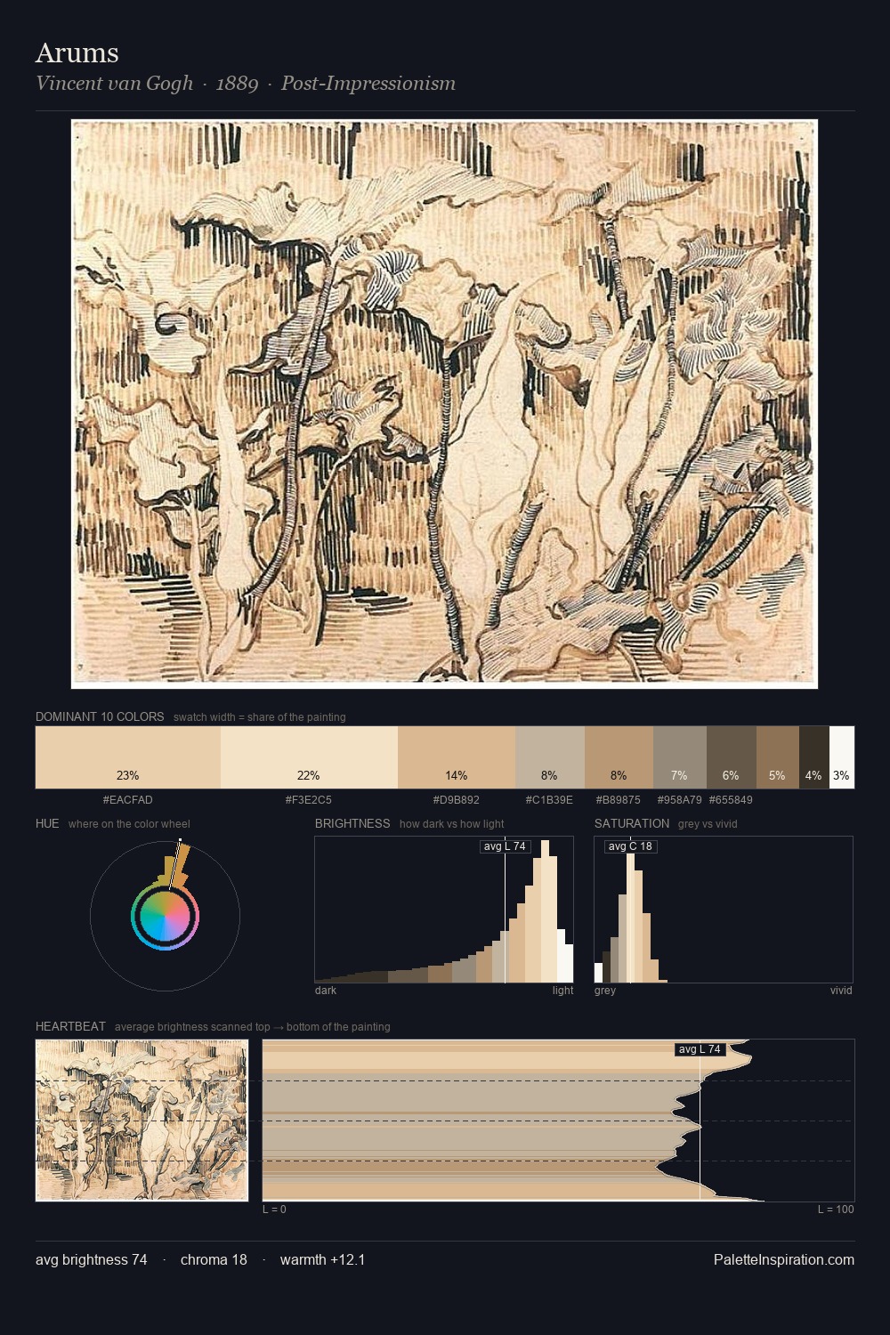
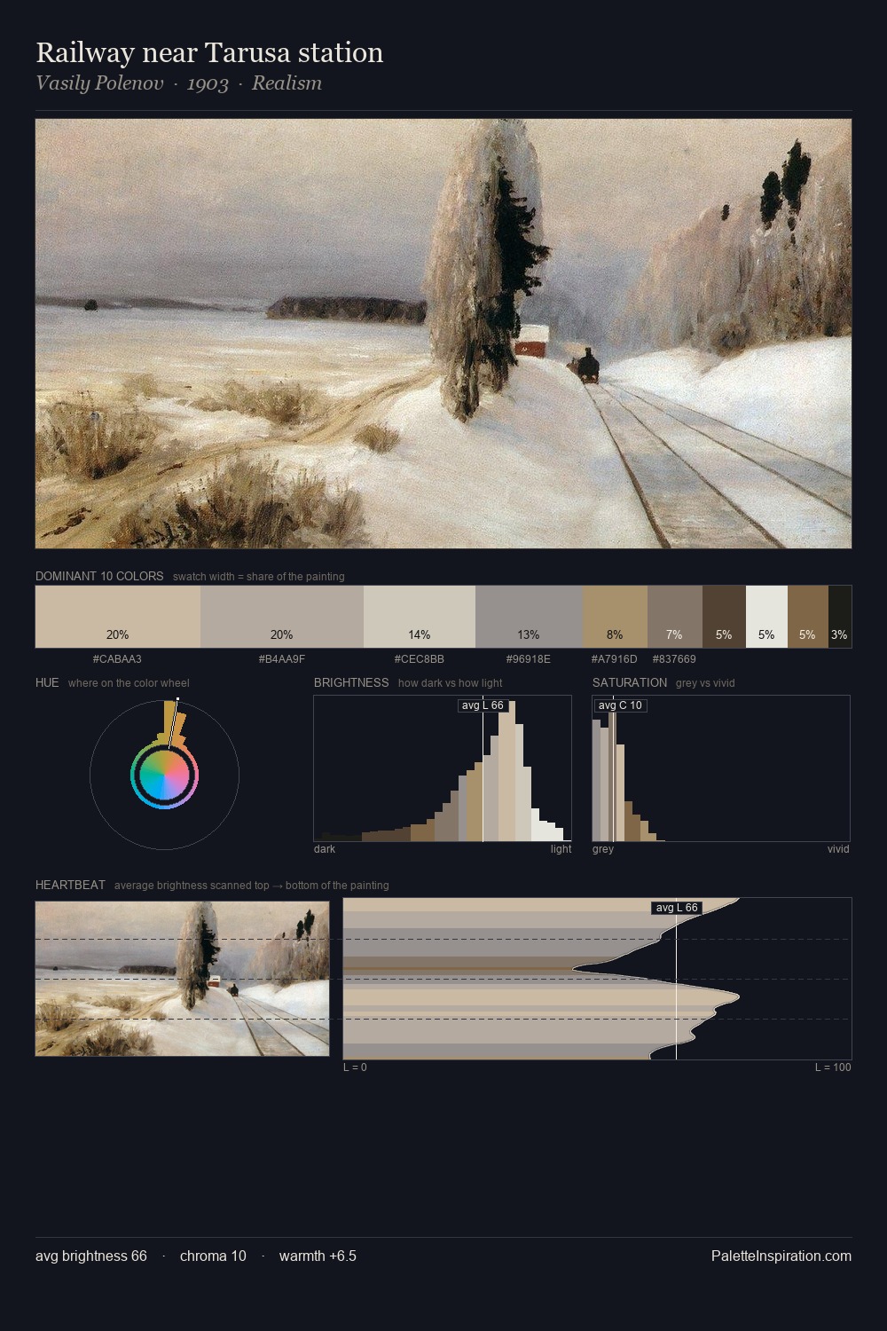
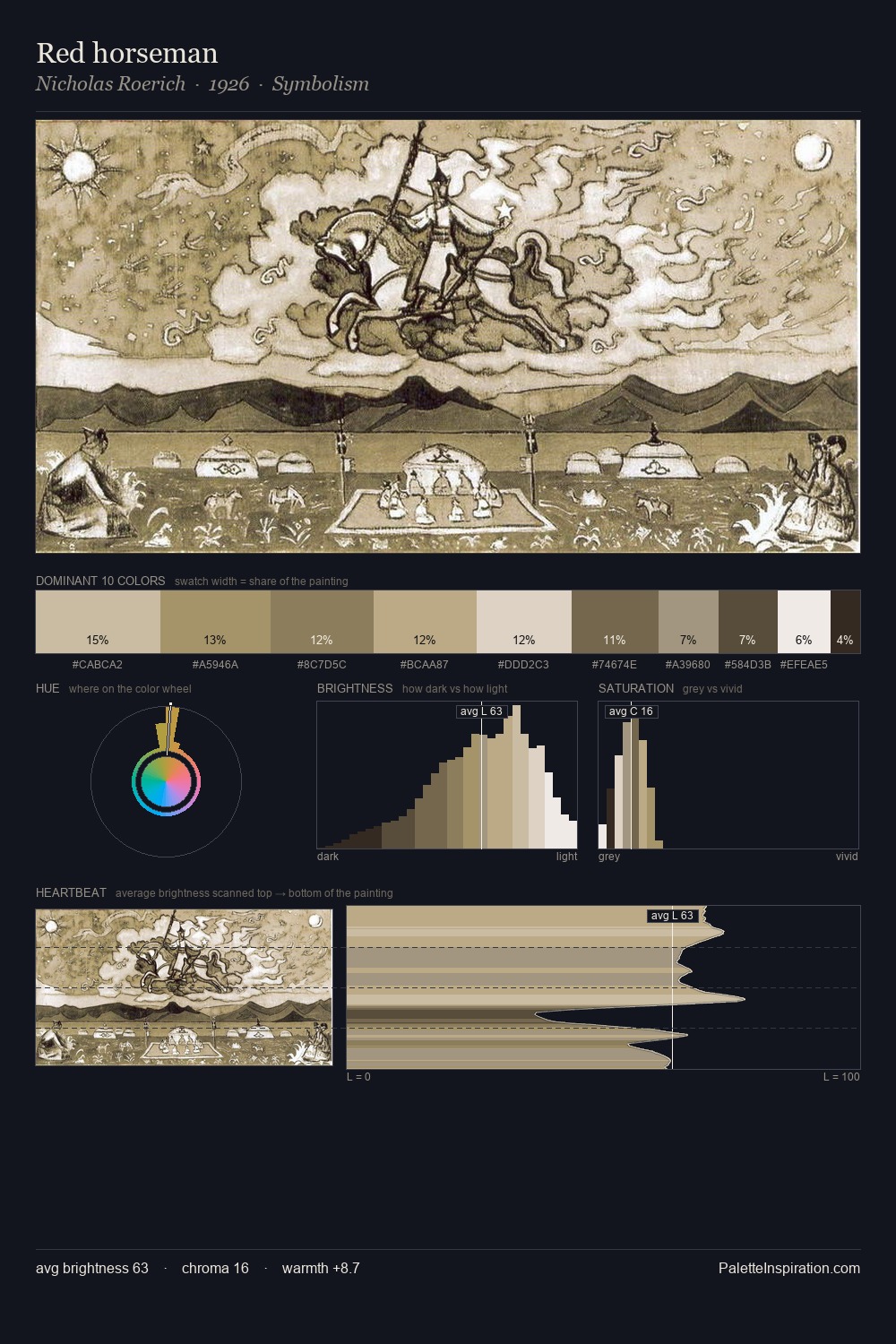
Johann Nepomuk Passini occupies the comfortable middle of the value scale, avoiding both extremes to hold the eye in a sustained middle grey. Johann Nepomuk Passini tilts toward cool - blues and silver-greys carry the structural weight. The absence of saturated colour is itself an expressive choice: this is a palette of restraint and atmosphere. The saturated accent, #E3D9CC, registers at 5.5% - sparse enough to feel like a deliberate surprise. At 70 units of value range, the palette has the tonal breadth to sustain complex spatial readings. High luminosity and cool temperature suggest the plein-air condition: unfiltered daylight and open sky. In the context of Johann Nepomuk Passini's full range of palettes, group 3 represents one movement in an ongoing chromatic dialogue.
Example use cases
- exhibition design
- foundation branding
- estate management
- art education
- museums & galleries
I Love This!
Copy, export, or download for your project