Johann Nepomuk Passini Palette 1

Palette Analysis
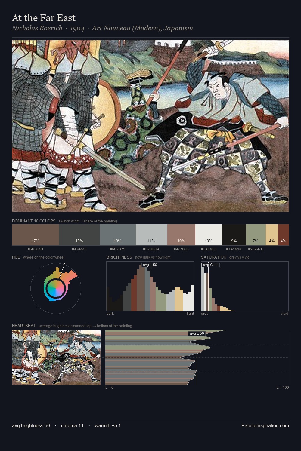
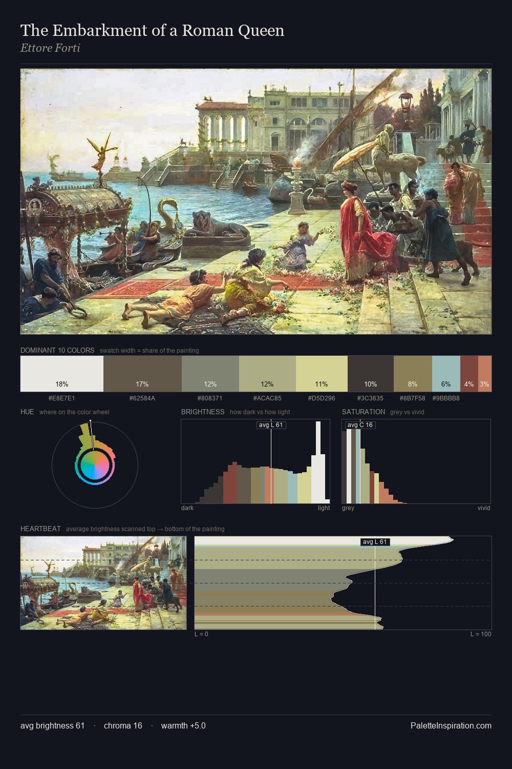
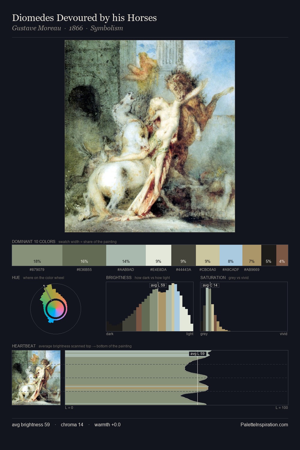
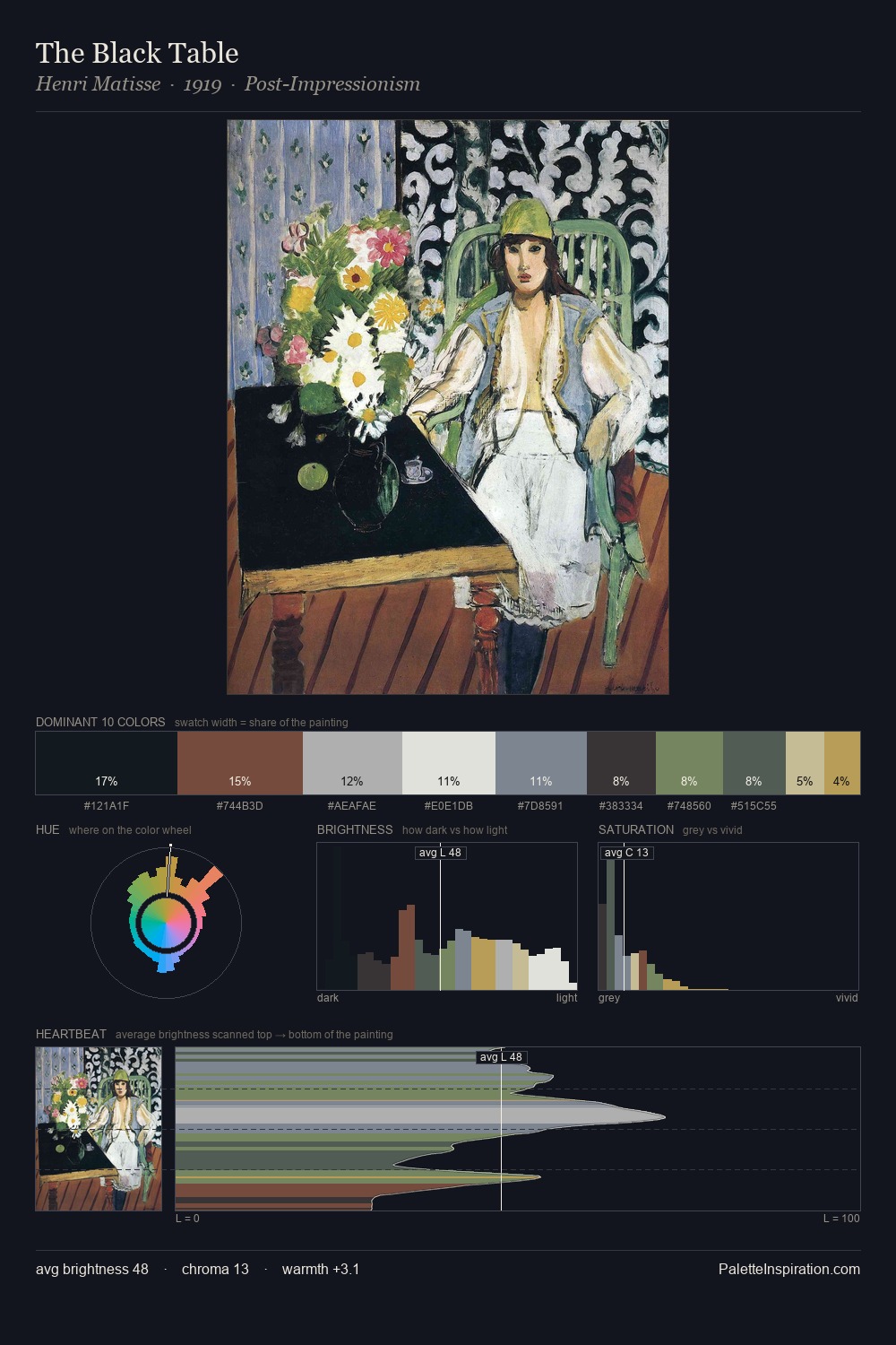
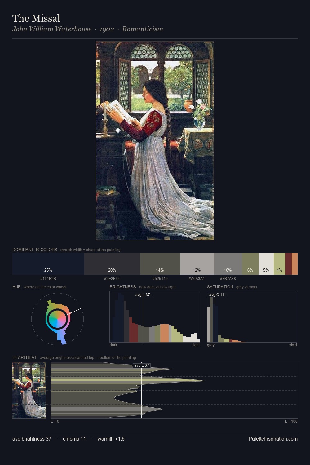
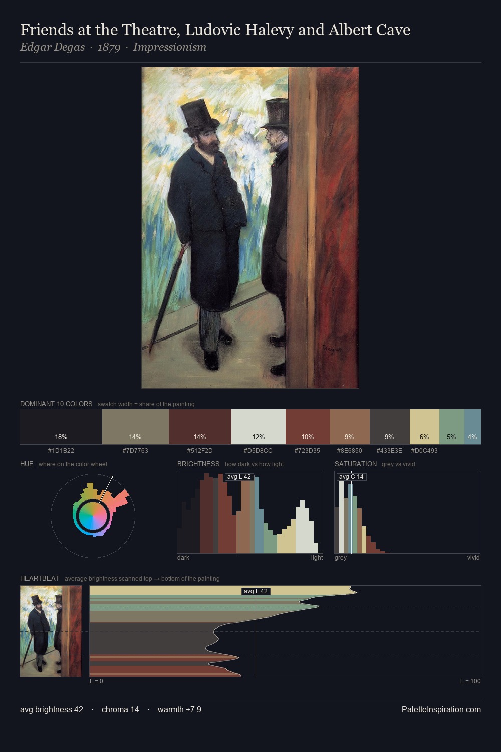
Johann Nepomuk Passini works in the upper reaches of the value scale, creating an atmosphere of brightness and expansiveness. A distinctly cool atmosphere runs through this palette: sky, water, and mist given colour form. Chroma is kept low across all colours, producing the soft, enveloping quality that characterises tonal painting. #ECE6D3 at 30.3% of the palette: an overwhelming presence that pulls all other colours into its gravitational field. #73372E delivers the chromatic peak at only 0.9% - a small shot of colour with outsized visual impact. From deepest dark to palest light, the palette traverses 69 units of the value scale - a span that creates natural depth. The palette has the character of outdoor light: cool, mid-bright, with colour rendered faithfully rather than expressively. Palette 1 sits within the larger chromatic argument that Johann Nepomuk Passini's complete body of work advances.
Example use cases
- publishing
- corporate identity
- consumer apps
- hospitality
- design agencies
I Love This!
Copy, export, or download for your project