Johann Justin Preissler Master Palette

Palette Analysis
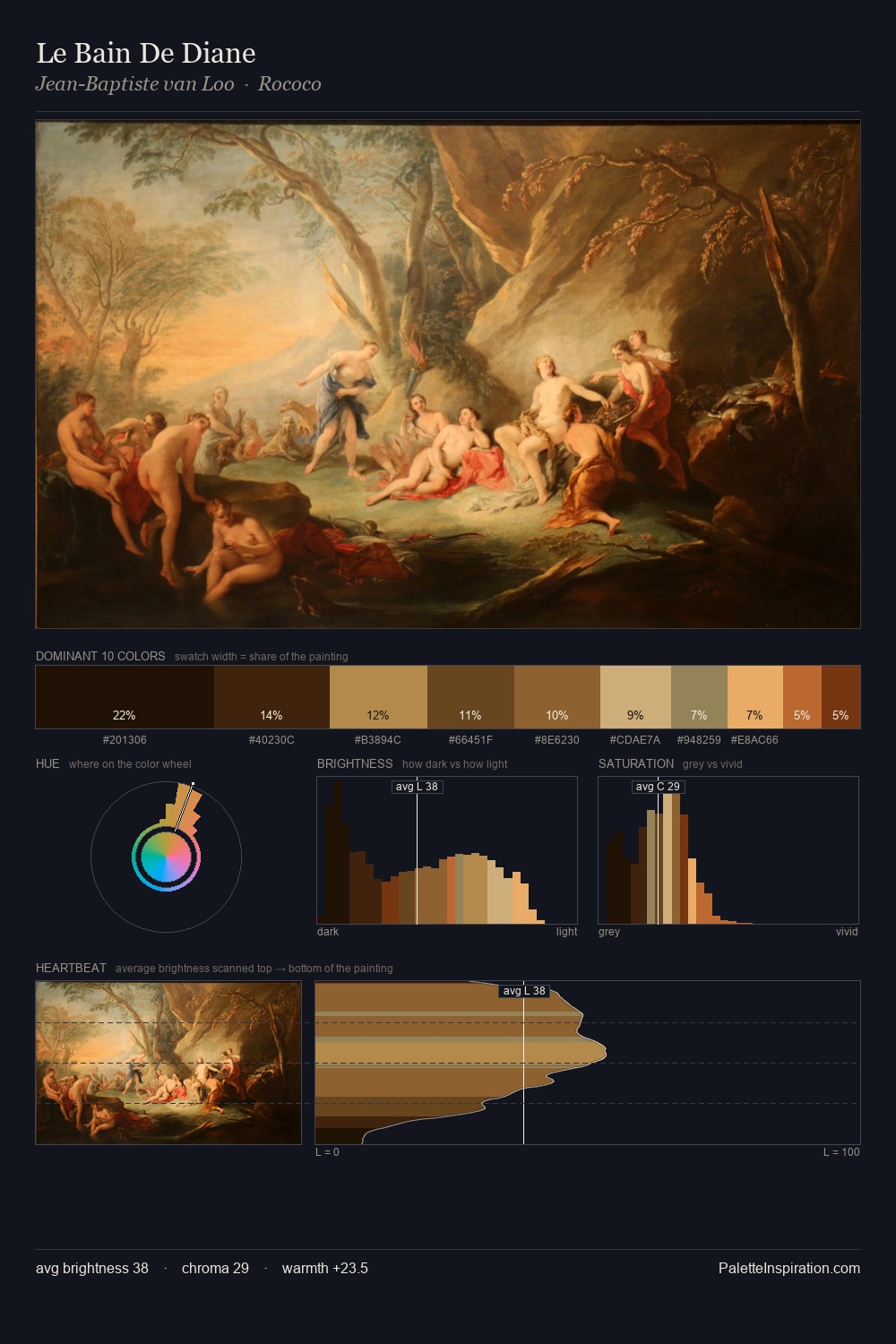
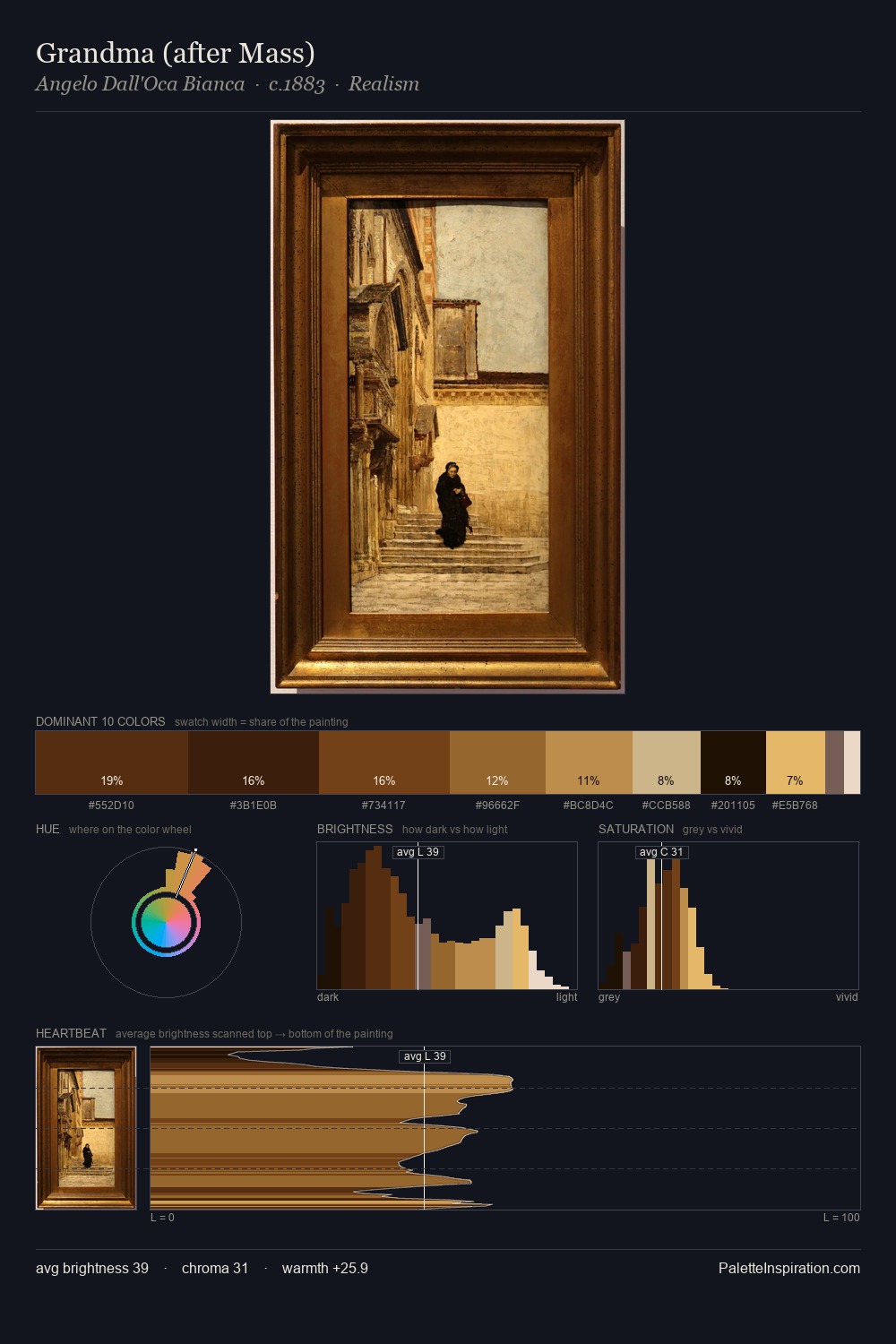
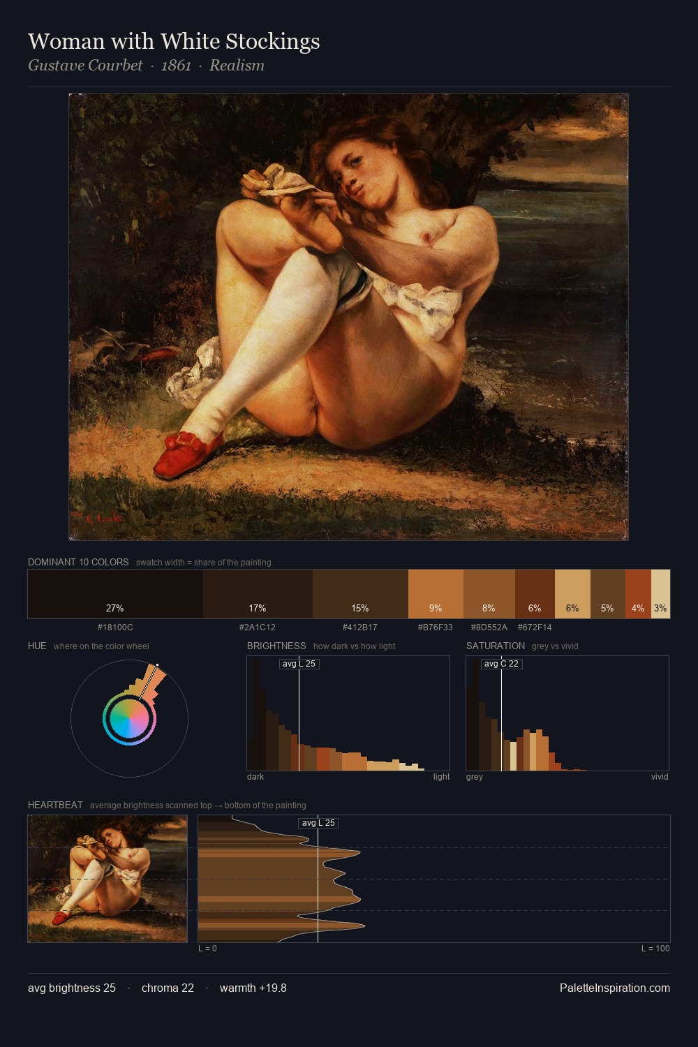
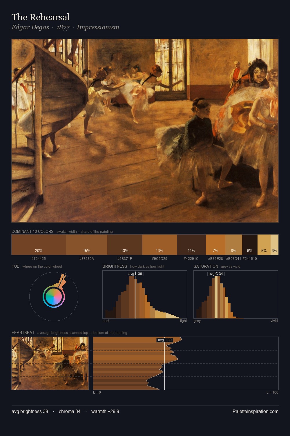
Johann Justin Preissler works almost entirely in the lower half of the value scale, privileging depth over brilliance. Warmth dominates - the palette of Johann Justin Preissler leans heavily on the yellow-orange-red arc of the colour wheel. The absence of saturated colour is itself an expressive choice: this is a palette of restraint and atmosphere. The highest-chroma note - #38240D - appears at just 8.8%, deployed as a precision accent against the quieter ground. The value range spans 59 units across the palette, providing the full gamut from deep shadow to near-white and ensuring clear tonal hierarchy. Together these qualities place Johann Justin Preissler firmly in the tonal tradition - concerned with mood and atmosphere rather than chromatic display. This is the light Johann Justin Preissler preferred, made measurable.
Example use cases
- theater design
- jewelry brands
- tobacco-adjacent retail
- event branding
- film & entertainment
I Love This!
Copy, export, or download for your project