Johann Justin Preissler Palette 1

Palette Analysis
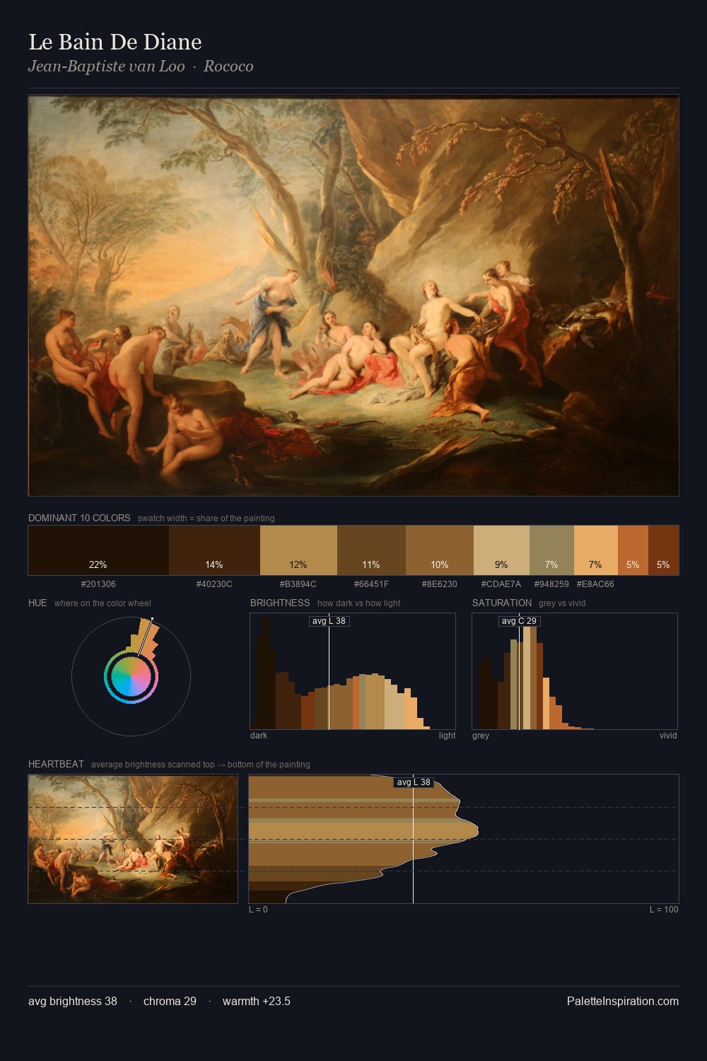
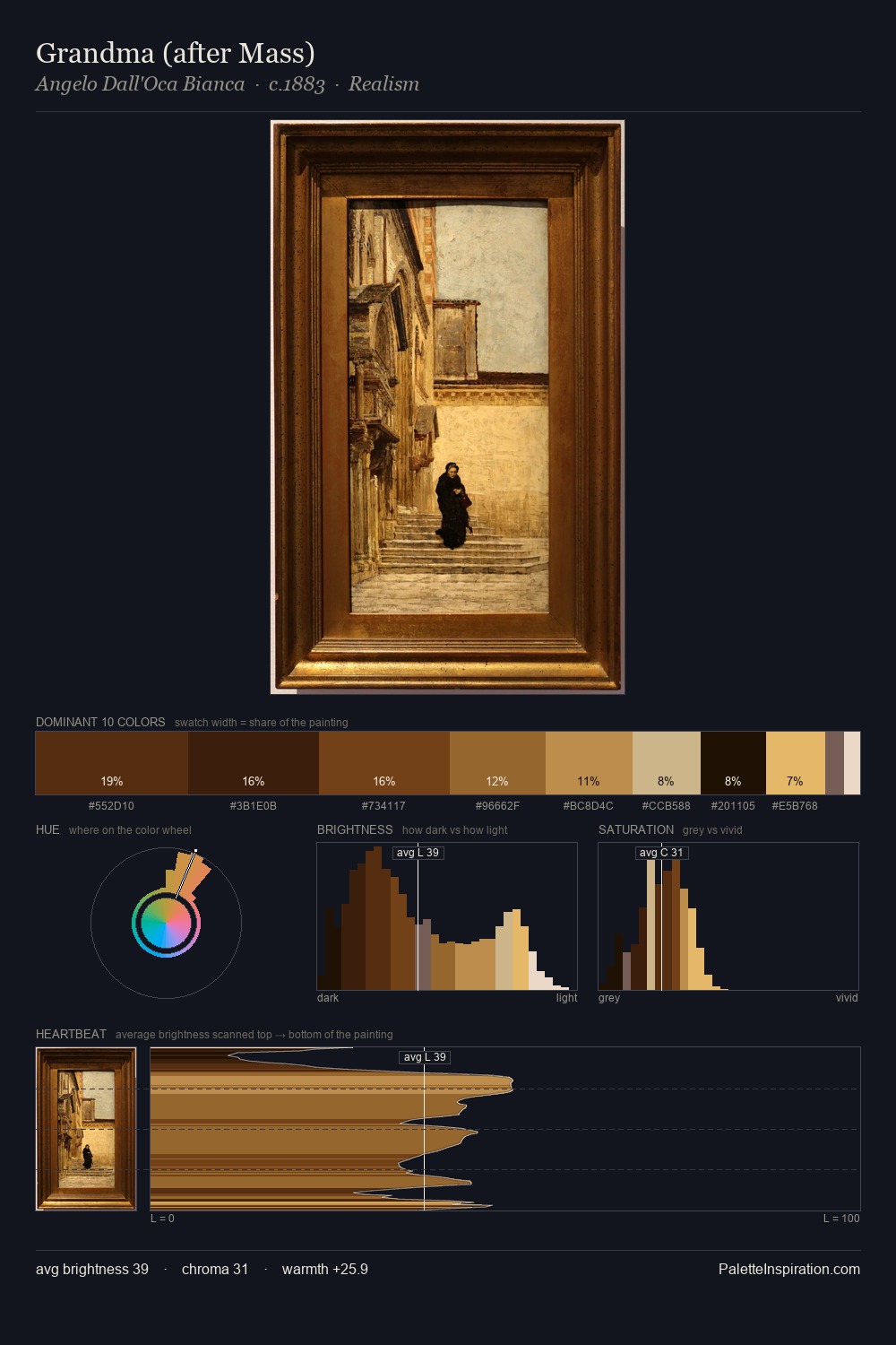
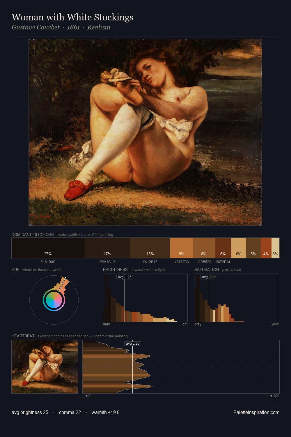
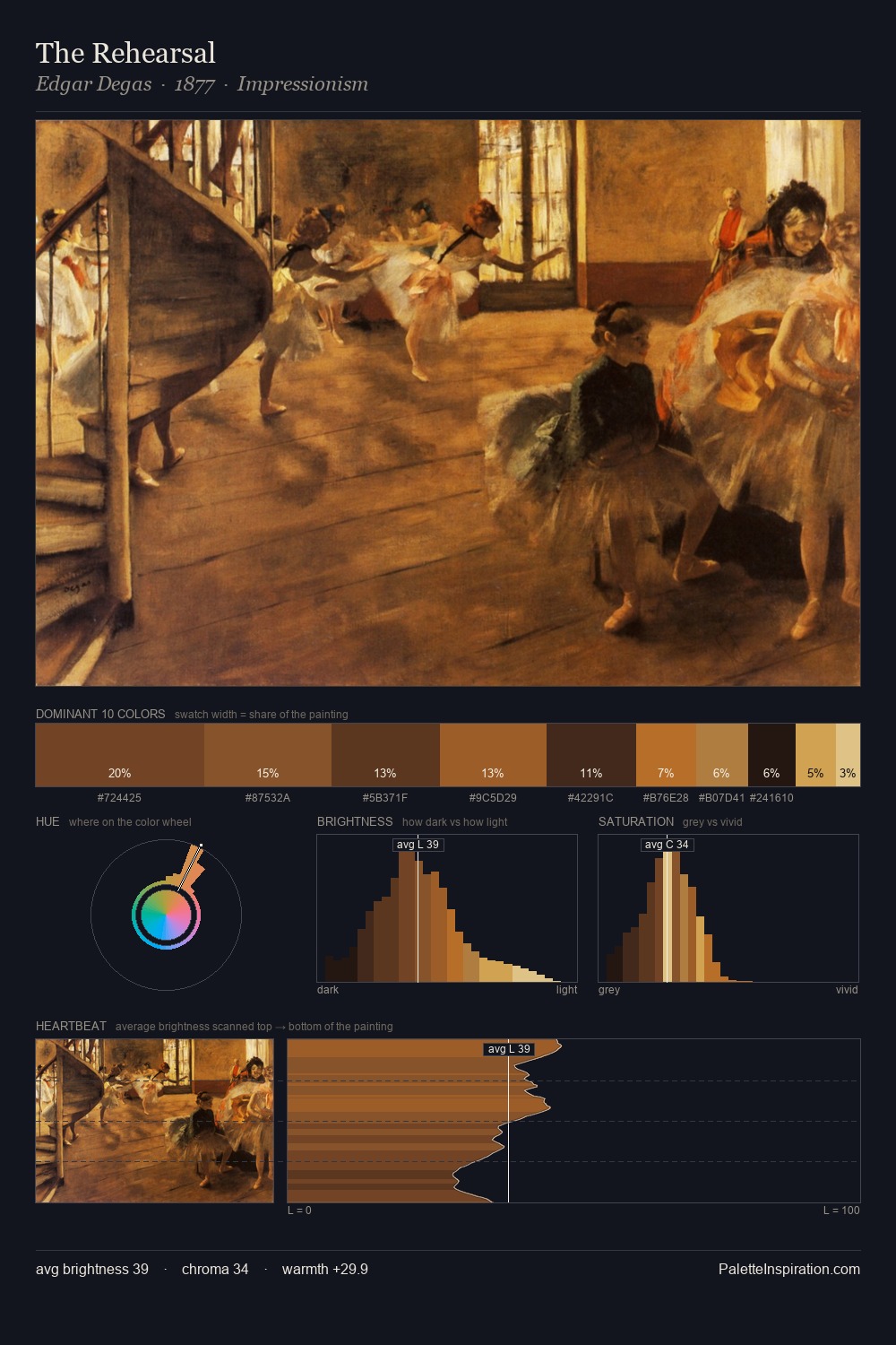
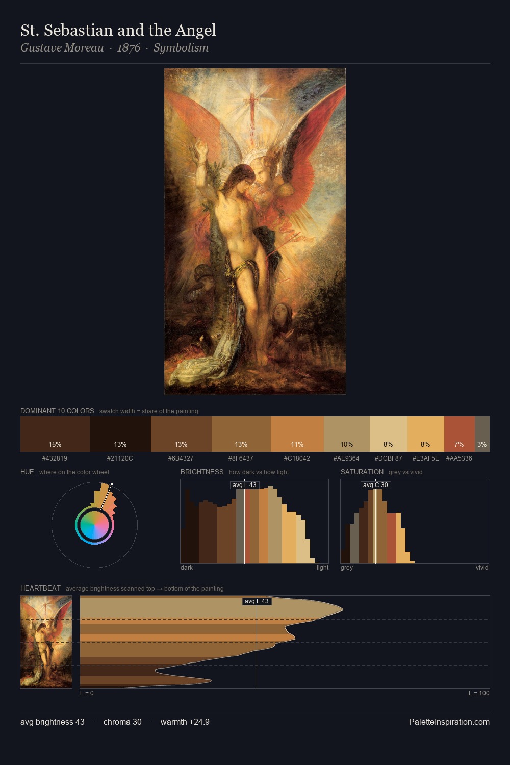
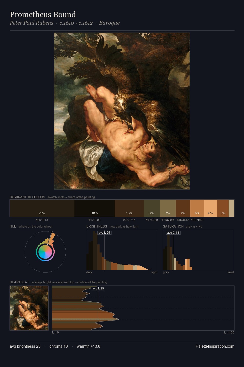
Johann Justin Preissler dwells firmly in the shadows, with no more than a whisper of light. Warm hues command this palette; Johann Justin Preissler favours the reds, oranges, and yellows of firelight and earth. Chroma is kept low across all colours, producing the soft, enveloping quality that characterises tonal painting. The most saturated colour, #38240D, is reserved to 8.8% of the surface, where it acts as a focal punctuation. At 59 units of value range, the palette has the tonal breadth to sustain complex spatial readings. This tonal restraint is characteristic of the Johann Justin Preissler approach: colour serves light, not the reverse. Palette 1 sits within the larger chromatic argument that Johann Justin Preissler's complete body of work advances.
Example use cases
- theater design
- jewelry brands
- tobacco-adjacent retail
- event branding
- film & entertainment
I Love This!
Copy, export, or download for your project