Johann Jakob Biedermann Palette 3
Muted Parchment
Muted Deliberately desaturated - chroma pulled toward gray, the restraint of tonal painting.
Parchment Aged warm neutral - the color of old manuscript parchment, tan and slightly yellowed.

Palette Analysis
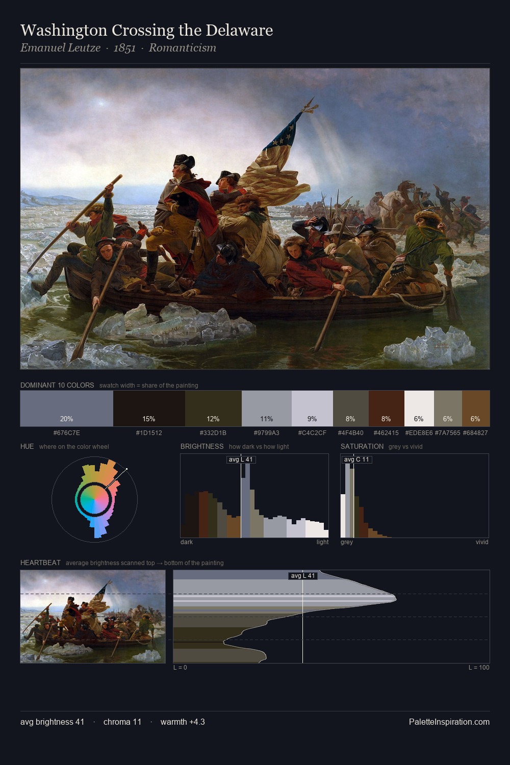
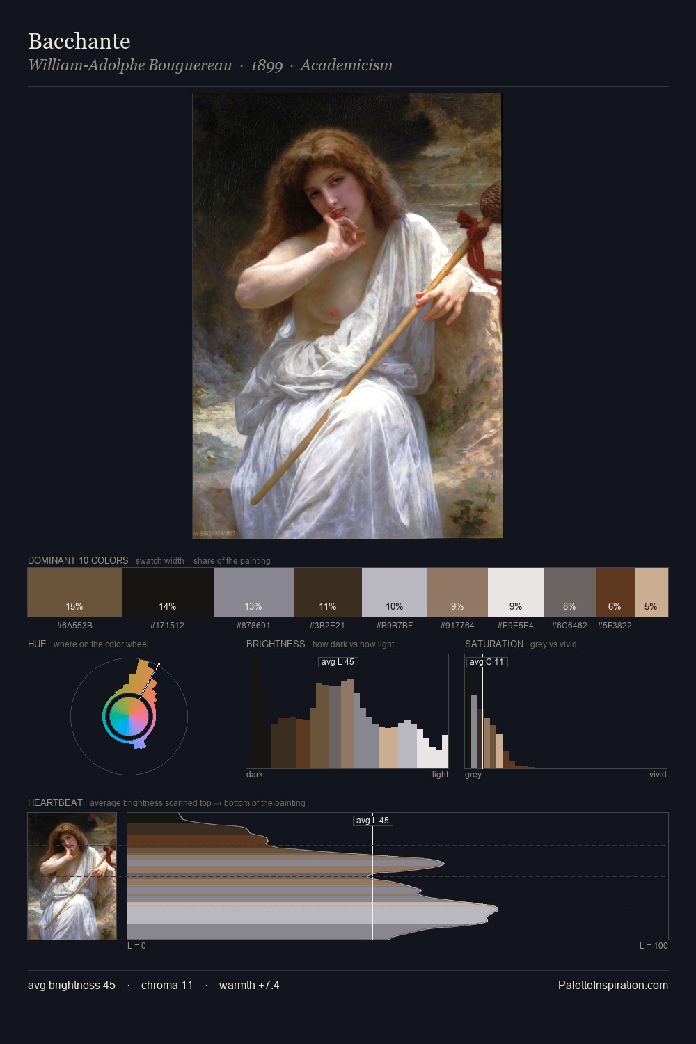
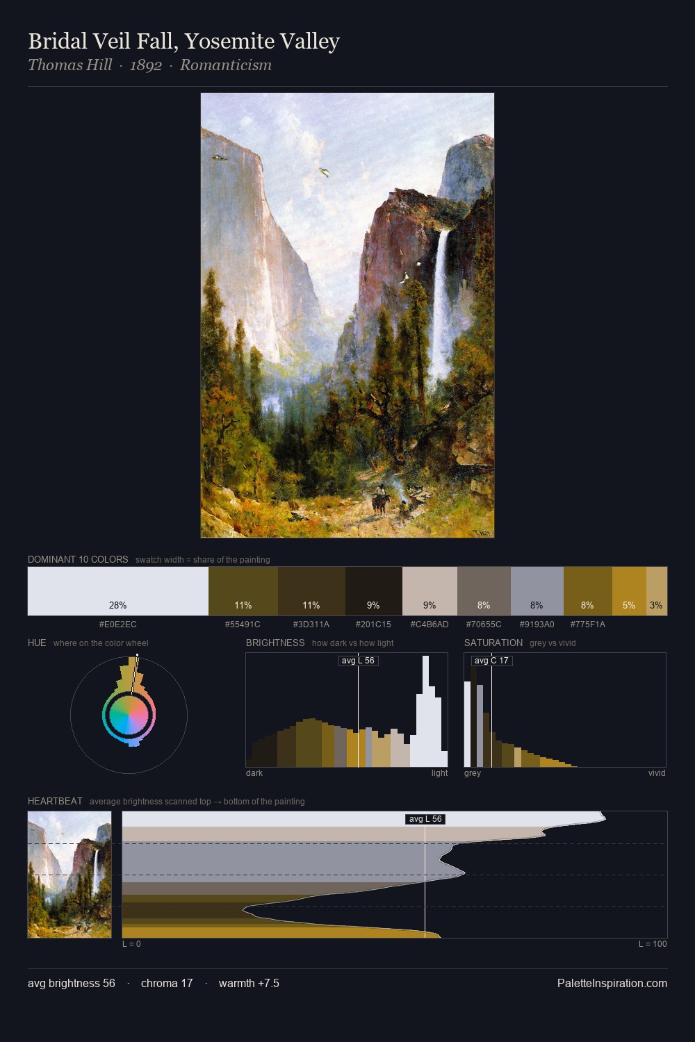
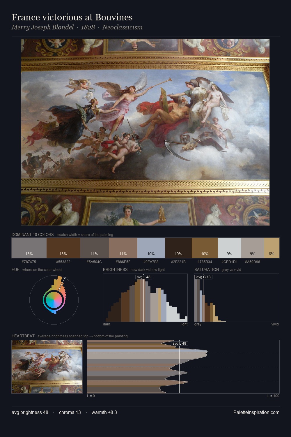
Values in Johann Jakob Biedermann rest in the mid-range - neither dramatically lit nor steeped in shadow. Neither warm nor cool has the upper hand here; the equilibrium between the two generates the palette's visual energy. Chroma is kept low across all colours, producing the soft, enveloping quality that characterises tonal painting. The most saturated colour, #523820, is reserved to 9.0% of the surface, where it acts as a focal punctuation. From deepest dark to palest light, the palette traverses 75 units of the value scale - a span that creates natural depth. Palette 3 sits within the larger chromatic argument that Johann Jakob Biedermann's complete body of work advances.
Example use cases
- ceramics & pottery
- boutique hospitality
- menswear
- heritage food brands
- craft & artisan brands
I Love This!
Use This Palette
Copy, export, or download for your project
Copy, export, or download for your project
Copy:
Download:
Share:
![[Unkown] palette card](/cards/0014171.jpg)