Johann Gottfried Steffan Palette 2

Palette Analysis
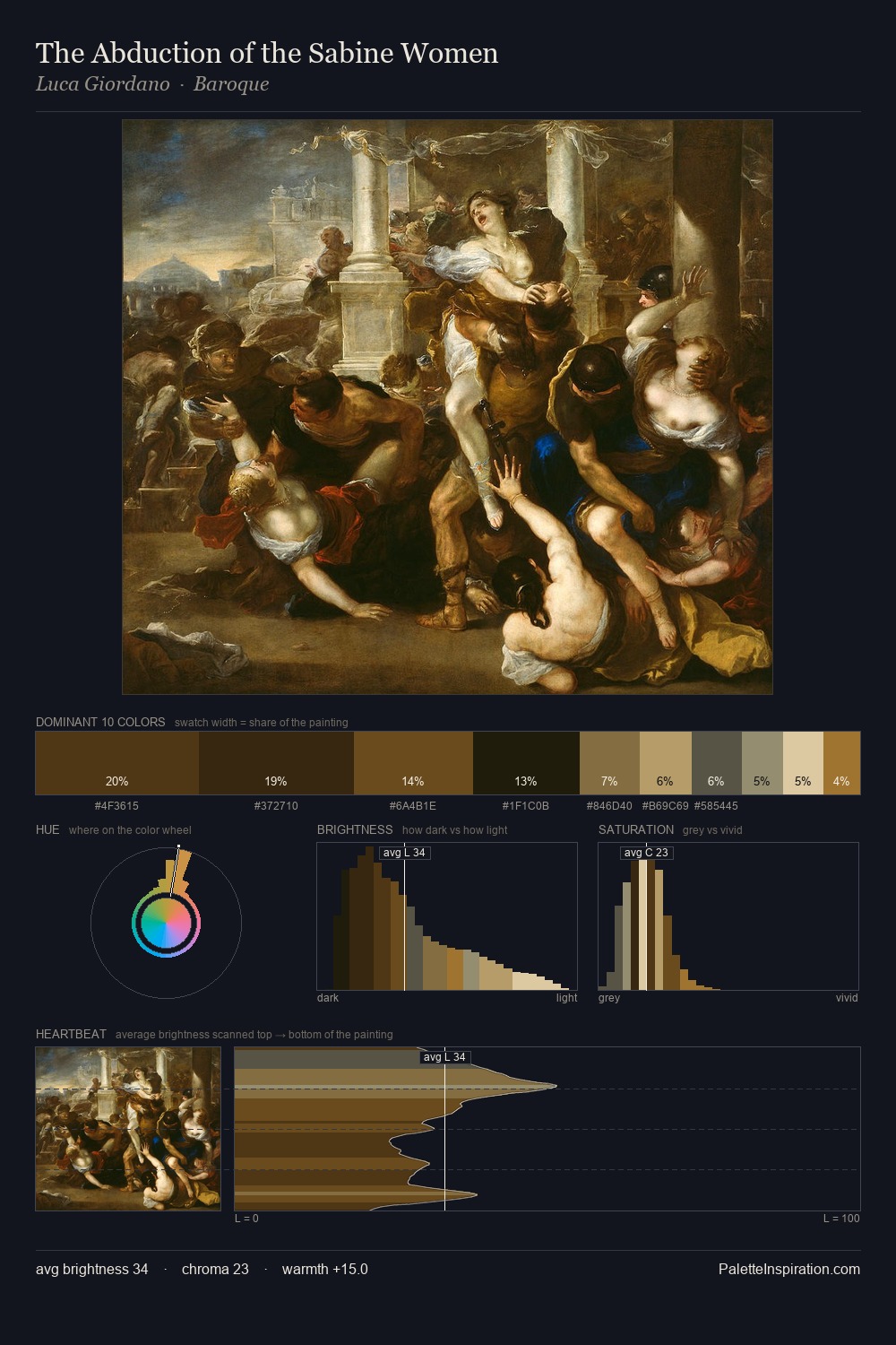
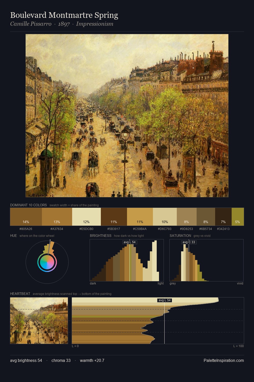
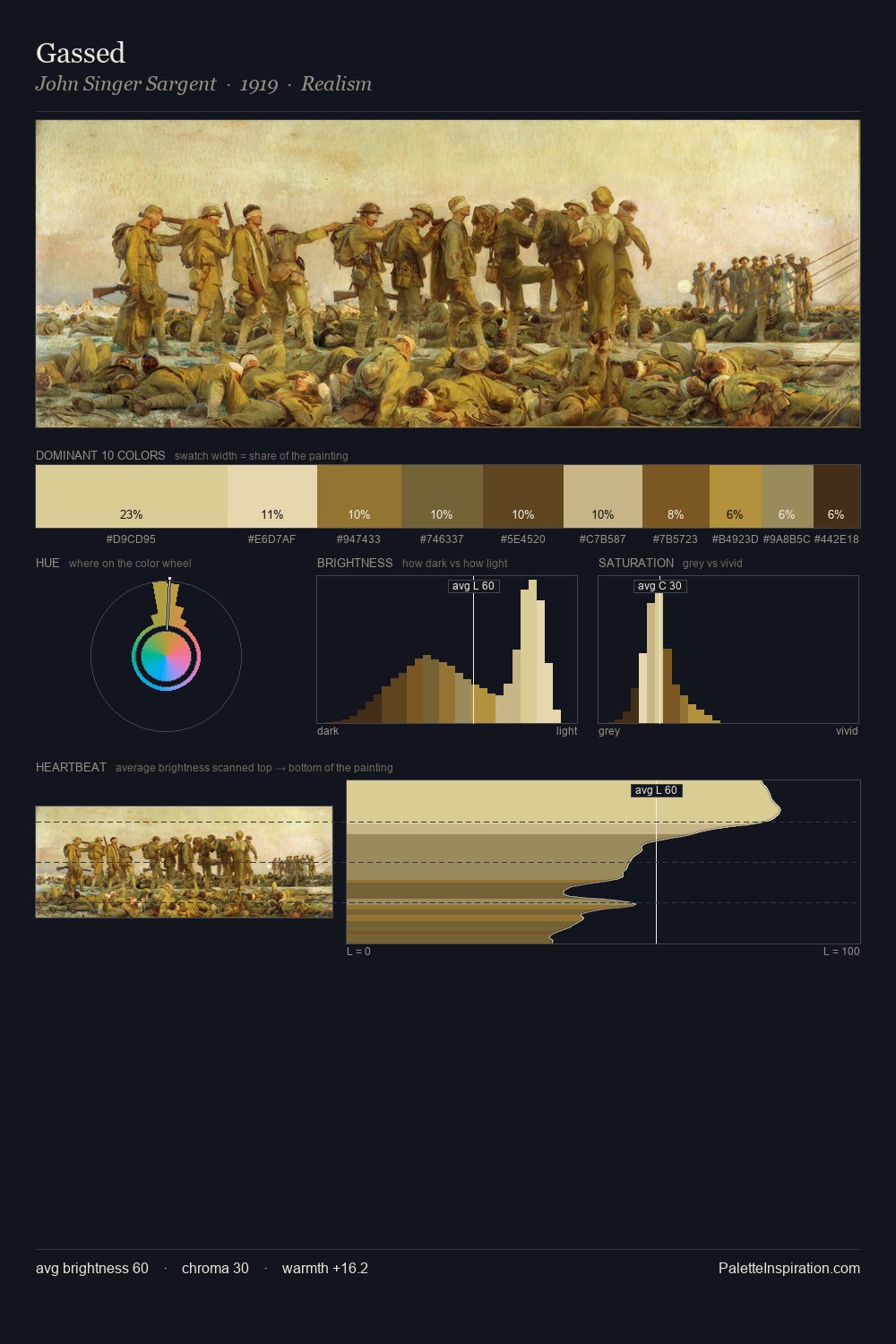
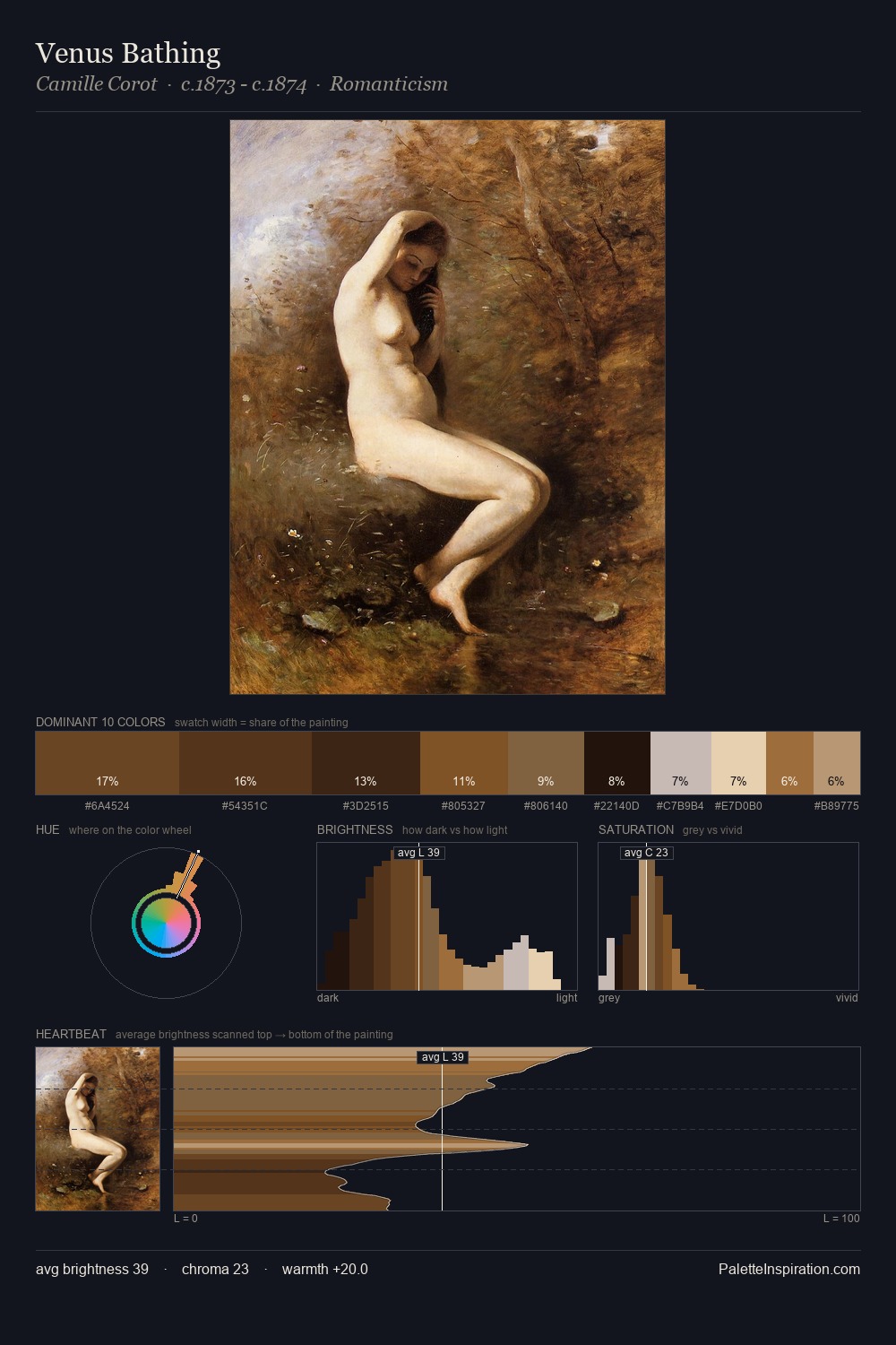
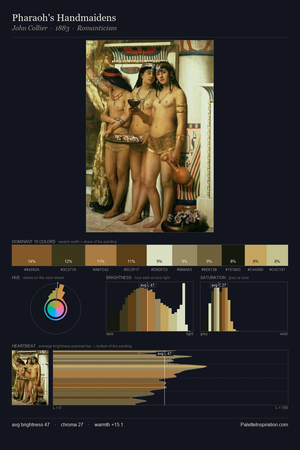
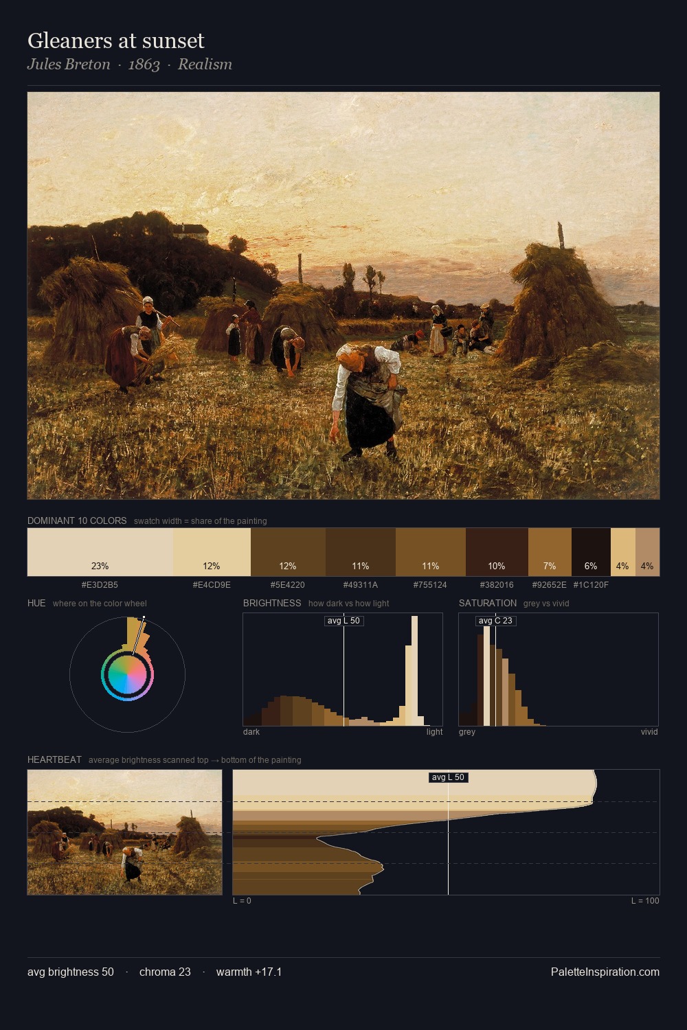
Johann Gottfried Steffan distributes its values across the middle register, creating harmony without high contrast. Johann Gottfried Steffan balances warm and cool with remarkable evenness, giving the composition its characteristic vibrancy. Chroma is moderate: colours carry enough saturation to be read as colour, but the palette stops well short of garish intensity. Only 5.0% is devoted to #EDDEBE, yet that small allocation delivers the palette's entire chromatic tension. 61 units of value range underpin the palette's structural clarity: the eye always knows where light falls. The palette reads as an Impressionist one - light-biased, chromatically direct, and built on temperature contrast rather than value opposition. Johann Gottfried Steffan's palette 2 carries its own internal logic while remaining in conversation with the artist's broader colour intelligence.
Example use cases
- film & entertainment
- fine dining
- spirits branding
- menswear
- theater design
I Love This!
Copy, export, or download for your project