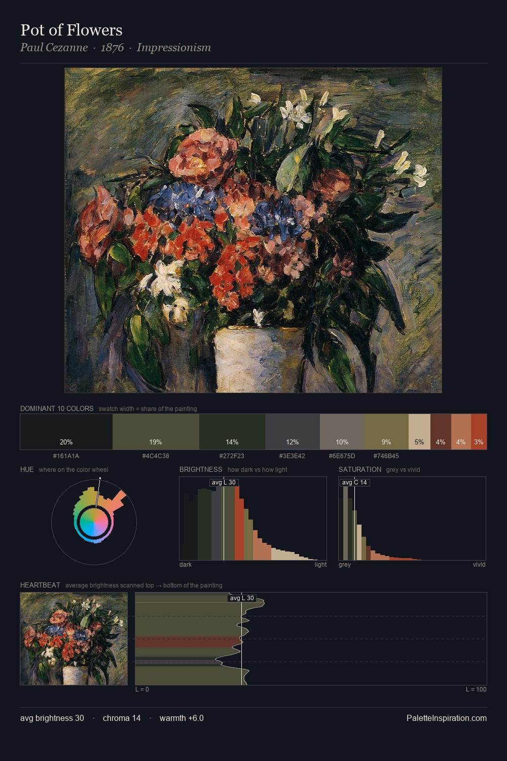
Johann Erdmann Hummel Palette 5

Palette Analysis
Johann Erdmann Hummel distributes its values across the middle register, creating harmony without high contrast. Cool tones set the register here - the blues and greens easily outweigh any warm accents. Saturation is deliberately withheld - the beauty here lies in the near-monochromatic gradations rather than colour difference. At 6.9%, #5D3629 carries the palette's sharpest chromatic charge: an accent that earns its place precisely because it is withheld. 54 units of value spread create a palette that is varied but unified - contrast in the service of harmony. High luminosity and cool temperature suggest the plein-air condition: unfiltered daylight and open sky. Palette 5 sits within the larger chromatic argument that Johann Erdmann Hummel's complete body of work advances.
Example use cases
- theater design
- jewelry brands
- tobacco-adjacent retail
- event branding
- film & entertainment
I Love This!
Copy, export, or download for your project