Johan Conrad Greive Palette 2
Muted Gamboge
Muted Deliberately desaturated - chroma pulled toward gray, the restraint of tonal painting.
Gamboge Deep golden yellow - a traditional warm pigment, rich amber-gold.

Palette Analysis
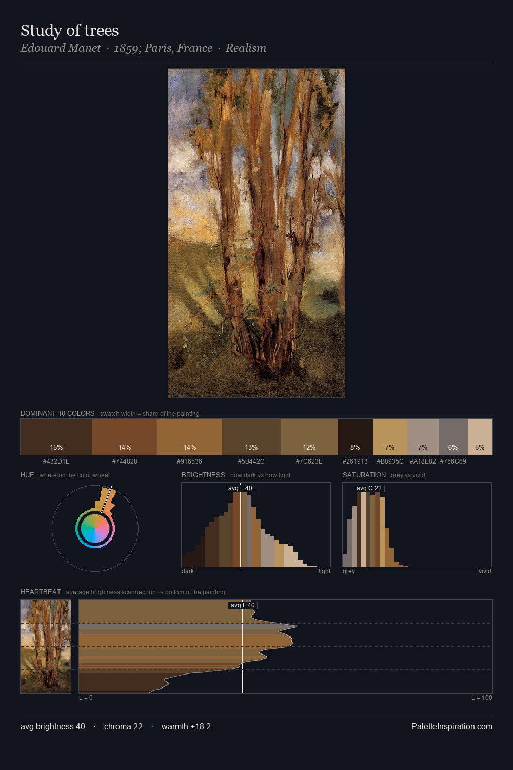
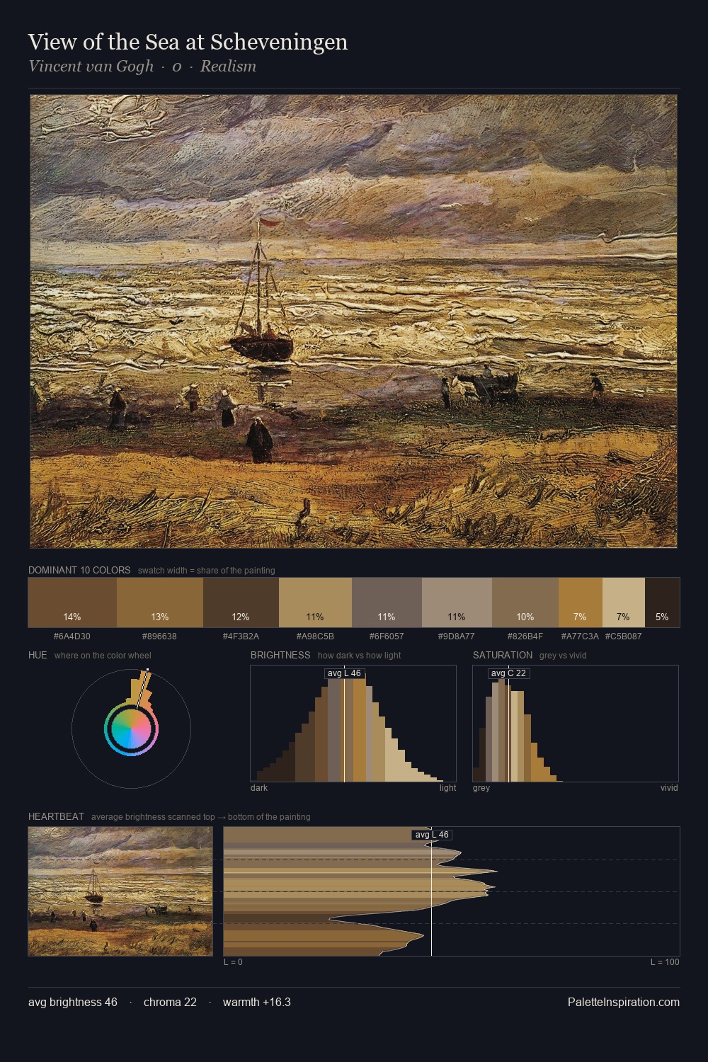
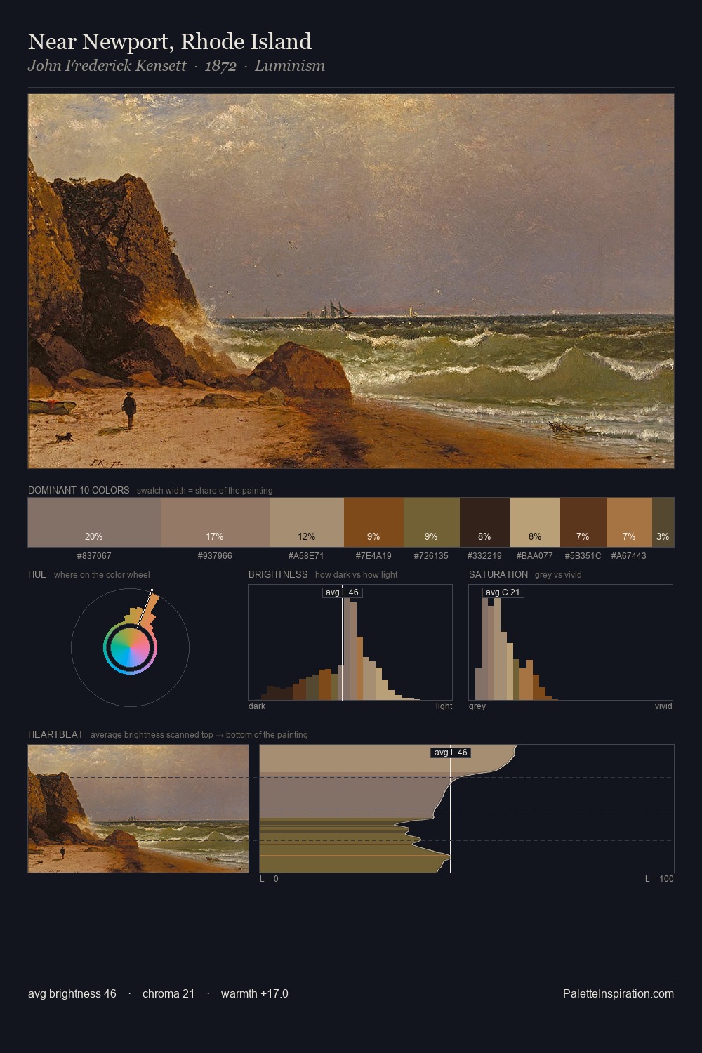
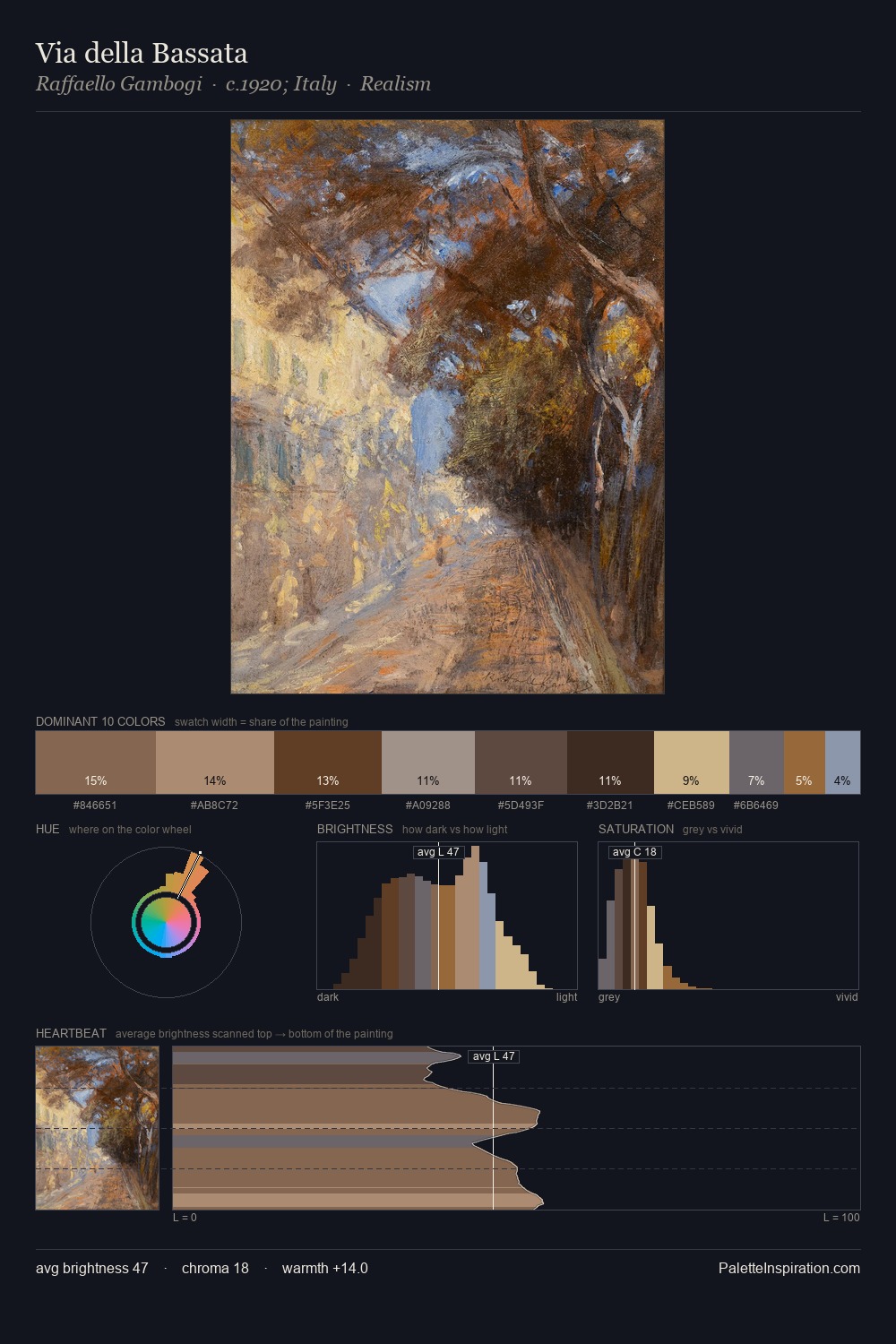
Johan Conrad Greive keeps values measured and balanced, a hallmark of tonal restraint. Heat pervades this palette; warm chromatic identities outweigh cool ones at almost every weight. Saturation is deliberately withheld - the beauty here lies in the near-monochromatic gradations rather than colour difference. At 4.8%, #5F472A carries the palette's sharpest chromatic charge: an accent that earns its place precisely because it is withheld. The palette spans 44 value units: a measured range that delivers coherence over drama. Palette 2 sits within the larger chromatic argument that Johan Conrad Greive's complete body of work advances.
Example use cases
- ceramics & pottery
- boutique hospitality
- menswear
- heritage food brands
- craft & artisan brands
I Love This!
Use This Palette
Copy, export, or download for your project
Copy, export, or download for your project
Copy:
Download:
Share: