Joan Miro Palette 2

Palette Analysis
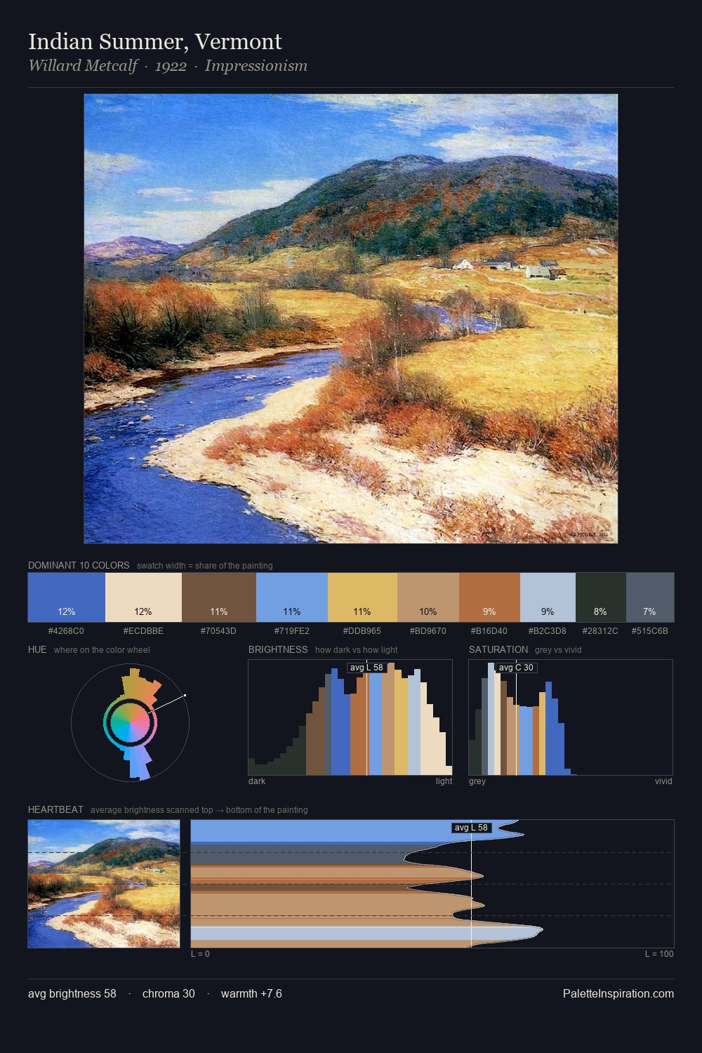
Joan Miro occupies the comfortable middle of the value scale, avoiding both extremes to hold the eye in a sustained middle grey. The palette achieves thermal balance - reds and blues, ochres and greens, each holding the other in check. Mid-saturation across the board: the palette has colour character without chromatic excess. The highest-chroma note - #452520 - appears at just 4.8%, deployed as a precision accent against the quieter ground. The value range spans 59 units across the palette, providing the full gamut from deep shadow to near-white and ensuring clear tonal hierarchy. Together these qualities point to the open-air Impressionist method: recording light rather than local colour. Joan Miro's palette 2 carries its own internal logic while remaining in conversation with the artist's broader colour intelligence.
Example use cases
- publishing
- corporate identity
- consumer apps
- hospitality
- design agencies
I Love This!
Copy, export, or download for your project