Joan Blaeu Master Palette

Palette Analysis
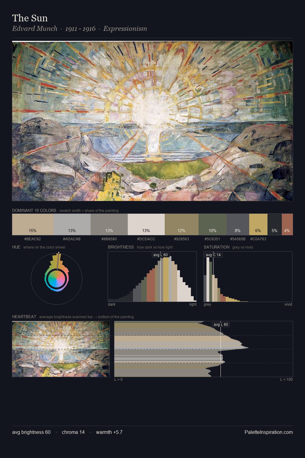
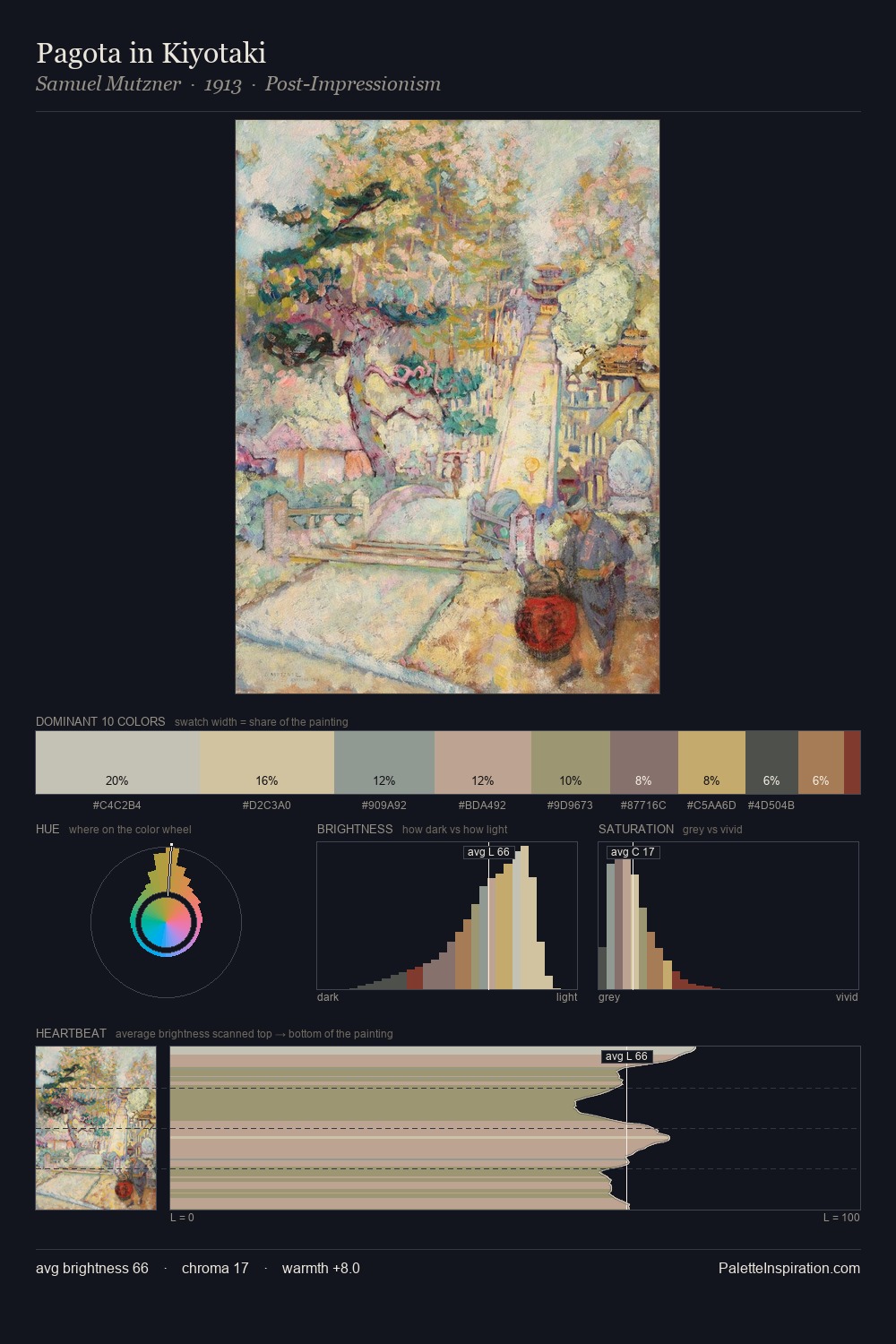
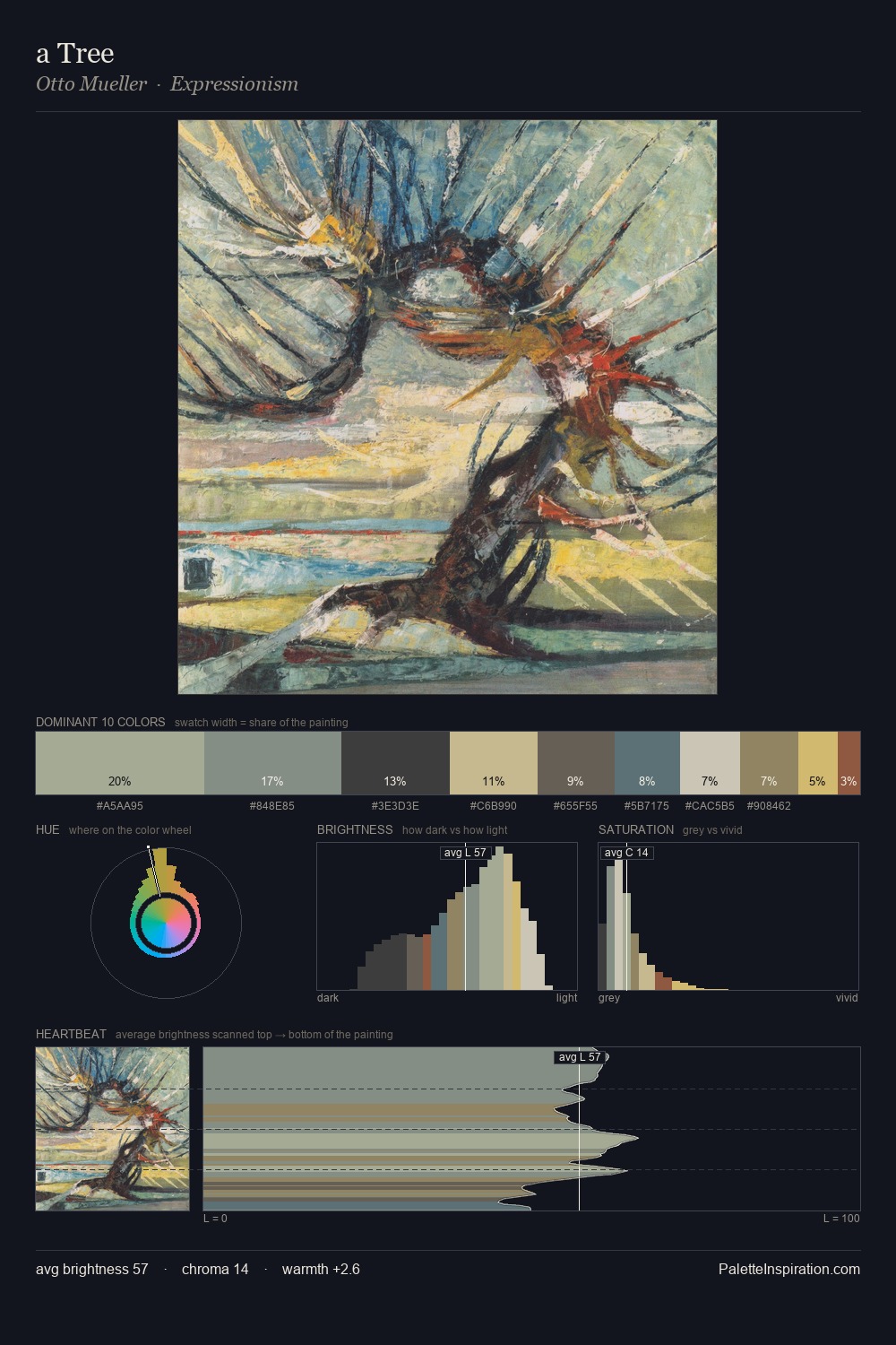
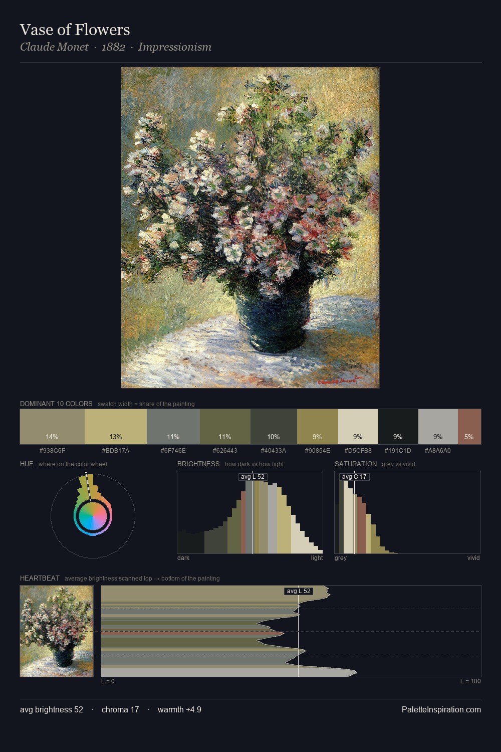
Joan Blaeu distributes its values across the middle register, creating harmony without high contrast. Joan Blaeu tilts toward cool - blues and silver-greys carry the structural weight. Chroma is kept low across all colours, producing the soft, enveloping quality that characterises tonal painting. At 6.7%, #7B473D carries the palette's sharpest chromatic charge: an accent that earns its place precisely because it is withheld. The palette spans 44 value units: a measured range that delivers coherence over drama. The mid-to-high key, cool bias, and moderate chroma point to outdoor observation - sky and diffused daylight as the dominant light source. Joan Blaeu arrived at this balance through long practice; the palette carries the weight of that experience.
Example use cases
- nonprofit identity
- public libraries
- historical sites
- literary journals
- archival print
I Love This!
Copy, export, or download for your project