Joachim Patinir Palette 6

Palette Analysis
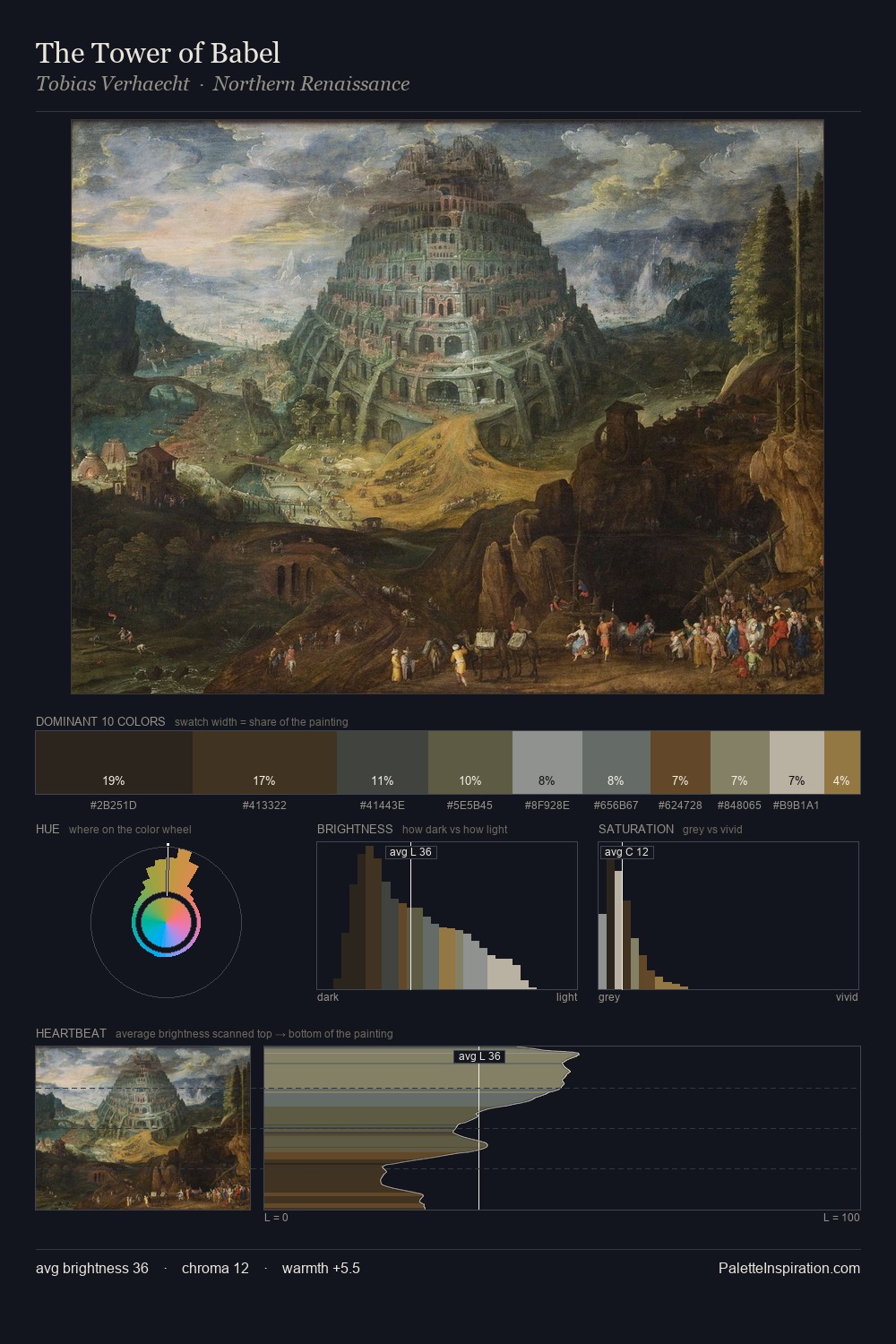
The value structure of Joachim Patinir is mid-key: quiet, controlled, and cohesive. A distinctly cool atmosphere runs through this palette: sky, water, and mist given colour form. Every colour is desaturated; the palette proceeds through near-neutrals and gently-coloured greys. #5E4E30 delivers the chromatic peak at only 10.0% - a small shot of colour with outsized visual impact. A value spread of 57 units gives the palette both depth and air - shadows are genuinely dark, lights genuinely light. The mid-to-high key, cool bias, and moderate chroma point to outdoor observation - sky and diffused daylight as the dominant light source. In the context of Joachim Patinir's full range of palettes, group 6 represents one movement in an ongoing chromatic dialogue.
Example use cases
- theater design
- jewelry brands
- tobacco-adjacent retail
- event branding
- film & entertainment
I Love This!
Copy, export, or download for your project