Joachim Patinir Palette 4

Palette Analysis
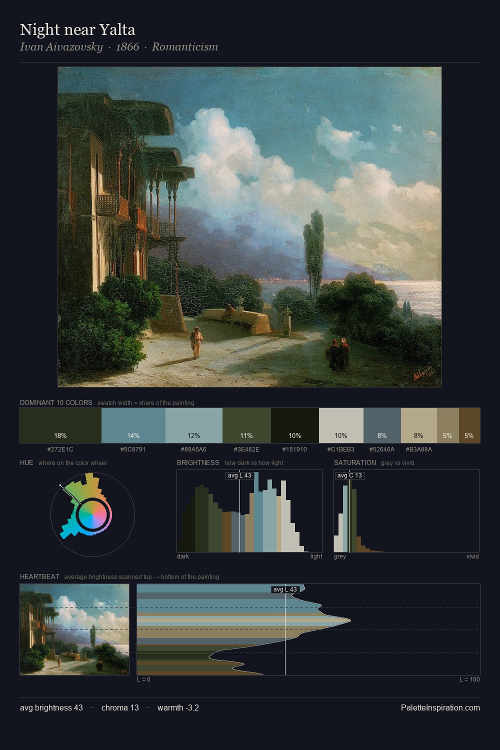
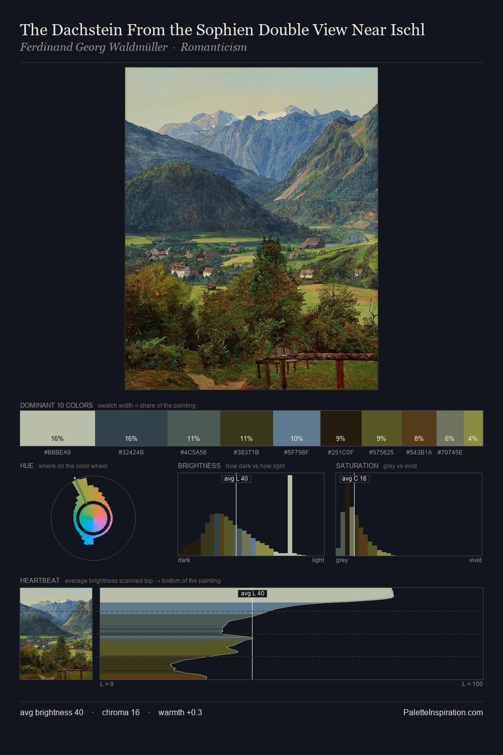
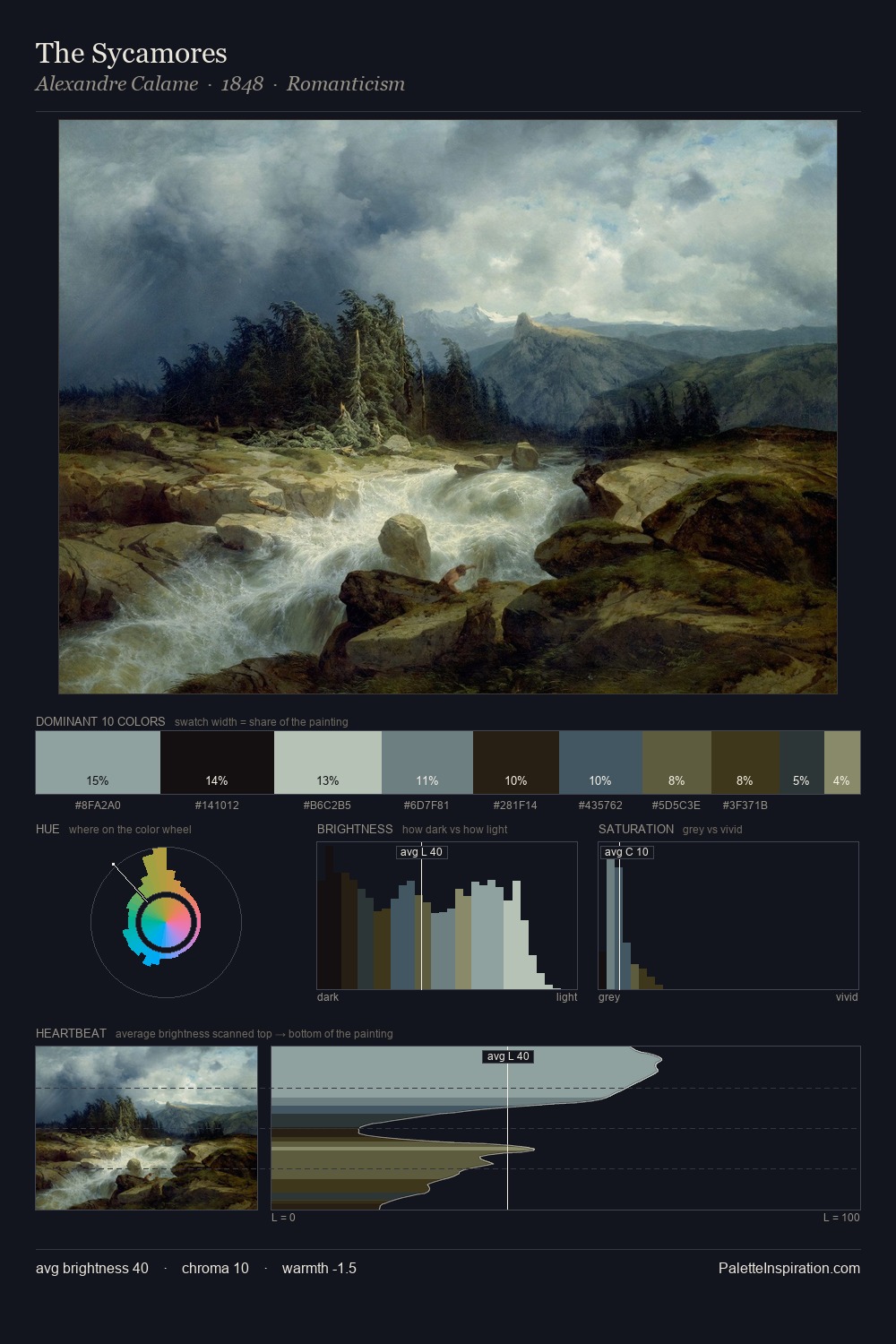
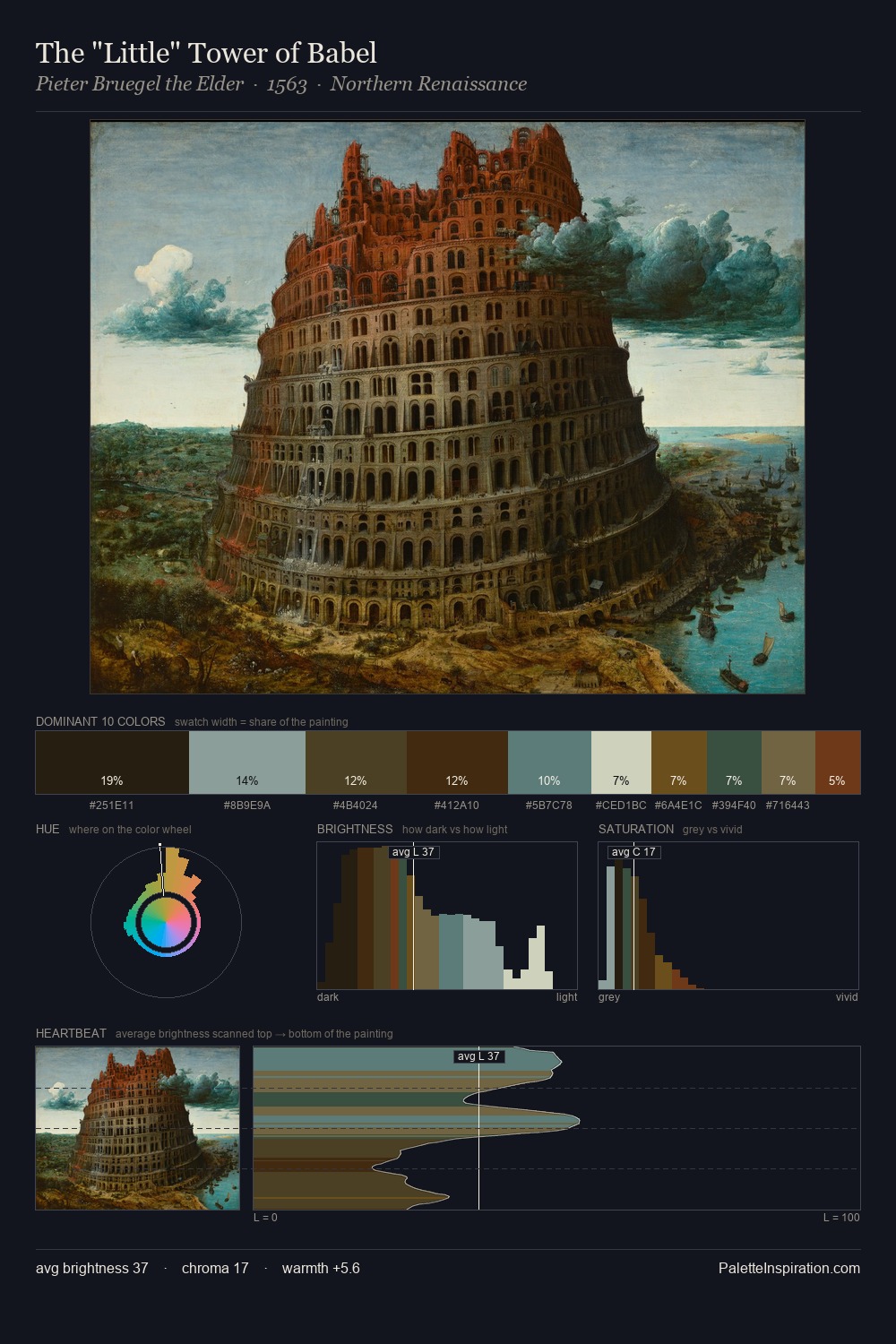
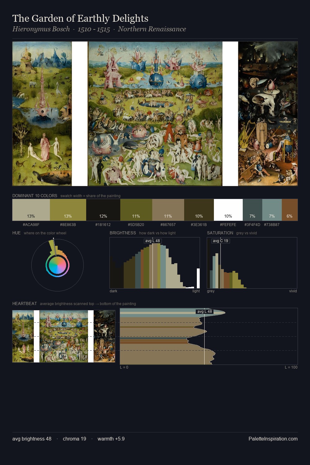
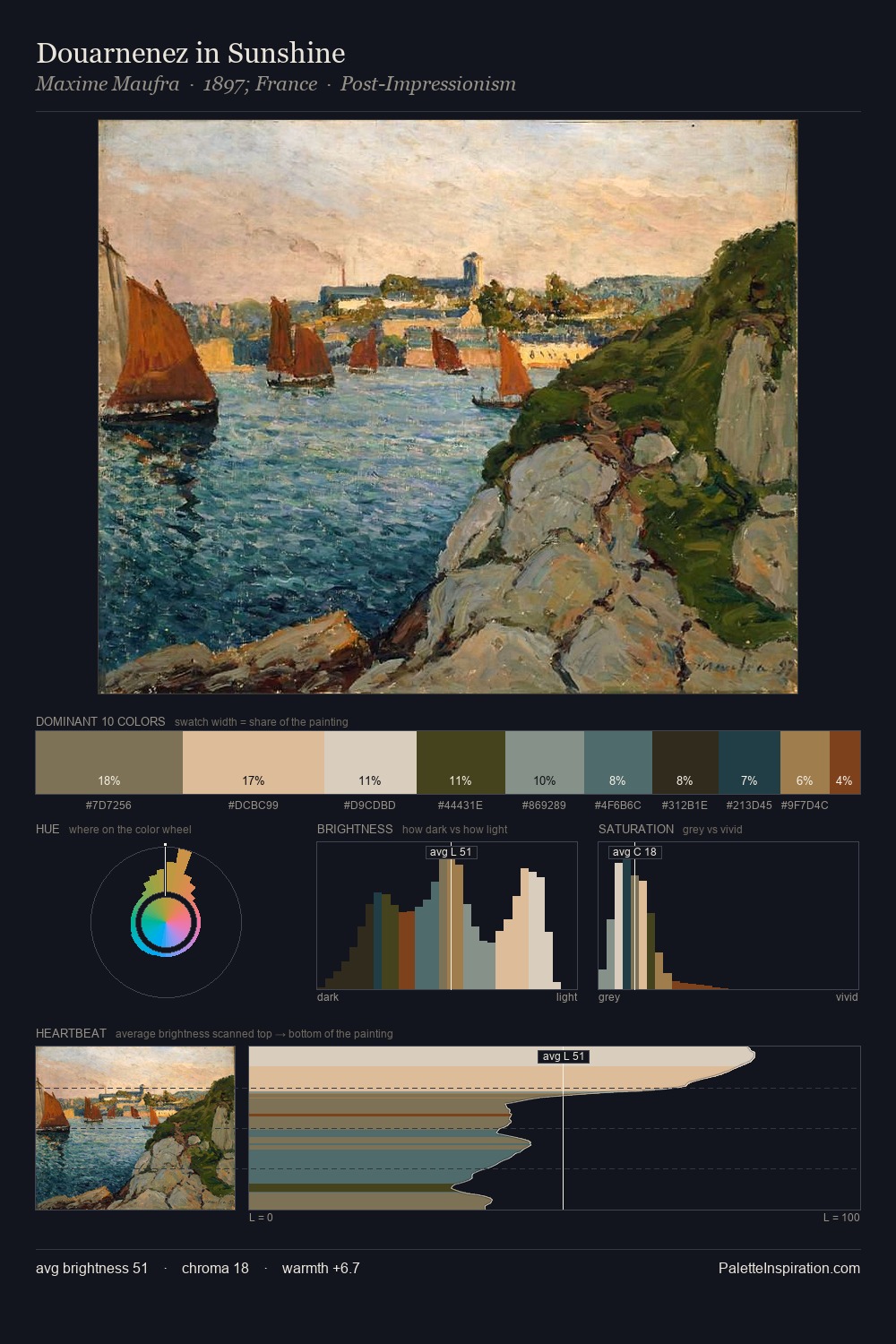
Mid-key values give Joachim Patinir its characteristic quietness - nothing blazes, nothing disappears. Joachim Patinir tilts toward cool - blues and silver-greys carry the structural weight. All colours lean toward grey, building depth through value rather than colour punch. At 7.6%, #4E5C2C carries the palette's sharpest chromatic charge: an accent that earns its place precisely because it is withheld. A value spread of 57 units gives the palette both depth and air - shadows are genuinely dark, lights genuinely light. The palette has the character of outdoor light: cool, mid-bright, with colour rendered faithfully rather than expressively. Joachim Patinir's palette 4 carries its own internal logic while remaining in conversation with the artist's broader colour intelligence.
Example use cases
- publishing
- corporate identity
- consumer apps
- hospitality
- design agencies
I Love This!
Copy, export, or download for your project