Joachim Govertsz. Camphuysen Palette 4

Palette Analysis
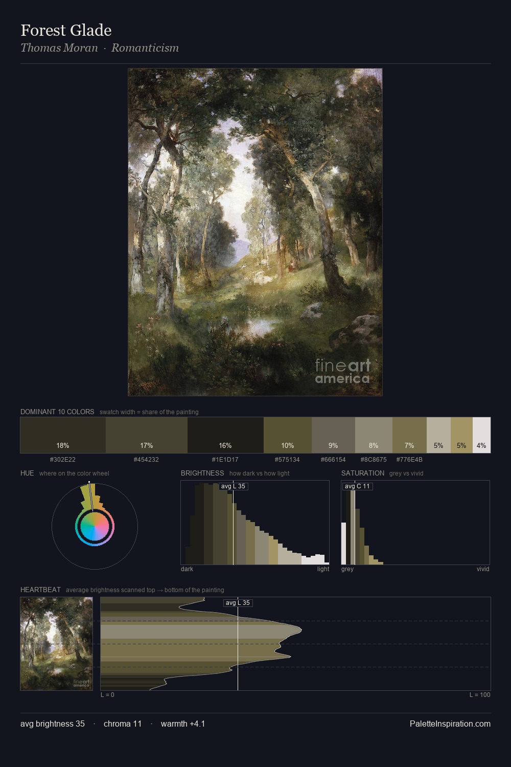
Joachim Govertsz. Camphuysen distributes its values across the middle register, creating harmony without high contrast. The palette achieves thermal balance - reds and blues, ochres and greens, each holding the other in check. Chroma is kept low across all colours, producing the soft, enveloping quality that characterises tonal painting. #1A1612 at 32.1% of the palette: an overwhelming presence that pulls all other colours into its gravitational field. #938A61 delivers the chromatic peak at only 3.4% - a small shot of colour with outsized visual impact. At 69 units of value range, the palette has the tonal breadth to sustain complex spatial readings. In the context of Joachim Govertsz. Camphuysen's full range of palettes, group 4 represents one movement in an ongoing chromatic dialogue.
Example use cases
- theater design
- jewelry brands
- tobacco-adjacent retail
- event branding
- film & entertainment
I Love This!
Copy, export, or download for your project