Jeptha Homer Wade Master Palette

Palette Analysis
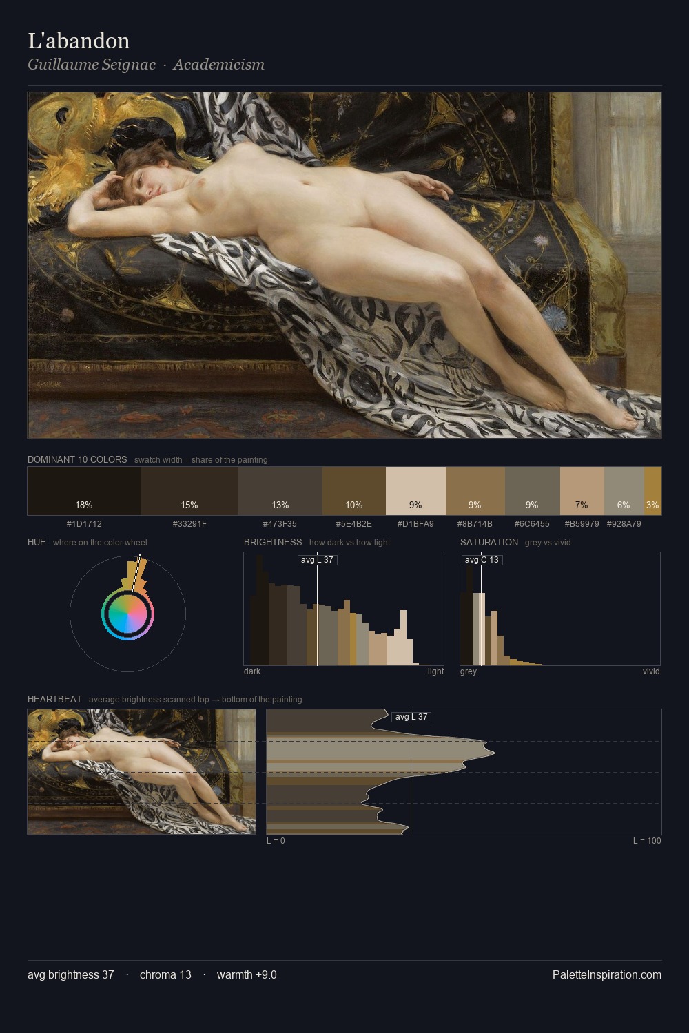
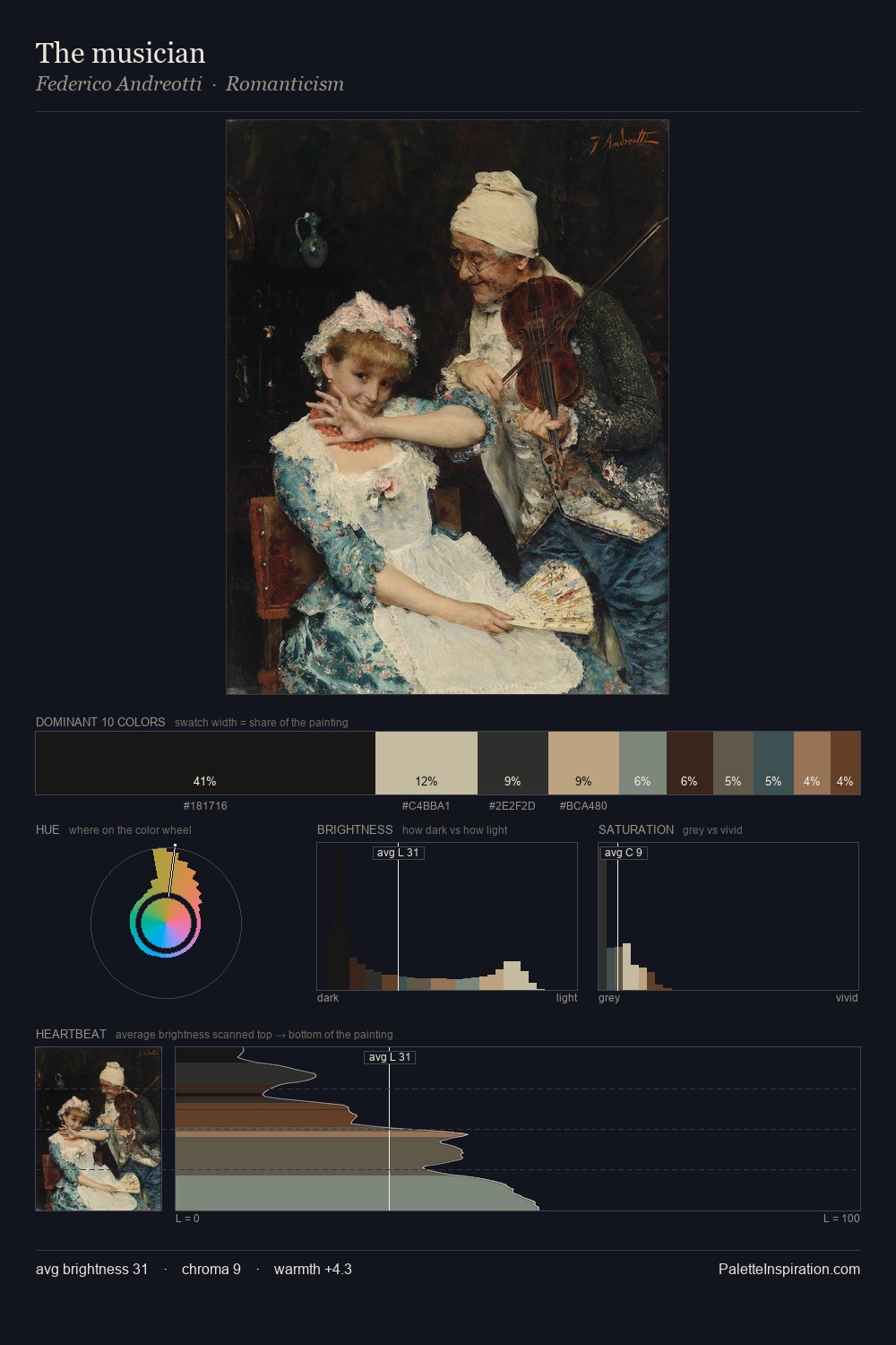
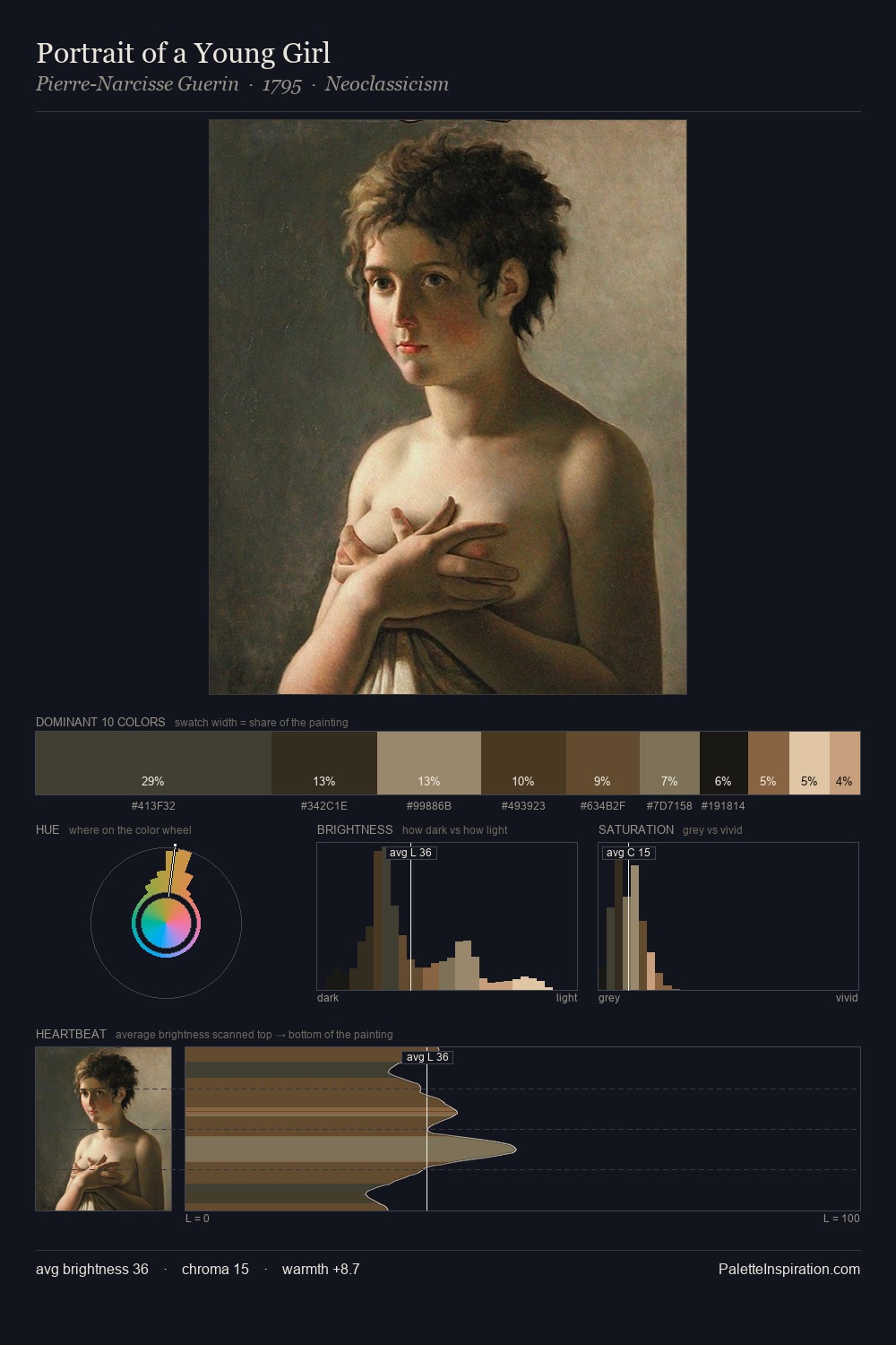
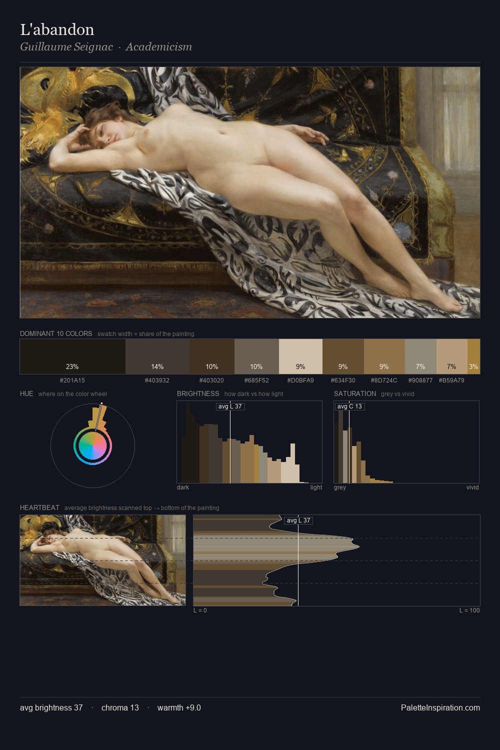
Darkness anchors Jeptha Homer Wade; light is rationed, creating dramatic contrast rather than open air. Warmth dominates - the palette of Jeptha Homer Wade leans heavily on the yellow-orange-red arc of the colour wheel. Muted throughout, the palette achieves its effects through value and temperature rather than chromatic force. #141210 at 27.0% of the palette: an overwhelming presence that pulls all other colours into its gravitational field. #392A19 functions as the palette's exclamation mark: highest chroma, lowest percentage (12.1%). From deepest dark to palest light, the palette traverses 63 units of the value scale - a span that creates natural depth. This tonal restraint is characteristic of the Jeptha Homer Wade approach: colour serves light, not the reverse. These proportions encode Jeptha Homer Wade's instinctive sense of how much of each quality the eye can hold.
Example use cases
- theater design
- jewelry brands
- tobacco-adjacent retail
- event branding
- film & entertainment
I Love This!
Copy, export, or download for your project