Jean-François Portaels Palette 3
Soft Ecru
Soft Low-contrast, gentle chroma - mid-key values and low saturation, approachable and calm.
Ecru Unbleached linen - warm mid-neutral, slightly grayed, raw and natural.
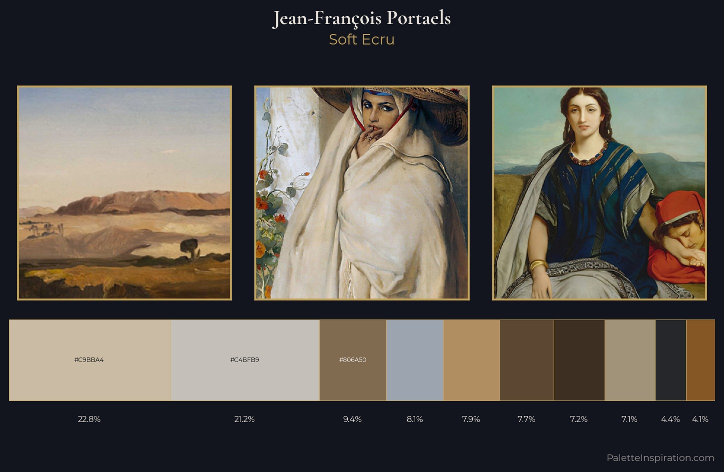
Palette Analysis
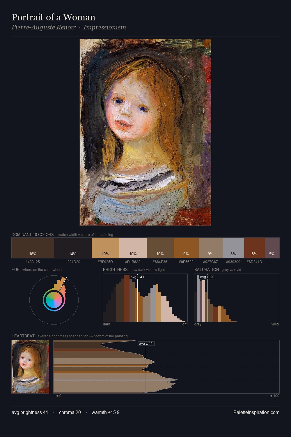
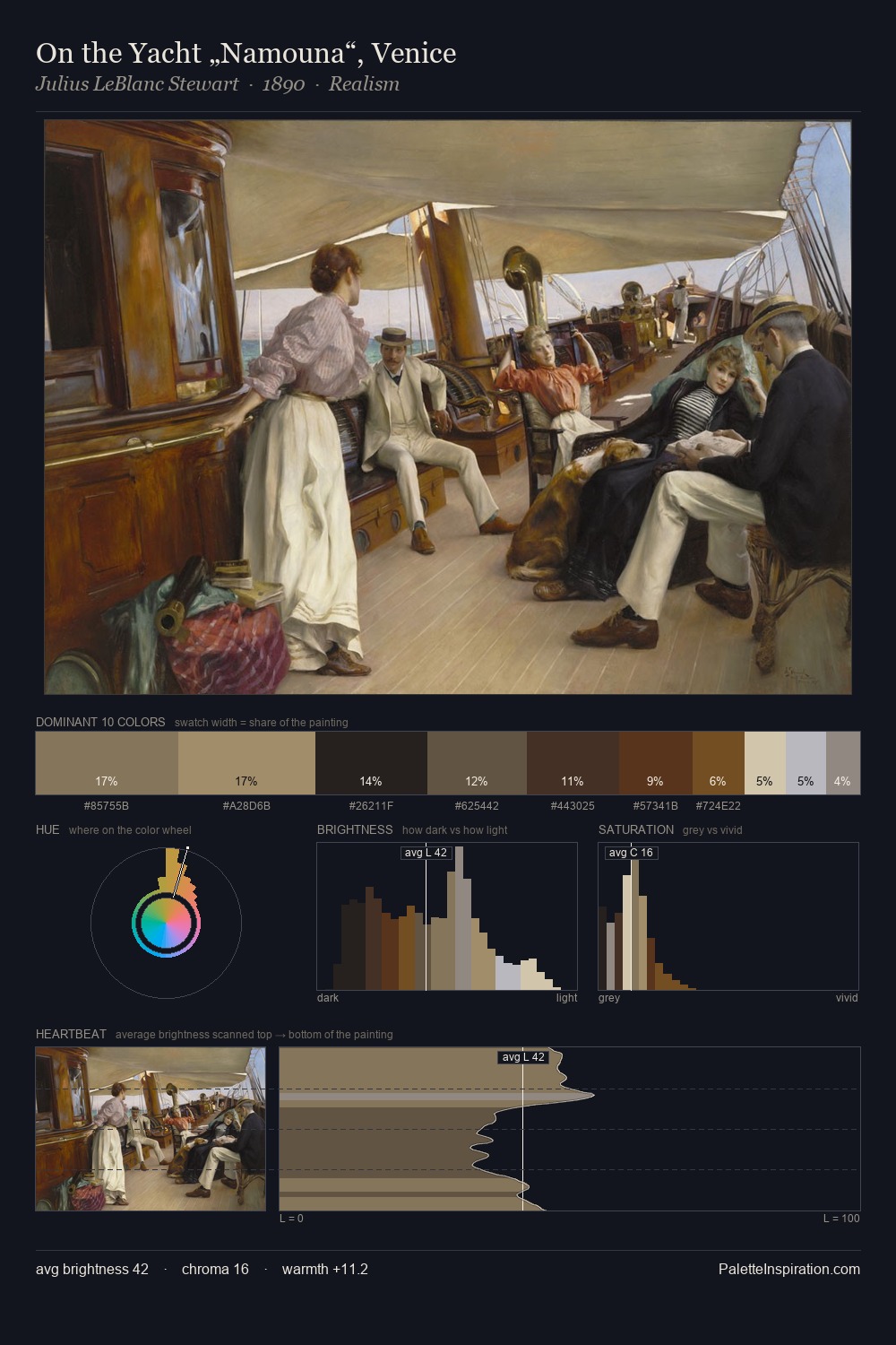
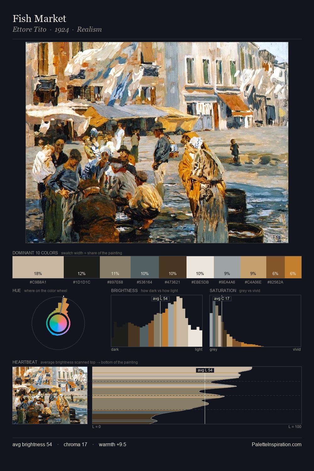
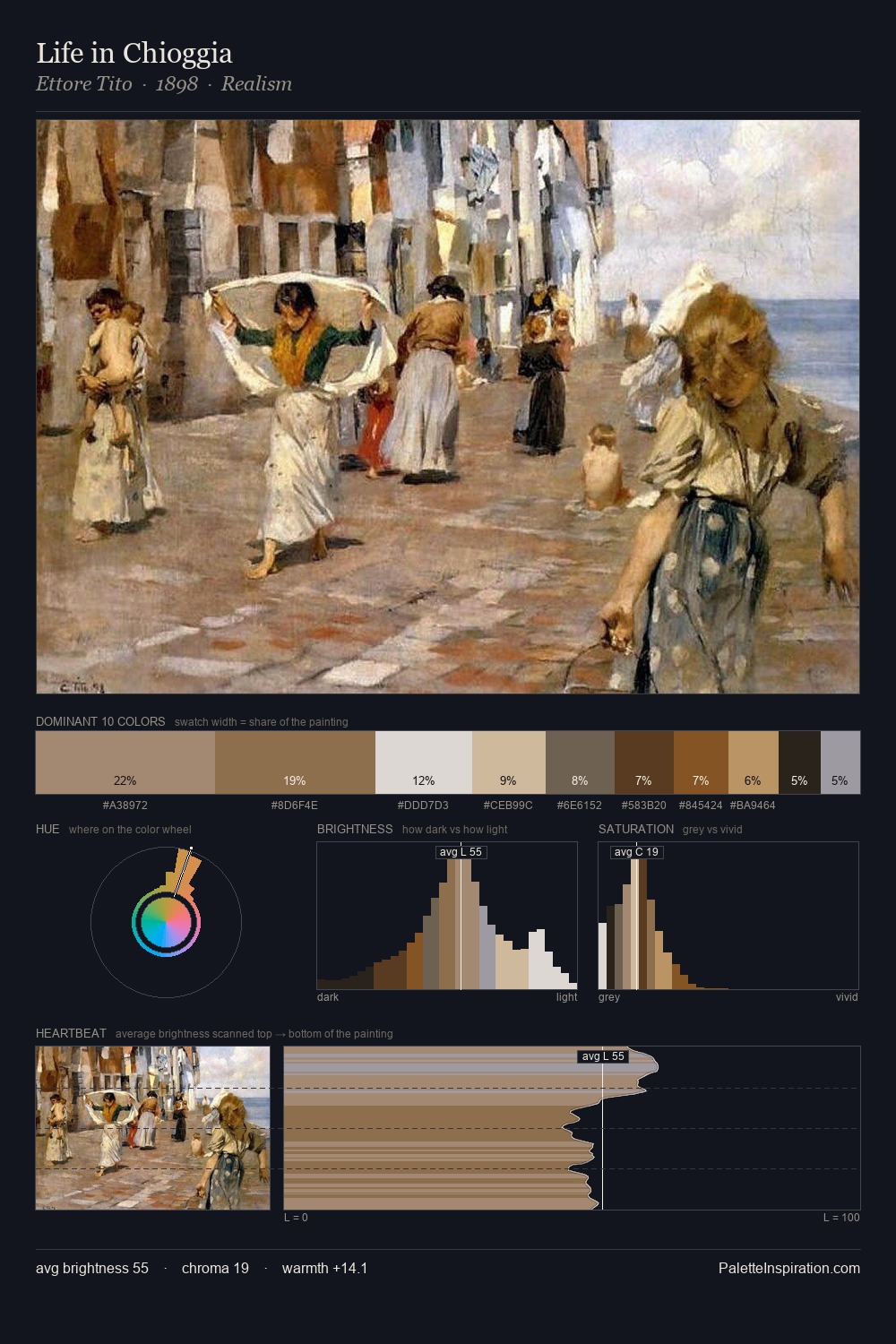
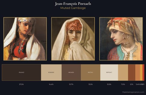
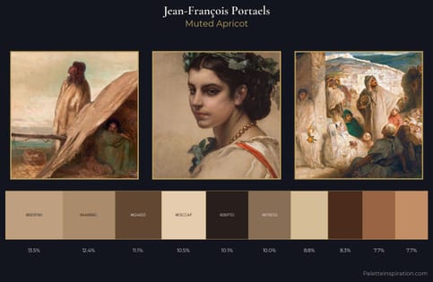
Values in Jean-François Portaels tilt decisively toward white, giving the palette its luminous character. Warmth dominates - the palette of Jean-François Portaels leans heavily on the yellow-orange-red arc of the colour wheel. Chroma is kept low across all colours, producing the soft, enveloping quality that characterises tonal painting. The saturated accent, #3D2F21, registers at 7.2% - sparse enough to feel like a deliberate surprise. At 54 units across the value scale, the palette keeps contrast readable without letting it dominate. In the context of Jean-François Portaels's full range of palettes, group 3 represents one movement in an ongoing chromatic dialogue.
Example use cases
- exhibition design
- foundation branding
- estate management
- art education
- museums & galleries
I Love This!
Use This Palette
Copy, export, or download for your project
Copy, export, or download for your project
Copy:
Download:
Share: