Jean-Baptiste Greuze Palette 7

Palette Analysis
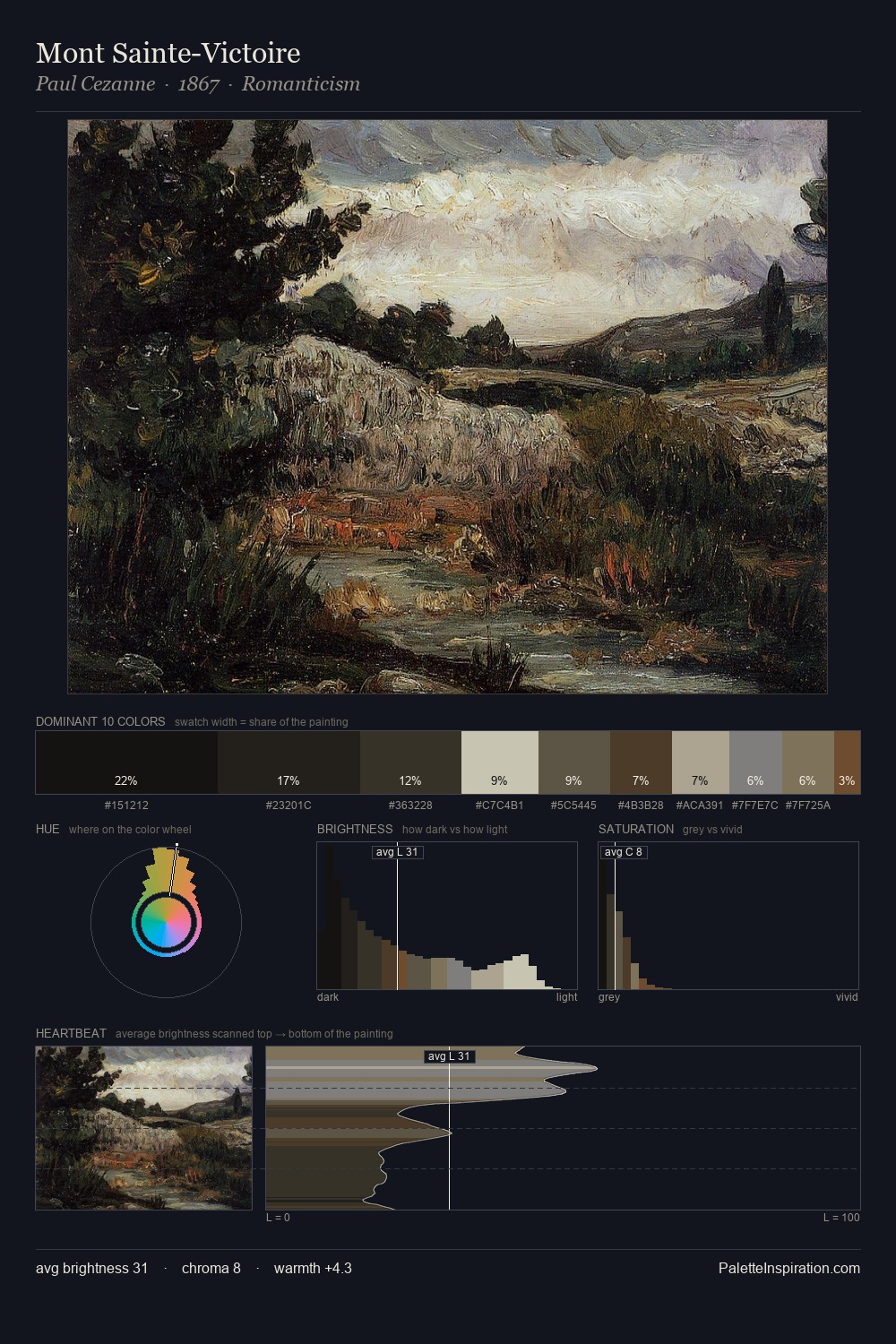
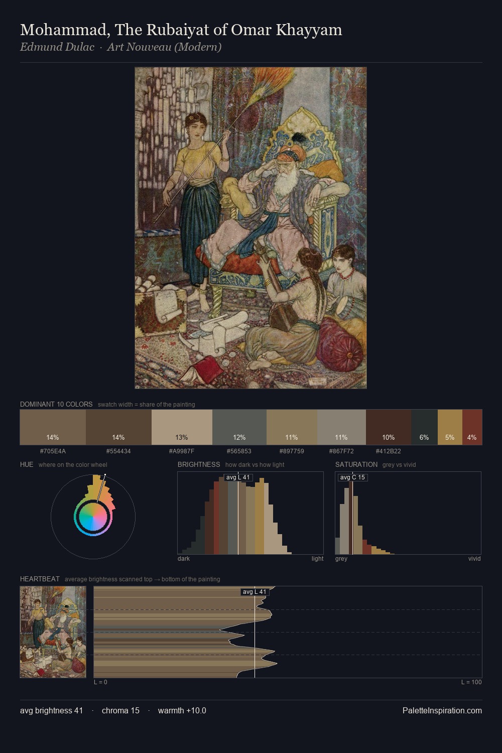
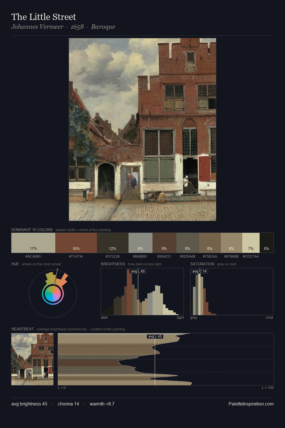
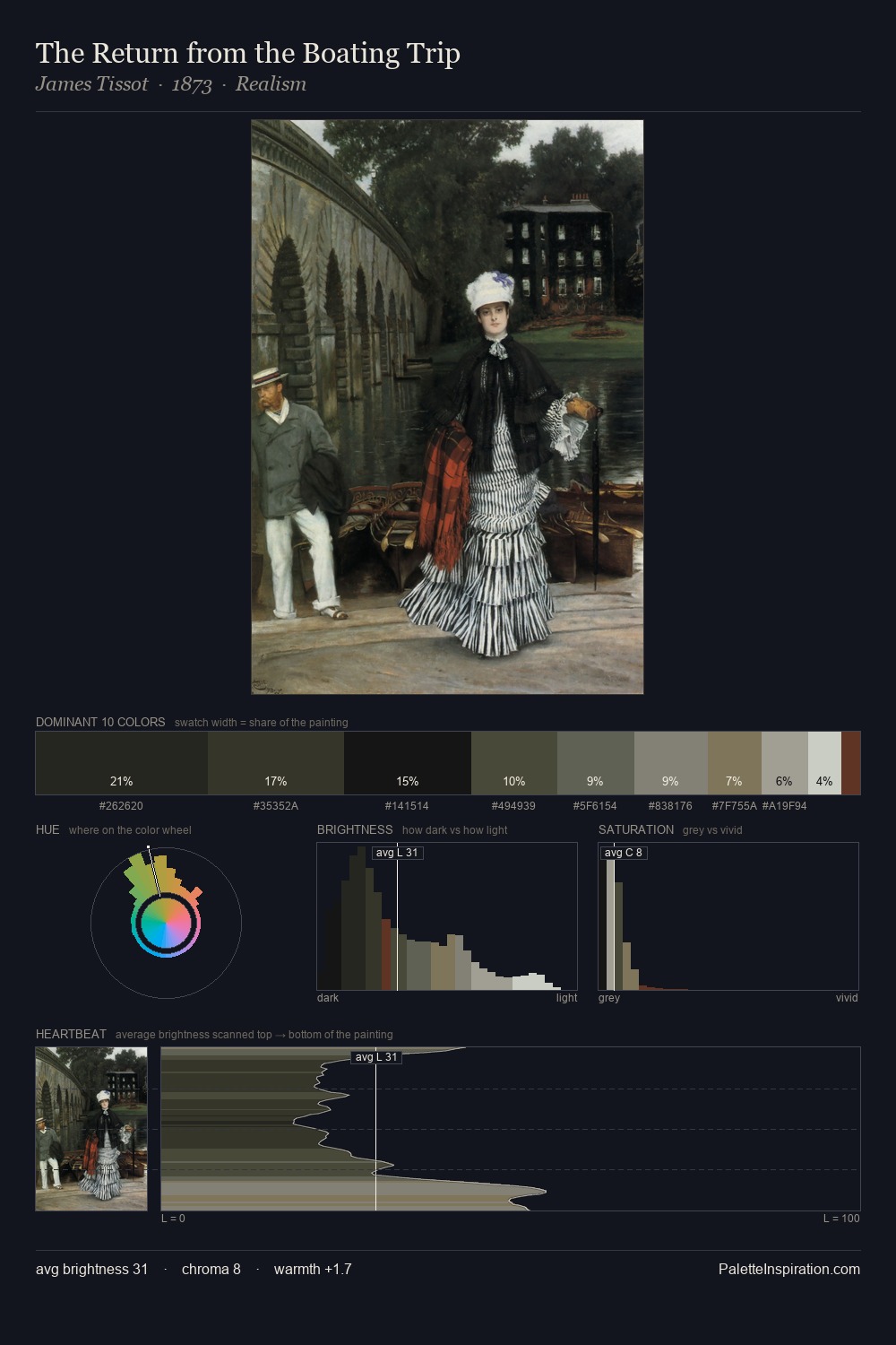
Values in Jean-Baptiste Greuze rest in the mid-range - neither dramatically lit nor steeped in shadow. Temperature is cool-dominant, with blue and green families claiming the largest areas. The absence of saturated colour is itself an expressive choice: this is a palette of restraint and atmosphere. The highest-chroma note - #836E52 - appears at just 5.9%, deployed as a precision accent against the quieter ground. The value range of 51 units sits in the comfortable middle: enough depth, enough light, neither extreme. The mid-to-high key, cool bias, and moderate chroma point to outdoor observation - sky and diffused daylight as the dominant light source. Palette 7 sits within the larger chromatic argument that Jean-Baptiste Greuze's complete body of work advances.
Example use cases
- theater design
- jewelry brands
- tobacco-adjacent retail
- event branding
- film & entertainment
I Love This!
Copy, export, or download for your project