January Suchodolski Palette 1
Muted Tawny
Muted Deliberately desaturated - chroma pulled toward gray, the restraint of tonal painting.
Tawny Warm orange-brown - a traditional term for the color of tanned leather or lion fur.

Palette Analysis
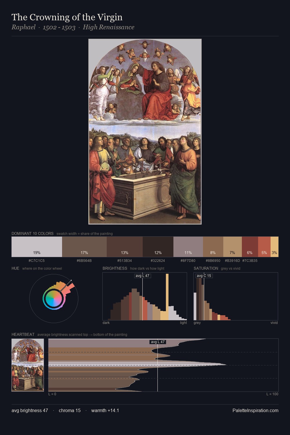
Values in January Suchodolski rest in the mid-range - neither dramatically lit nor steeped in shadow. Warmth dominates - the palette of January Suchodolski leans heavily on the yellow-orange-red arc of the colour wheel. Saturation is deliberately withheld - the beauty here lies in the near-monochromatic gradations rather than colour difference. The most saturated colour, #AE4B37, is reserved to 1.8% of the surface, where it acts as a focal punctuation. 61 units of value range underpin the palette's structural clarity: the eye always knows where light falls. Palette 1 sits within the larger chromatic argument that January Suchodolski's complete body of work advances.
Example use cases
- exhibition design
- foundation branding
- estate management
- art education
- museums & galleries
I Love This!
Use This Palette
Copy, export, or download for your project
Copy, export, or download for your project
Copy:
Download:
Share: