Janos Tornyai Palette 1

Palette Analysis
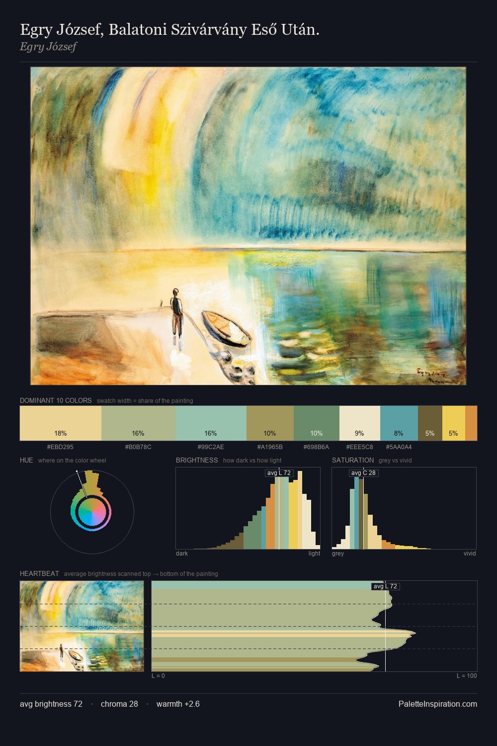
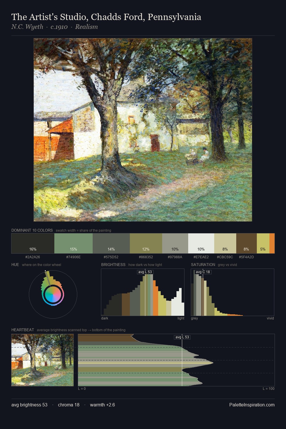
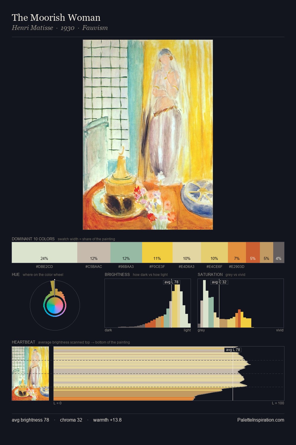
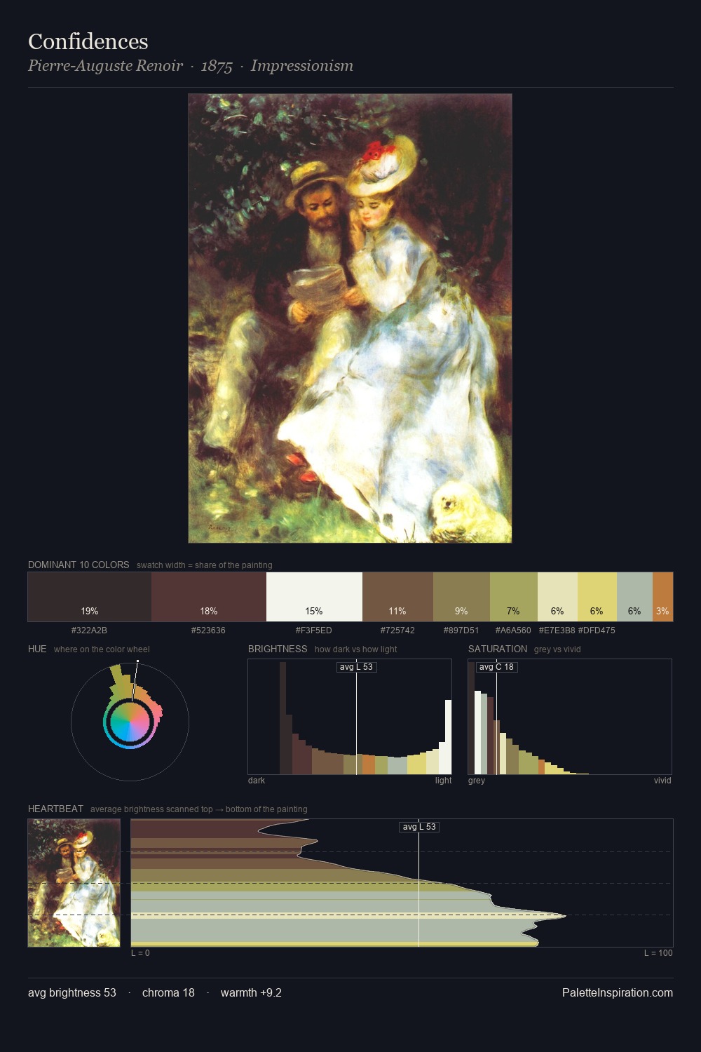
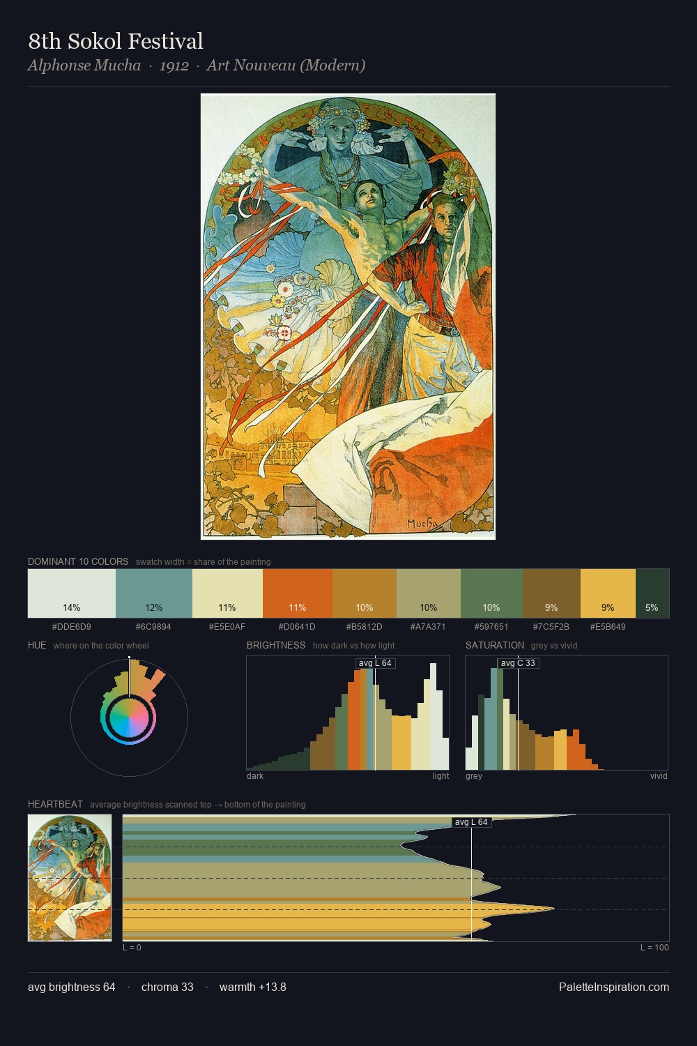
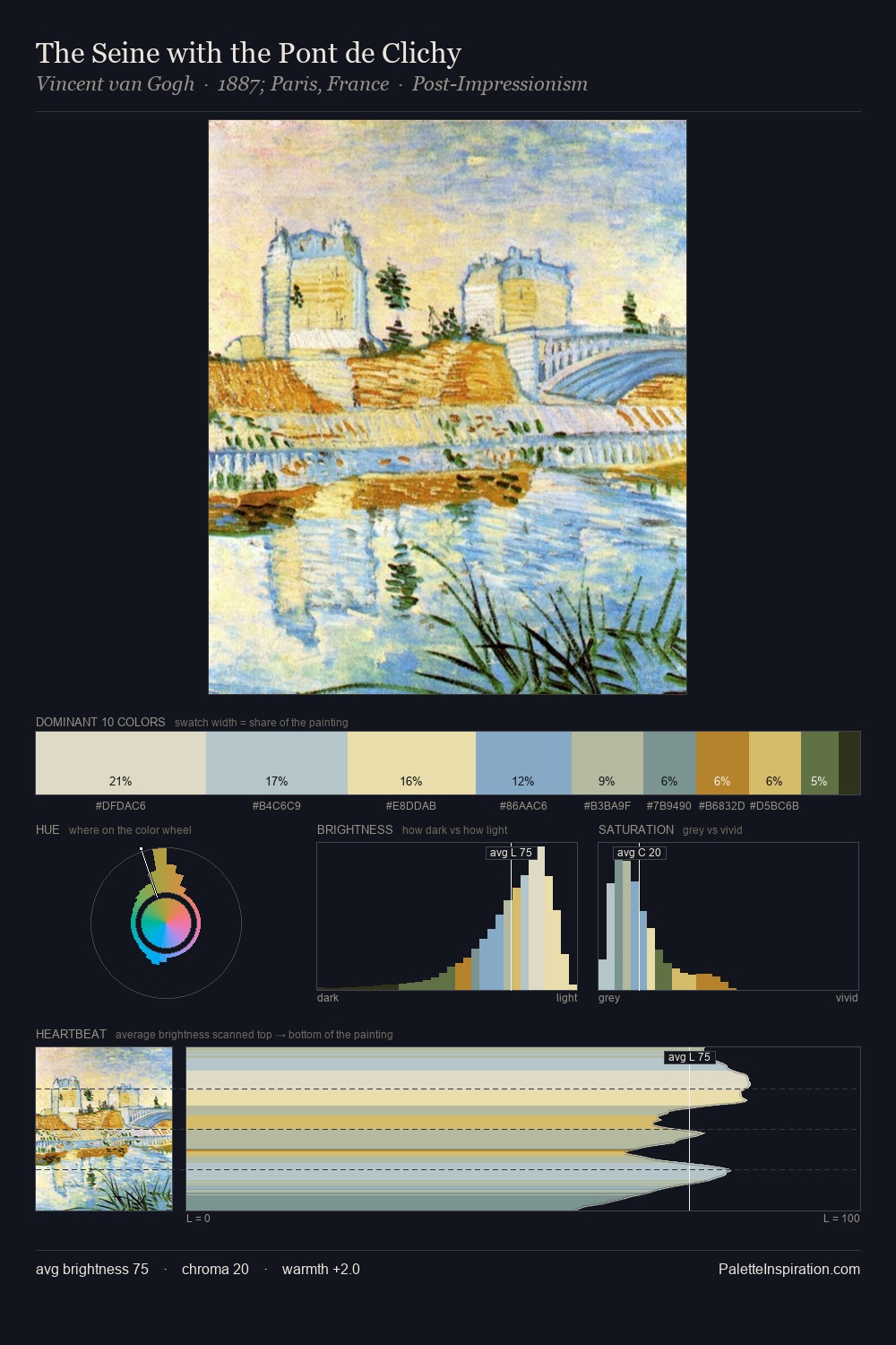
Janos Tornyai is strongly light-biased - shadow is suggested rather than declared. Janos Tornyai tilts toward cool - blues and silver-greys carry the structural weight. Every colour is desaturated; the palette proceeds through near-neutrals and gently-coloured greys. At 54.6%, #FAFCFD functions less as a colour accent and more as a complete atmospheric environment. At 1.1%, #BE741E carries the palette's sharpest chromatic charge: an accent that earns its place precisely because it is withheld. Value range is moderate at 45 units - enough contrast for legibility, not so much as to fragment the tonal unity. The mid-to-high key, cool bias, and moderate chroma point to outdoor observation - sky and diffused daylight as the dominant light source. In the context of Janos Tornyai's full range of palettes, group 1 represents one movement in an ongoing chromatic dialogue.
Example use cases
- garden centers
- natural beauty
- park & rec design
- sustainable fashion
- sustainability
I Love This!
Copy, export, or download for your project