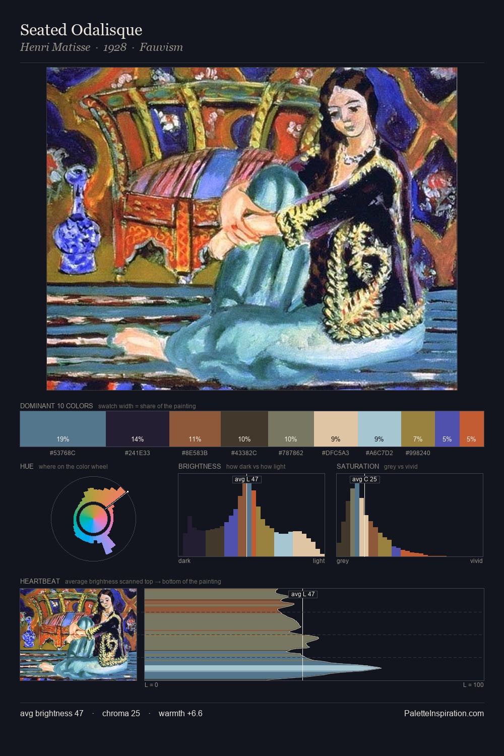
Jankel Adler Master Palette
Shadowed Gamboge
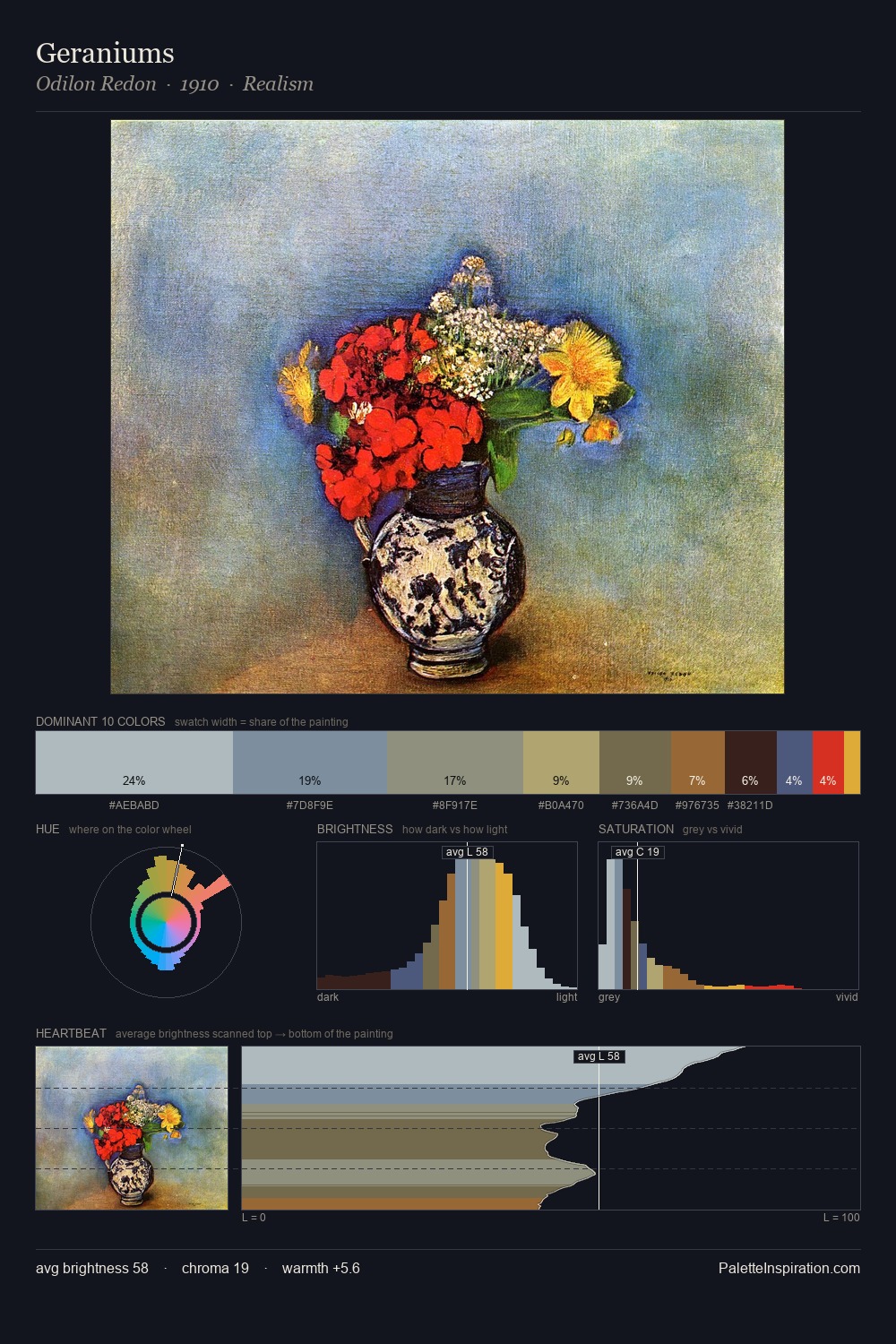
Shadowed Low-key - values weighted toward shadow, the palette of dim interiors and overcast skies.
Gamboge Deep golden yellow - a traditional warm pigment, rich amber-gold.

Palette Analysis
Jankel Adler distributes its values across the middle register, creating harmony without high contrast. Jankel Adler keeps warm and cool in parity, a balance that lends the work a perceptual shimmer. Chroma is held at a comfortable level - distinct colours, but no single hue is allowed to overwhelm. The highest-chroma note - #482C1C - appears at just 10.0%, deployed as a precision accent against the quieter ground. 44 units of value spread create a palette that is varied but unified - contrast in the service of harmony. The palette reads as an Impressionist one - light-biased, chromatically direct, and built on temperature contrast rather than value opposition. This is the light Jankel Adler preferred, made measurable.
Example use cases
- theater design
- jewelry brands
- tobacco-adjacent retail
- event branding
- film & entertainment
I Love This!
Use This Palette
Copy, export, or download for your project
Copy, export, or download for your project
Copy:
Download:
Share: