Jan Weenix Palette 3

Palette Analysis
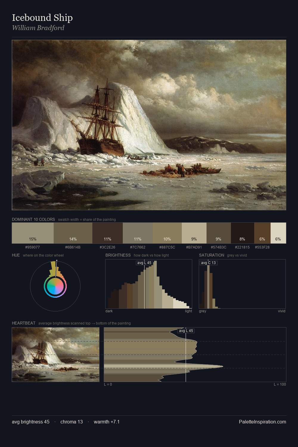
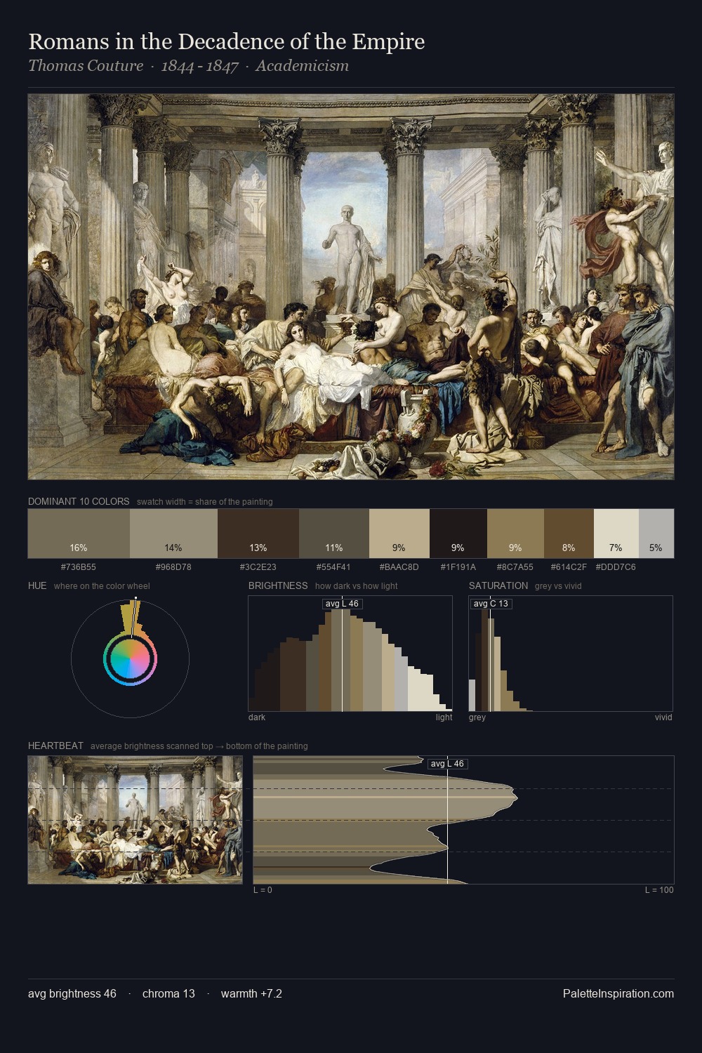
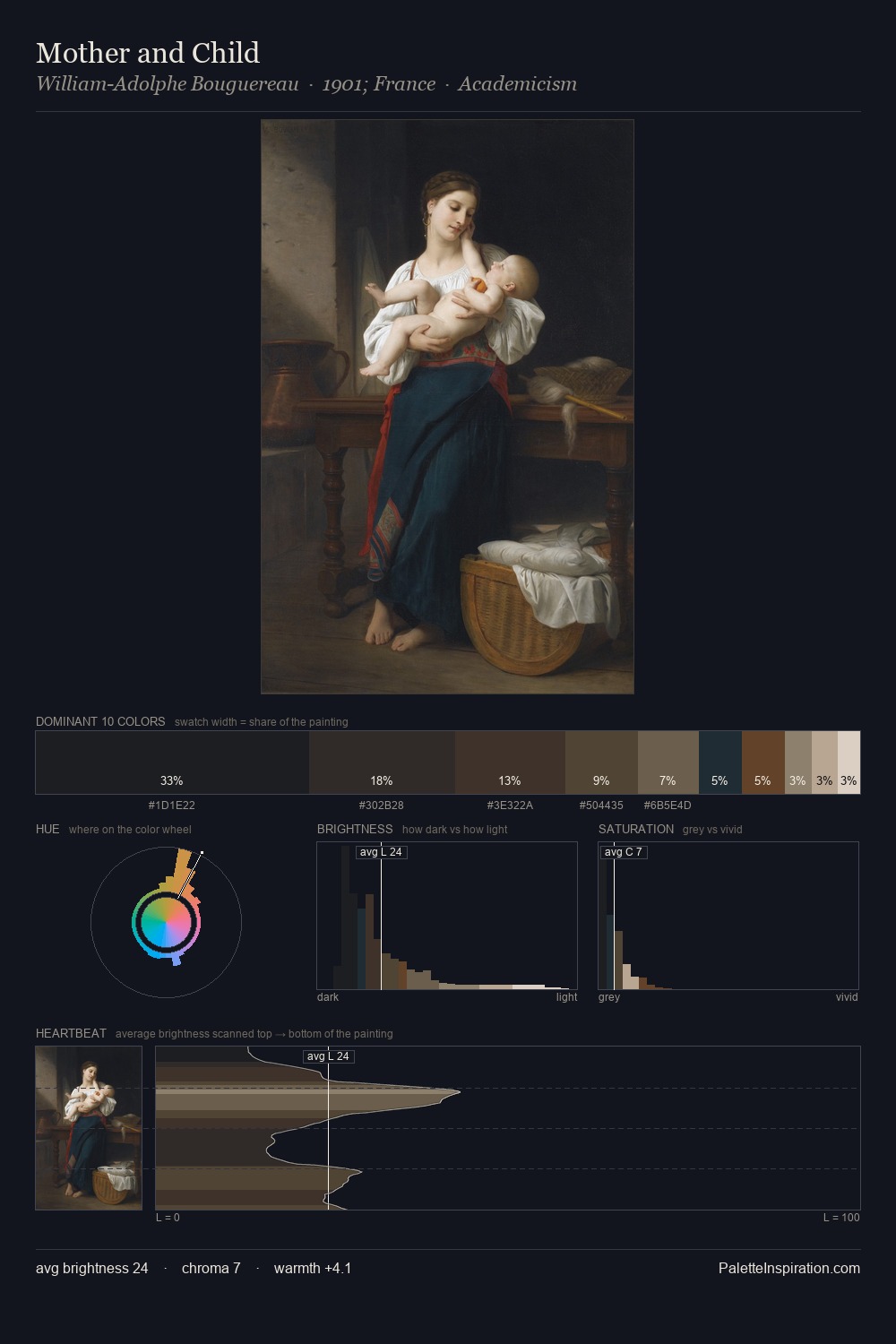
Mid-key values give Jan Weenix its characteristic quietness - nothing blazes, nothing disappears. A distinctly cool atmosphere runs through this palette: sky, water, and mist given colour form. Every colour is desaturated; the palette proceeds through near-neutrals and gently-coloured greys. A single dominant - #DDD9C7 at 30.8% - sets the character of the whole composition. The saturated accent, #593A20, registers at 2.1% - sparse enough to feel like a deliberate surprise. The value range spans 65 units across the palette, providing the full gamut from deep shadow to near-white and ensuring clear tonal hierarchy. The mid-to-high key, cool bias, and moderate chroma point to outdoor observation - sky and diffused daylight as the dominant light source. Jan Weenix's palette 3 carries its own internal logic while remaining in conversation with the artist's broader colour intelligence.
Example use cases
- archival print
- university identity
- rare books
- cultural institutions
- nonprofit identity
I Love This!
Copy, export, or download for your project