Jan van den Hoecke Palette 1
Muted Caramel
Muted Deliberately desaturated - chroma pulled toward gray, the restraint of tonal painting.
Caramel Warm mid-brown - the color of cooked sugar, smooth and amber-toned.

Palette Analysis
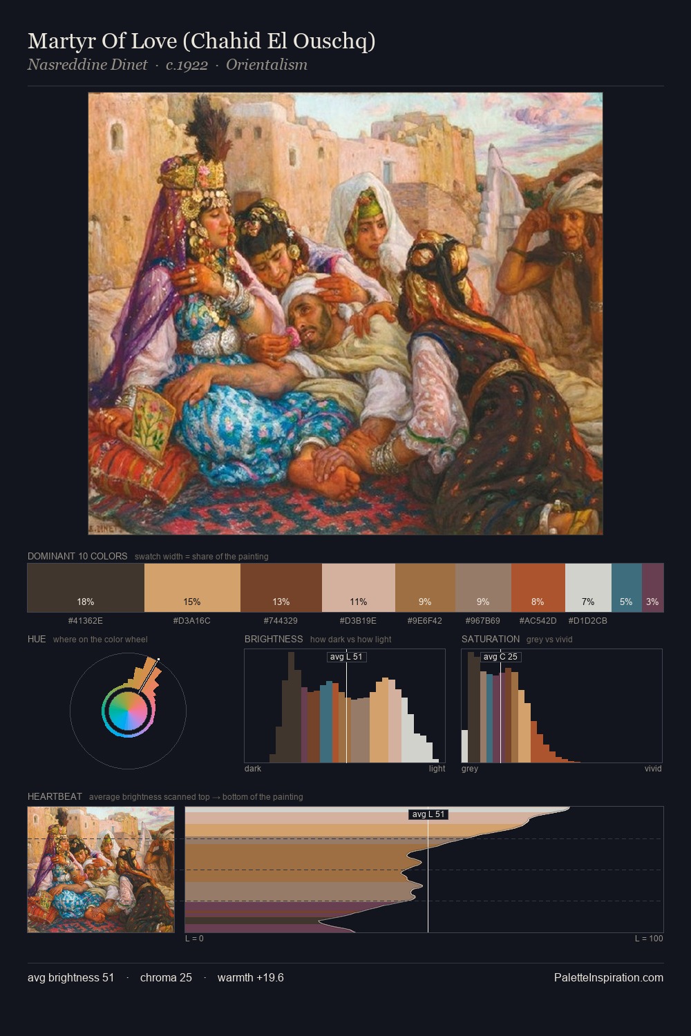
Jan van den Hoecke distributes its values across the middle register, creating harmony without high contrast. Warm hues command this palette; Jan van den Hoecke favours the reds, oranges, and yellows of firelight and earth. Chroma is moderate: colours carry enough saturation to be read as colour, but the palette stops well short of garish intensity. #D19E6A functions as the palette's exclamation mark: highest chroma, lowest percentage (10.7%). At 51 units across the value scale, the palette keeps contrast readable without letting it dominate. This is palette 1 of Jan van den Hoecke's sequence - a single chapter in a chromatic story told across many works.
Example use cases
- theater design
- jewelry brands
- tobacco-adjacent retail
- event branding
- film & entertainment
I Love This!
Use This Palette
Copy, export, or download for your project
Copy, export, or download for your project
Copy:
Download:
Share: