Jan Asselijn Palette 3
Nocturnal Terracotta
Nocturnal Night-register palette - very low values, the world after dark.
Terracotta Fired clay red-orange - the color of unglazed earthenware pottery.

Palette Analysis
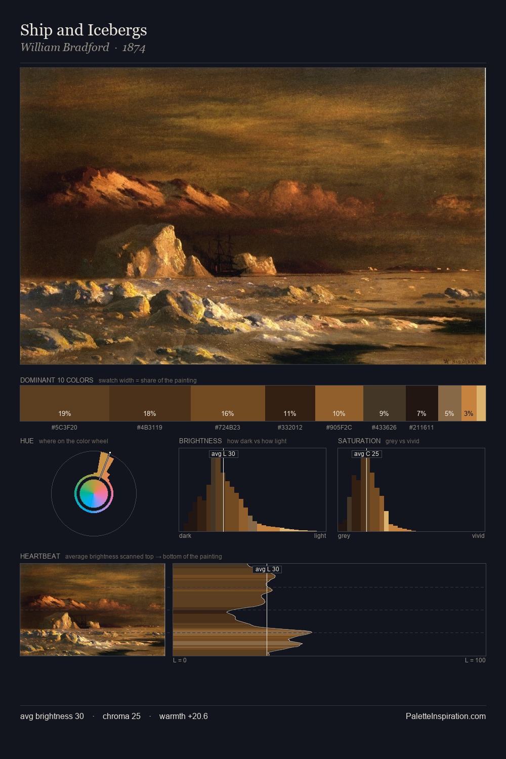
Jan Asselijn distributes its values across the middle register, creating harmony without high contrast. The dominant temperature is warm, with earth tones and fire-hues setting the emotional key. All colours lean toward grey, building depth through value rather than colour punch. The most saturated colour, #AD6F34, is reserved to 6.3% of the surface, where it acts as a focal punctuation. Value range is moderate at 43 units - enough contrast for legibility, not so much as to fragment the tonal unity. Palette 3 sits within the larger chromatic argument that Jan Asselijn's complete body of work advances.
Example use cases
- theater design
- jewelry brands
- tobacco-adjacent retail
- event branding
- film & entertainment
I Love This!
Use This Palette
Copy, export, or download for your project
Copy, export, or download for your project
Copy:
Download:
Share: