James Pollard Palette 2

Palette Analysis
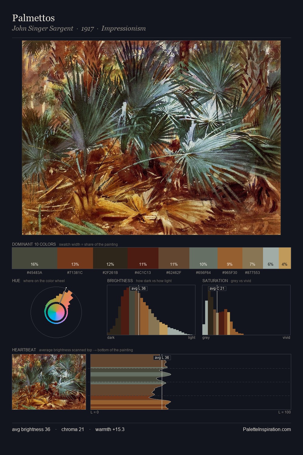
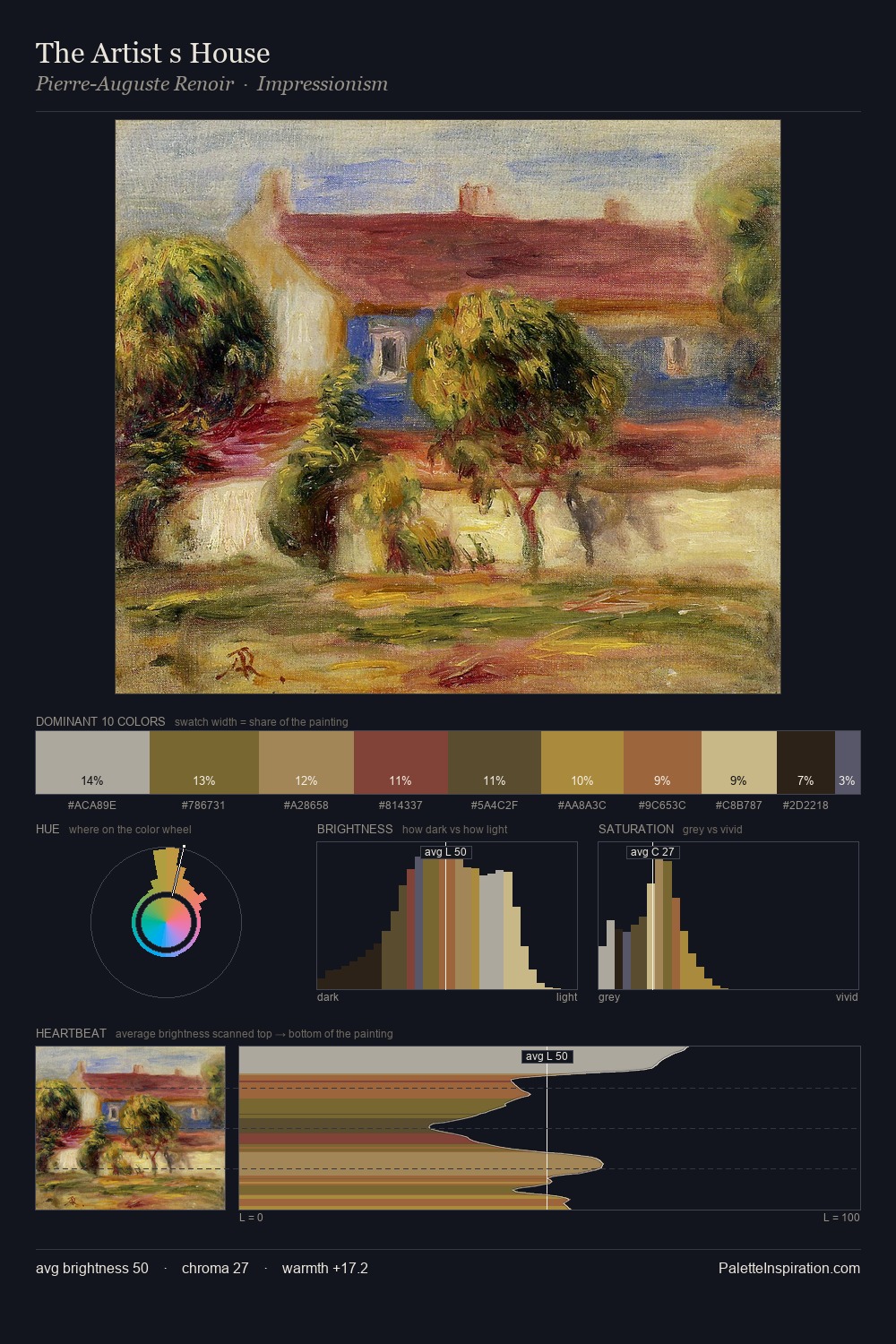
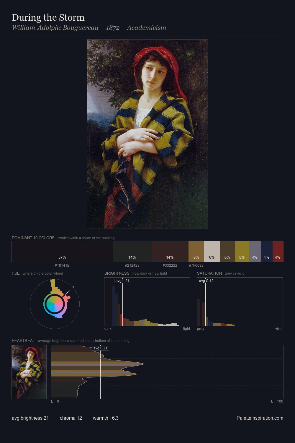
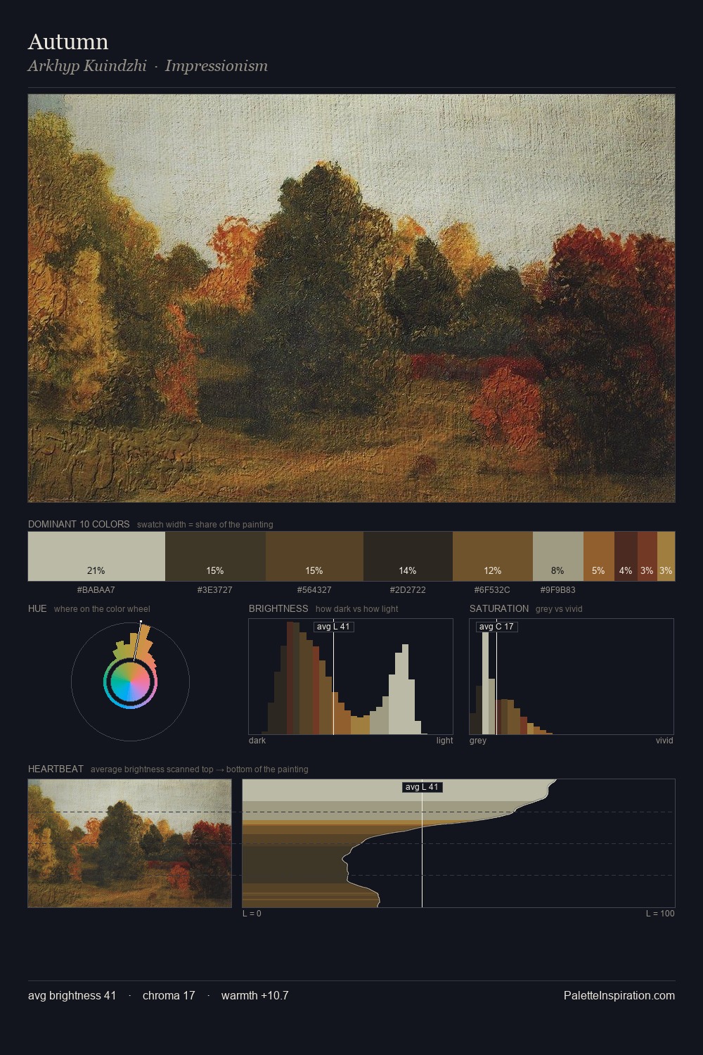
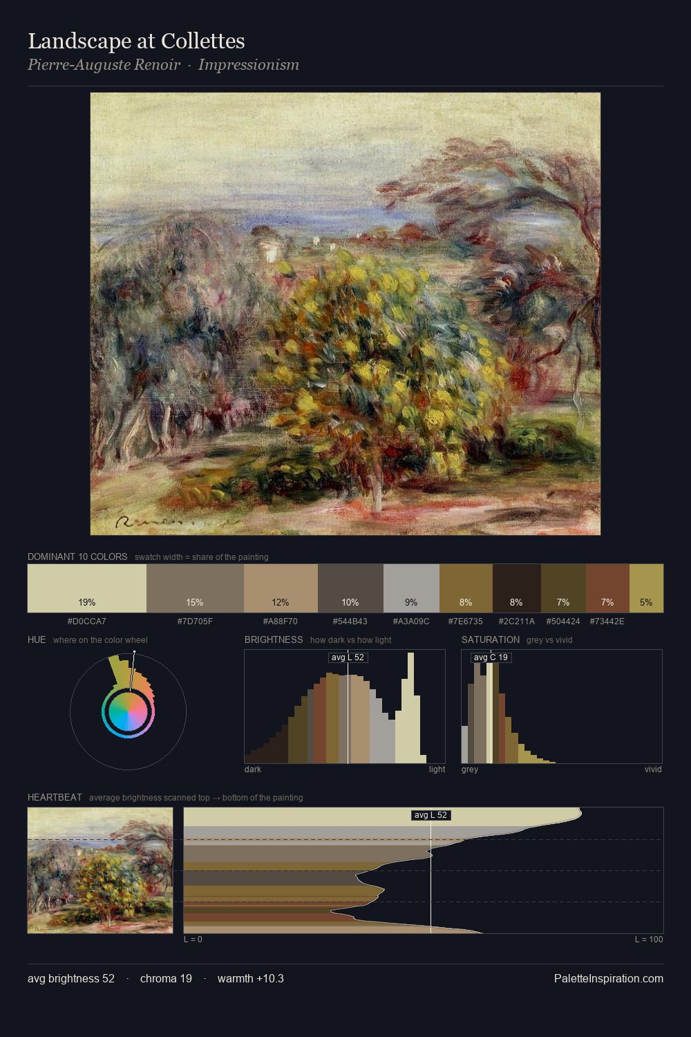
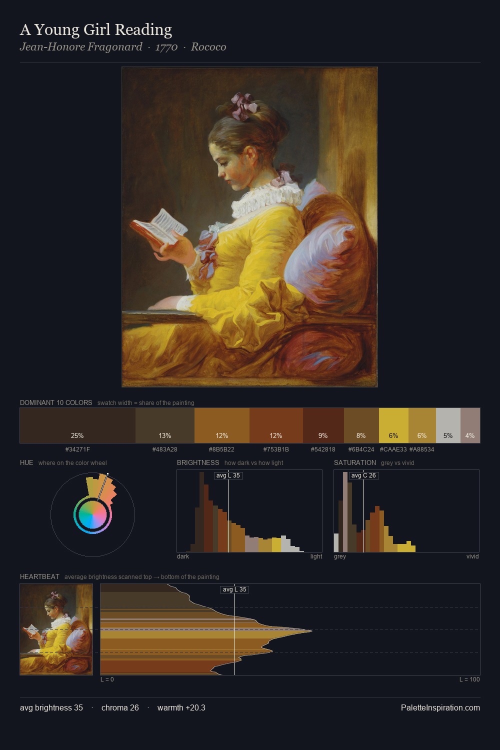
James Pollard occupies the comfortable middle of the value scale, avoiding both extremes to hold the eye in a sustained middle grey. Cool hues prevail: blues, greens, and greys anchor the palette's emotional temperature. Saturation is deliberately withheld - the beauty here lies in the near-monochromatic gradations rather than colour difference. The chromatic peak belongs to #5A4726, and at 4.9% it dominates, not decorates. The value range of 54 units sits in the comfortable middle: enough depth, enough light, neither extreme. The palette has the character of outdoor light: cool, mid-bright, with colour rendered faithfully rather than expressively. This is palette 2 of James Pollard's sequence - a single chapter in a chromatic story told across many works.
Example use cases
- exhibition design
- foundation branding
- estate management
- art education
- museums & galleries
I Love This!
Copy, export, or download for your project