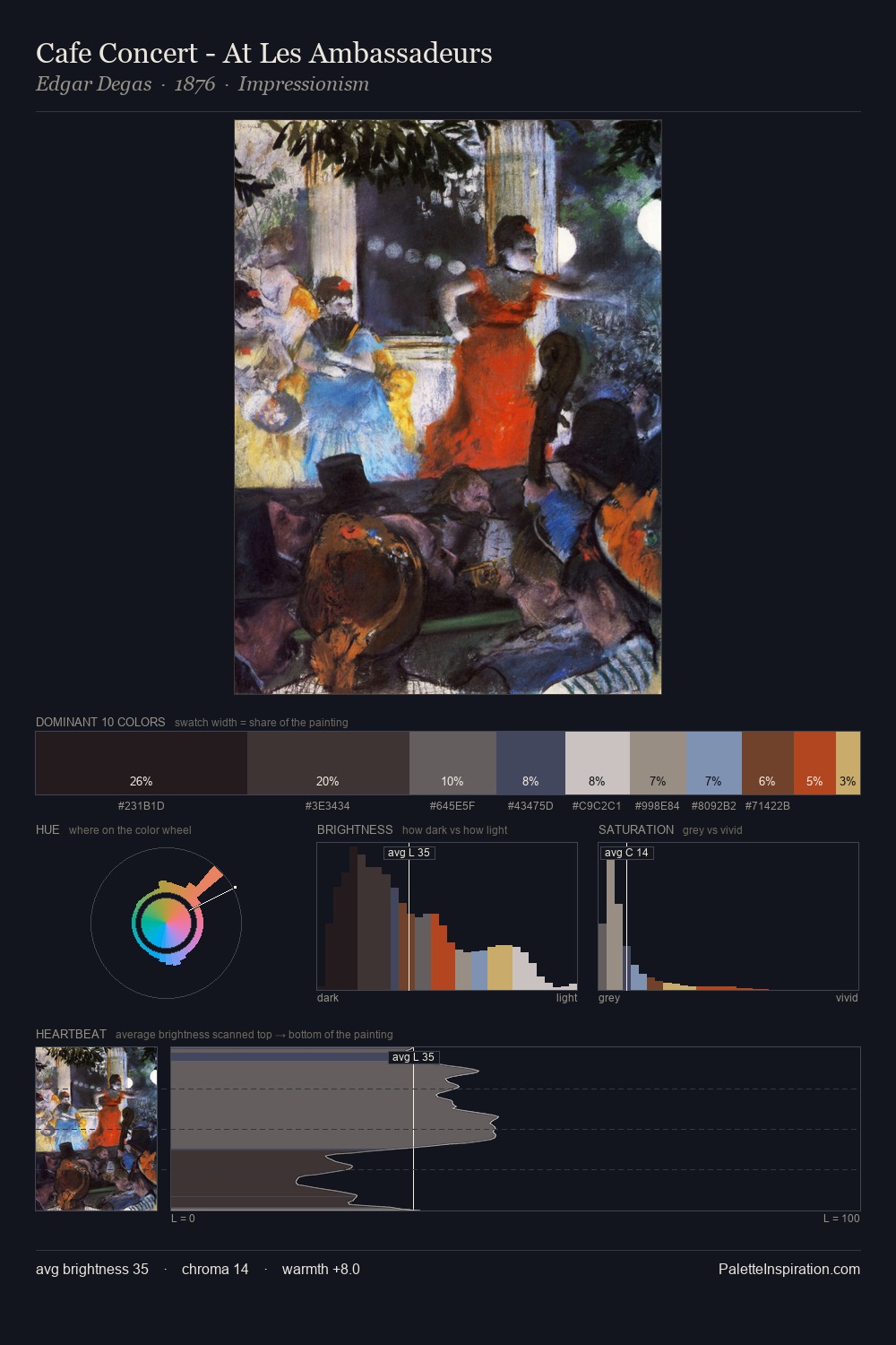
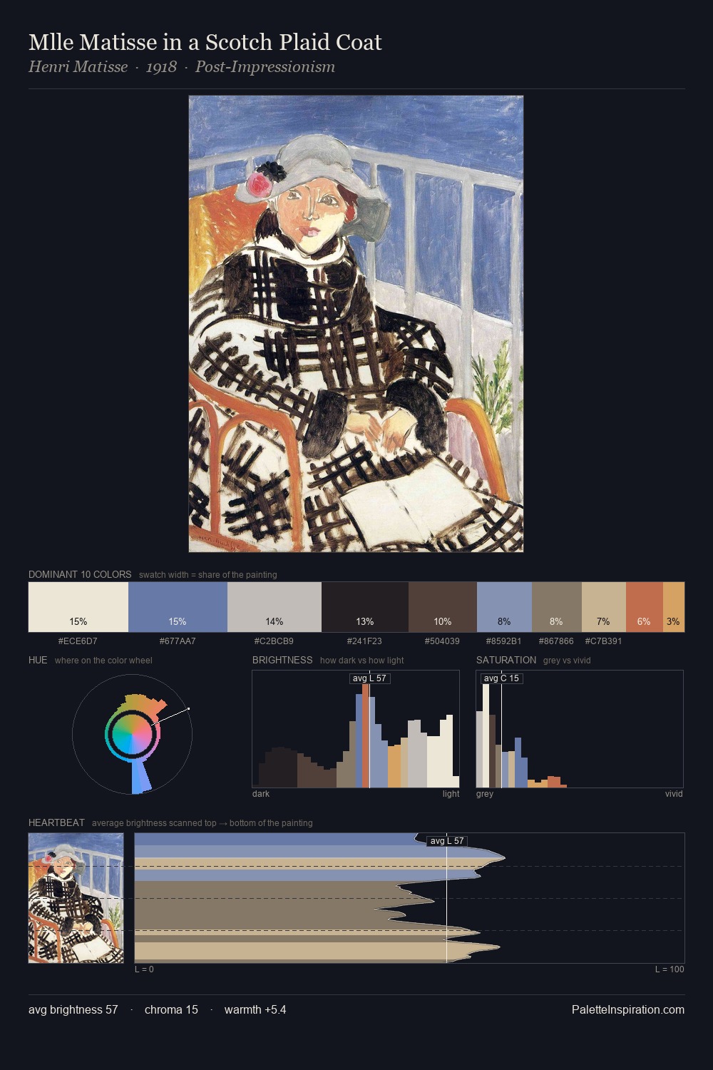
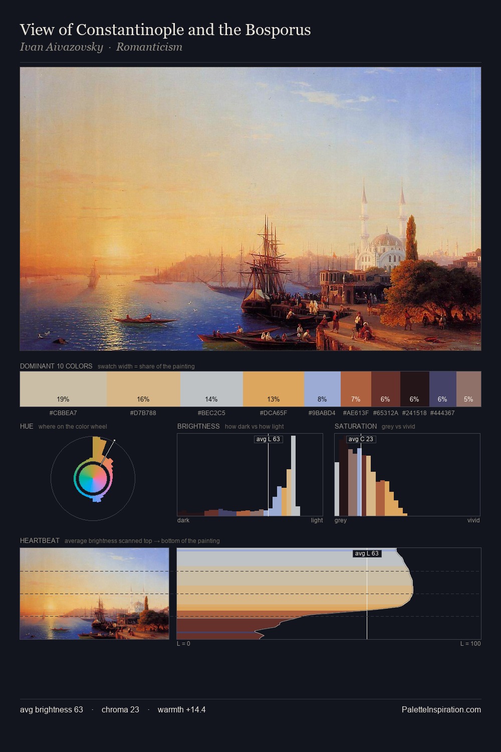
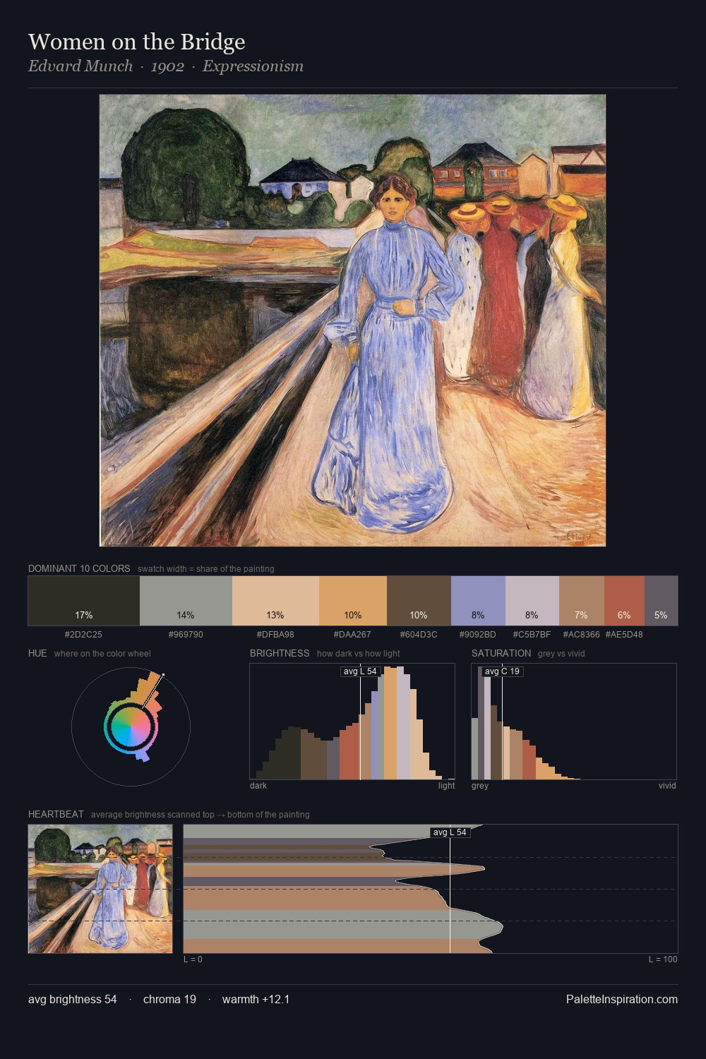
James Hamilton Palette 2

Palette Analysis
The value structure of James Hamilton is mid-key: quiet, controlled, and cohesive. A distinctly cool atmosphere runs through this palette: sky, water, and mist given colour form. Saturation is deliberately withheld - the beauty here lies in the near-monochromatic gradations rather than colour difference. At 31.1%, #D1D4E0 functions less as a colour accent and more as a complete atmospheric environment. The highest-chroma note - #E3B272 - appears at just 5.7%, deployed as a precision accent against the quieter ground. 68 units of value range underpin the palette's structural clarity: the eye always knows where light falls. High luminosity and cool temperature suggest the plein-air condition: unfiltered daylight and open sky. Palette 2 sits within the larger chromatic argument that James Hamilton's complete body of work advances.
Example use cases
- art galleries
- creative studios
- consumer goods
- lifestyle media
- professional services
I Love This!
Copy, export, or download for your project