James Archer Palette 5

Palette Analysis
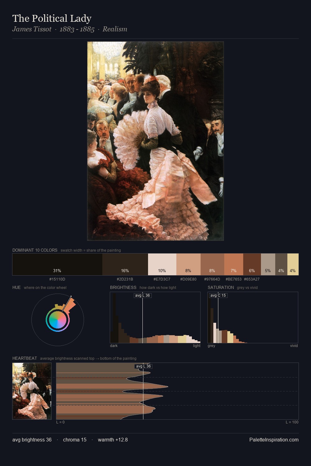
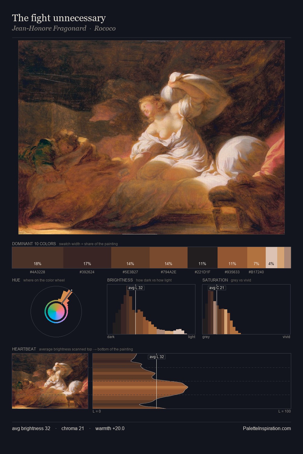
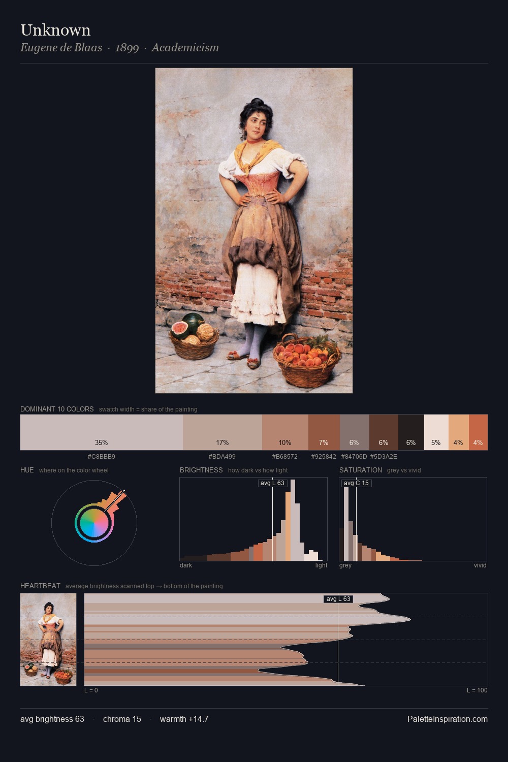
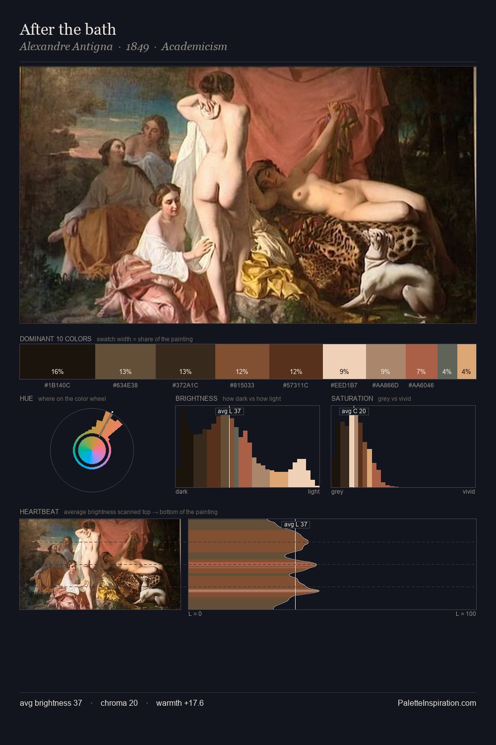
The palette of James Archer sits in the lower register of the value scale - dense, contained, and weighted. The dominant temperature is warm, with earth tones and fire-hues setting the emotional key. All colours lean toward grey, building depth through value rather than colour punch. 31.2% of the palette belongs to #1E1B18, a concentration that makes it the unmistakable visual centre. #F2DAD0 delivers the chromatic peak at only 3.6% - a small shot of colour with outsized visual impact. The value range spans 69 units across the palette, providing the full gamut from deep shadow to near-white and ensuring clear tonal hierarchy. This tonal restraint is characteristic of the James Archer approach: colour serves light, not the reverse. James Archer's palette 5 carries its own internal logic while remaining in conversation with the artist's broader colour intelligence.
Example use cases
- theater design
- jewelry brands
- tobacco-adjacent retail
- event branding
- film & entertainment
I Love This!
Copy, export, or download for your project