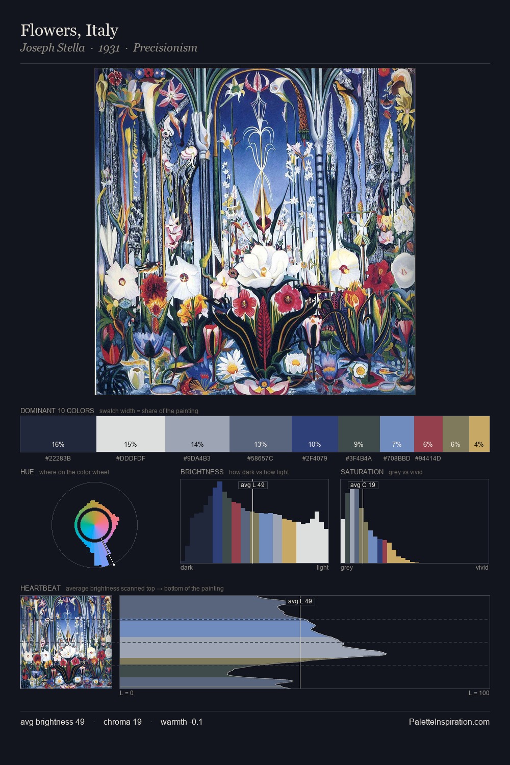
Jacoba van Heemskerck Palette 1

Palette Analysis
Jacoba van Heemskerck distributes its values across the middle register, creating harmony without high contrast. Cool hues prevail: blues, greens, and greys anchor the palette's emotional temperature. All colours lean toward grey, building depth through value rather than colour punch. Jacoba van Heemskerck gives 30.5% of the composition to a single #1E201F - a decisive chromatic anchor. #1F3770 delivers the chromatic peak at only 3.6% - a small shot of colour with outsized visual impact. 69 units of value range underpin the palette's structural clarity: the eye always knows where light falls. High luminosity and cool temperature suggest the plein-air condition: unfiltered daylight and open sky. Palette 1 sits within the larger chromatic argument that Jacoba van Heemskerck's complete body of work advances.
Example use cases
- boutique hospitality
- film production
- menswear
- art prints & posters
- heritage brands
I Love This!
Copy, export, or download for your project