Italo Nunes-Vais Palette 2
Shadowed Tawny
Shadowed Low-key - values weighted toward shadow, the palette of dim interiors and overcast skies.
Tawny Warm orange-brown - a traditional term for the color of tanned leather or lion fur.

Palette Analysis
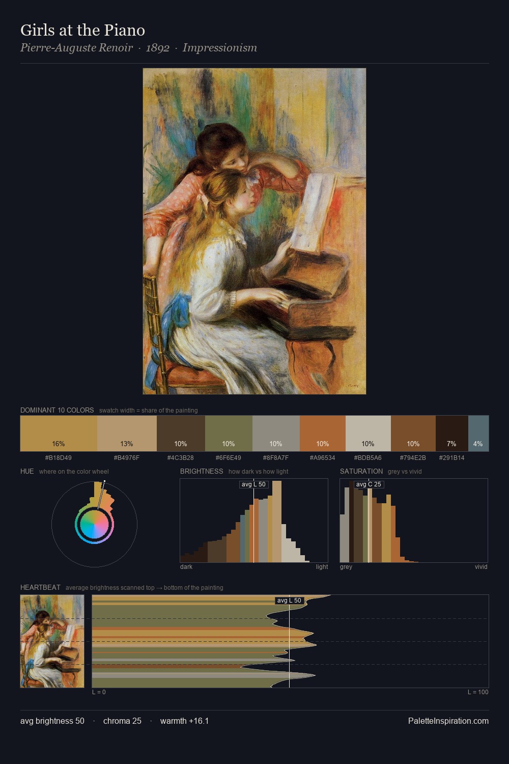
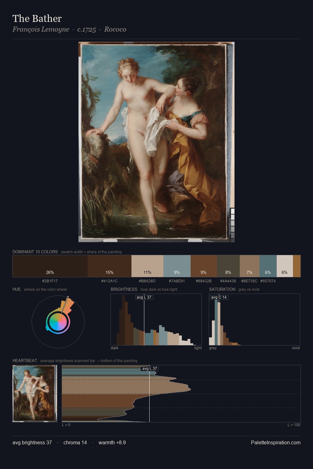
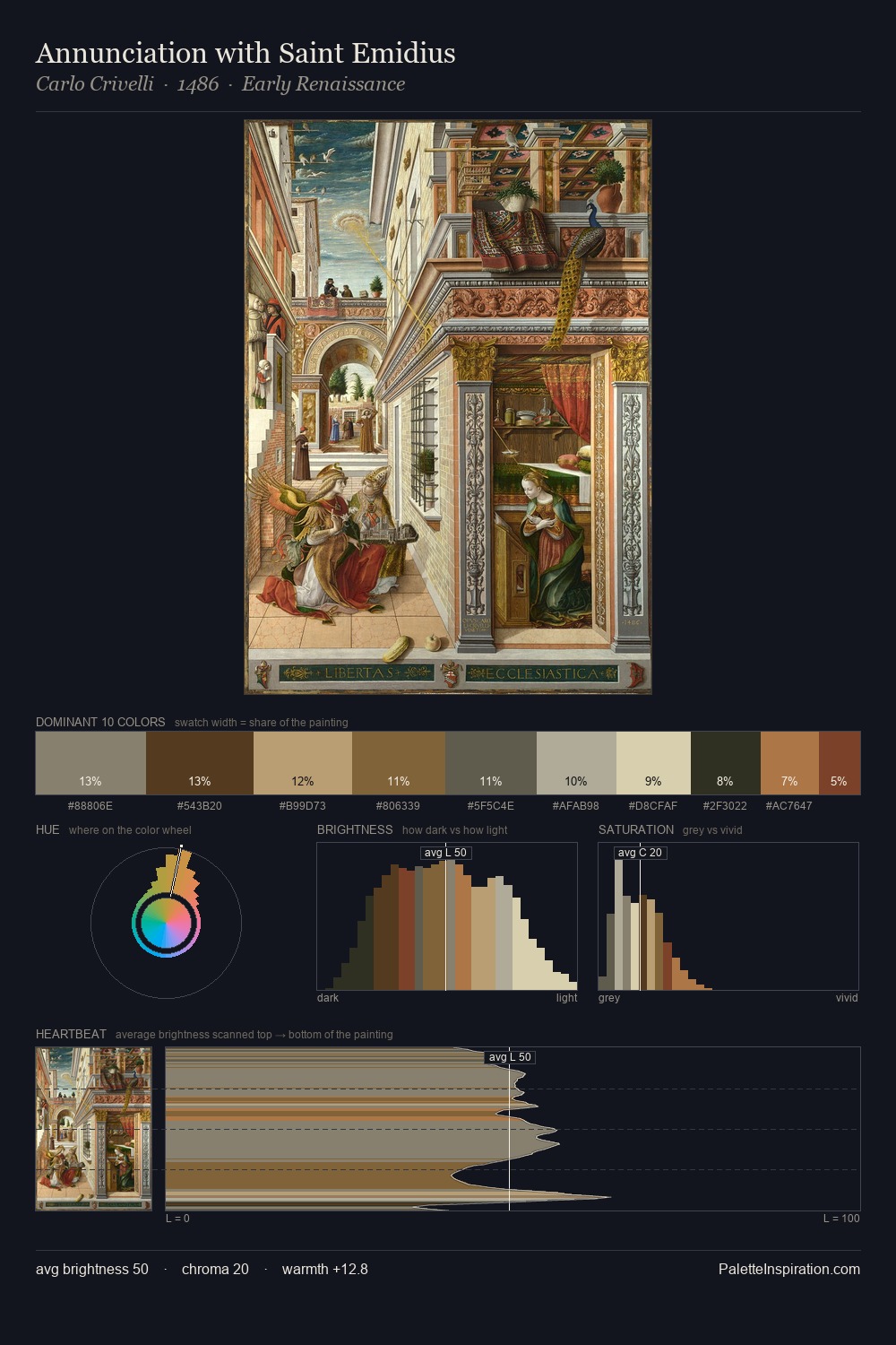
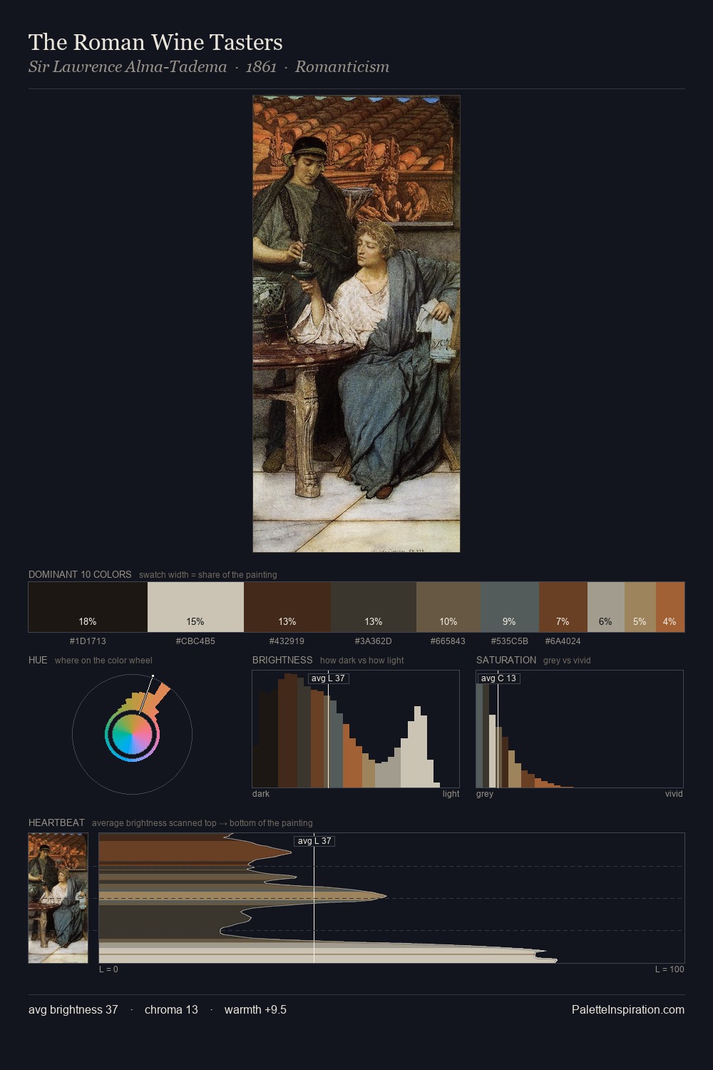
Mid-key values give Italo Nunes-Vais its characteristic quietness - nothing blazes, nothing disappears. Italo Nunes-Vais orchestrates warmth above all else - reds, ambers, and siennas take the lead. All colours lean toward grey, building depth through value rather than colour punch. At 8.3%, #B59D79 carries the palette's sharpest chromatic charge: an accent that earns its place precisely because it is withheld. 59 units of value range underpin the palette's structural clarity: the eye always knows where light falls. Palette 2 sits within the larger chromatic argument that Italo Nunes-Vais's complete body of work advances.
Example use cases
- theater design
- jewelry brands
- tobacco-adjacent retail
- event branding
- film & entertainment
I Love This!
Use This Palette
Copy, export, or download for your project
Copy, export, or download for your project
Copy:
Download:
Share: