Italo Nunes-Vais Palette 1
Pale Ivory
Pale High-key and low-chroma - delicate, bleached, washed with light.
Ivory Warm creamy white - the color of natural ivory, warmer than pure white.

Palette Analysis
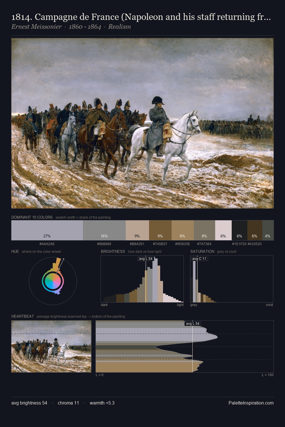
Italo Nunes-Vais is high in key: pale, luminous, and filled with optical air. Italo Nunes-Vais orchestrates warmth above all else - reds, ambers, and siennas take the lead. Saturation is deliberately withheld - the beauty here lies in the near-monochromatic gradations rather than colour difference. Only 2.1% is devoted to #615B31, yet that small allocation delivers the palette's entire chromatic tension. 53 units of value spread create a palette that is varied but unified - contrast in the service of harmony. This is palette 1 of Italo Nunes-Vais's sequence - a single chapter in a chromatic story told across many works.
Example use cases
- exhibition design
- foundation branding
- estate management
- art education
- museums & galleries
I Love This!
Use This Palette
Copy, export, or download for your project
Copy, export, or download for your project
Copy:
Download:
Share: