Istvan Farkas Palette 1

Palette Analysis
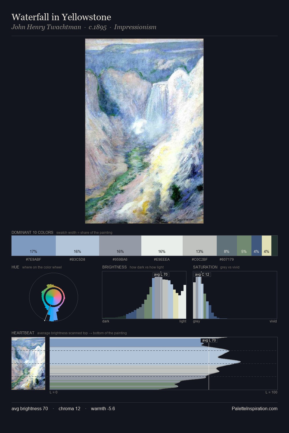
Istvan Farkas is high-key - luminous, open, and weighted toward light. A distinctly cool atmosphere runs through this palette: sky, water, and mist given colour form. The absence of saturated colour is itself an expressive choice: this is a palette of restraint and atmosphere. The highest-chroma note - #8B9DC7 - appears at just 13.0%, deployed as a precision accent against the quieter ground. Spanning 31 units on the value axis, the palette achieves the balance between tonal flatness and fragmentation. The mid-to-high key, cool bias, and moderate chroma point to outdoor observation - sky and diffused daylight as the dominant light source. Istvan Farkas's palette 1 carries its own internal logic while remaining in conversation with the artist's broader colour intelligence.
Example use cases
- exhibition design
- foundation branding
- estate management
- art education
- museums & galleries
I Love This!
Copy, export, or download for your project