Irma Stern Palette 3

Palette Analysis
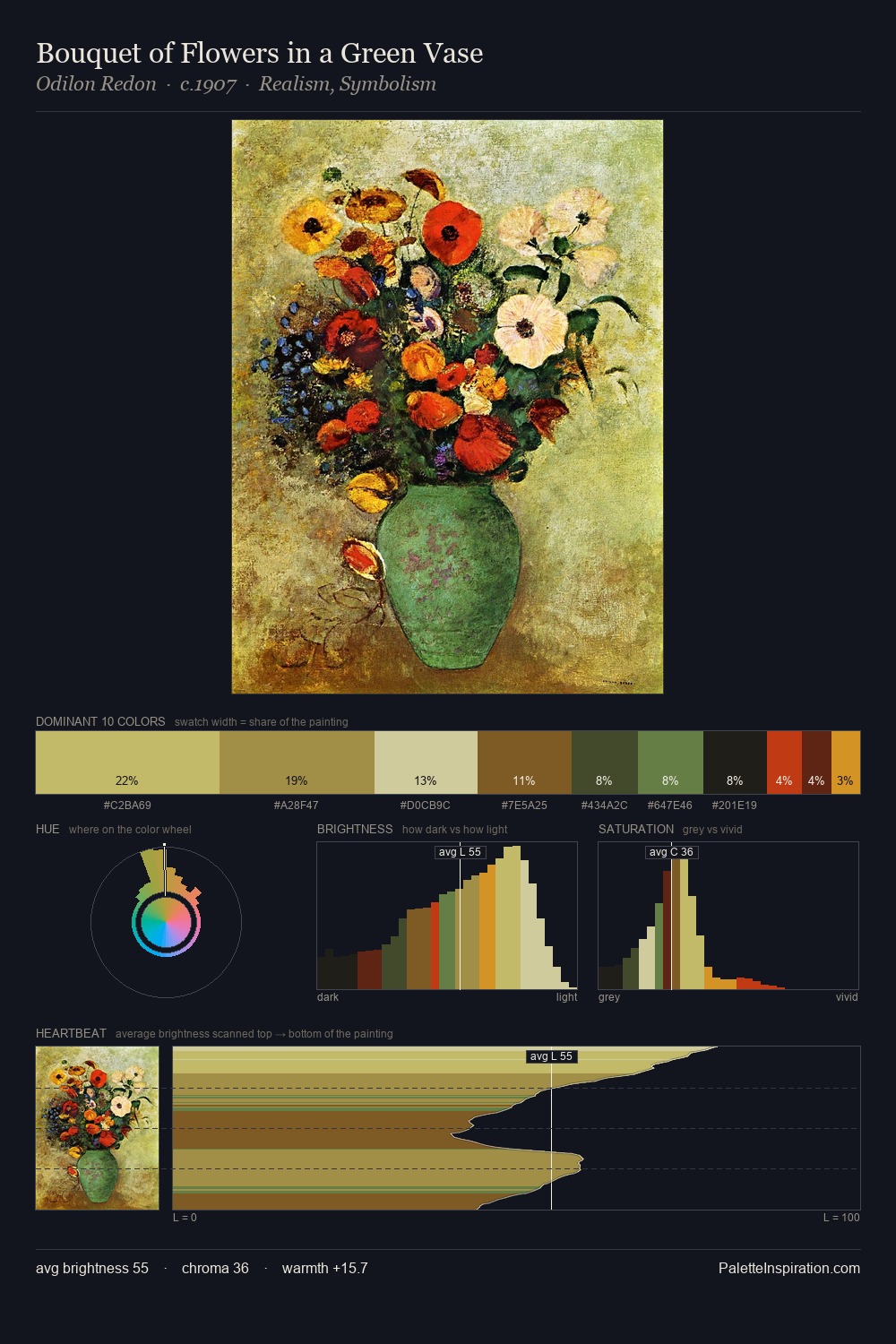
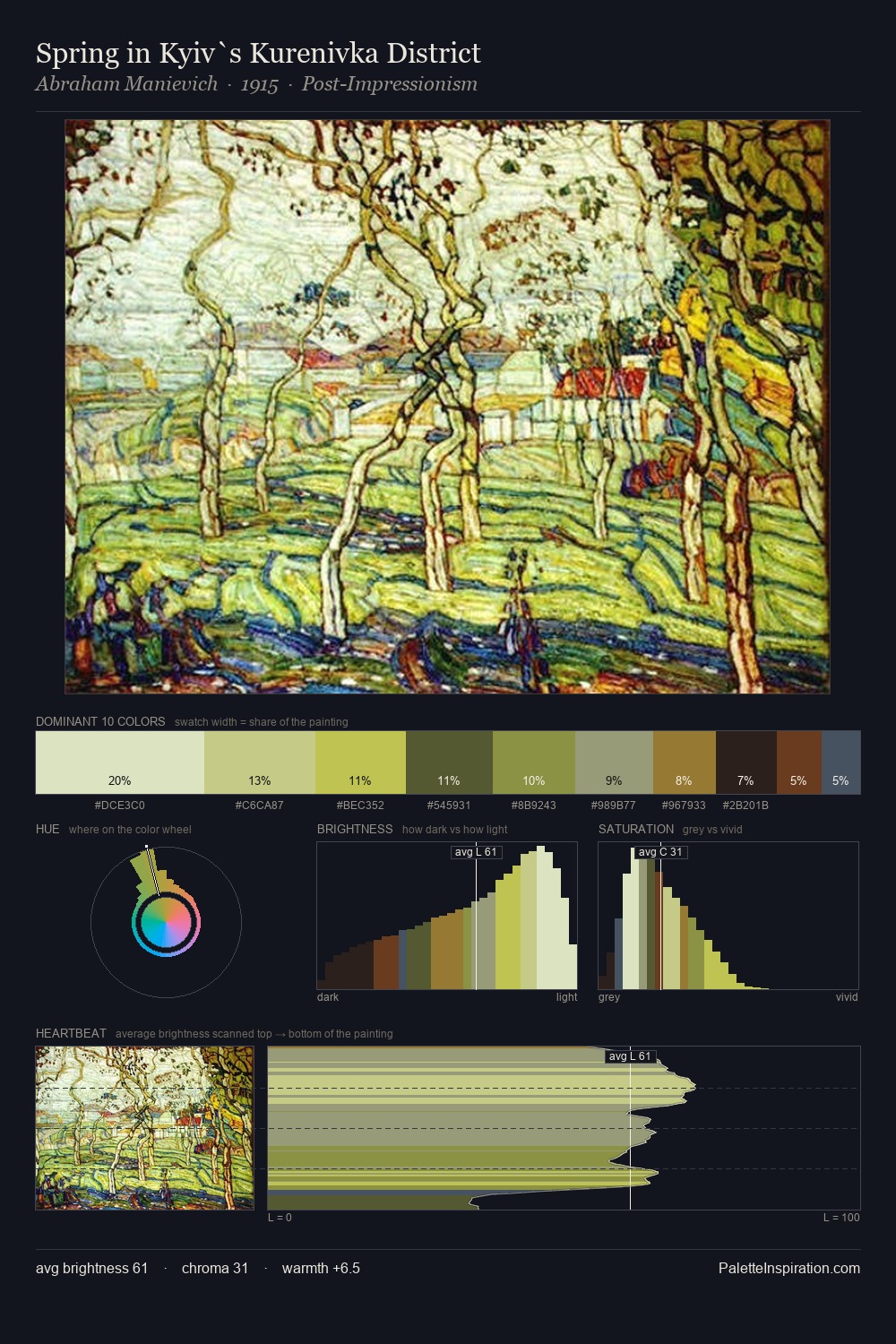
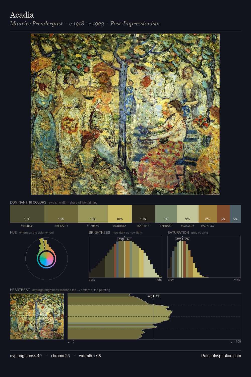
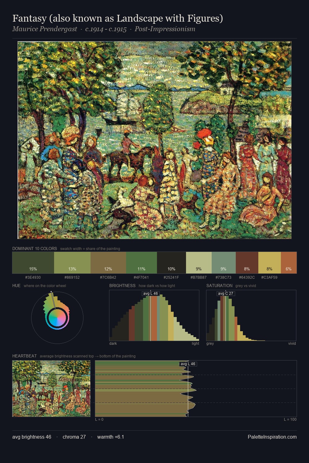
Values in Irma Stern rest in the mid-range - neither dramatically lit nor steeped in shadow. Temperature is cool-dominant, with blue and green families claiming the largest areas. Mid-saturation across the board: the palette has colour character without chromatic excess. At 10.8%, #D1B650 carries the palette's sharpest chromatic charge: an accent that earns its place precisely because it is withheld. 61 units of value range underpin the palette's structural clarity: the eye always knows where light falls. The mid-to-high key, cool bias, and moderate chroma point to outdoor observation - sky and diffused daylight as the dominant light source. Irma Stern's palette 3 carries its own internal logic while remaining in conversation with the artist's broader colour intelligence.
Example use cases
- publishing
- corporate identity
- consumer apps
- hospitality
- design agencies
I Love This!
Copy, export, or download for your project