Hugo van der Goes Palette 6
Tenebrous Bister
Tenebrous Dark and murky - low-key values with obscured form, Baroque in temperament.
Bister Dark warm brown - a traditional ink and wash pigment made from wood soot.

Palette Analysis
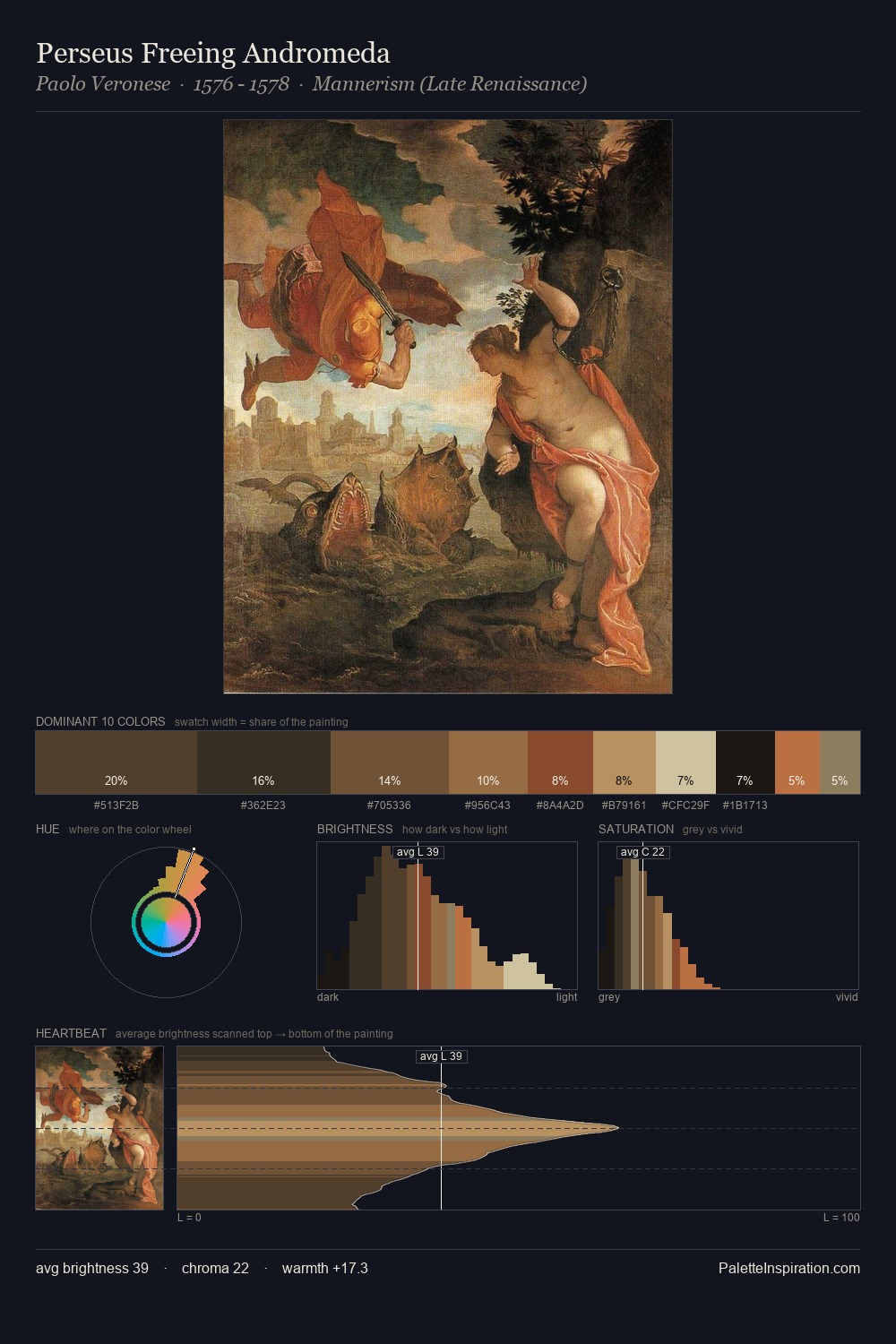
The value structure of Hugo van der Goes is mid-key: quiet, controlled, and cohesive. Warm hues command this palette; Hugo van der Goes favours the reds, oranges, and yellows of firelight and earth. All colours lean toward grey, building depth through value rather than colour punch. Hugo van der Goes gives 30.1% of the composition to a single #24201D - a decisive chromatic anchor. The highest-chroma note - #CAA47B - appears at just 5.4%, deployed as a precision accent against the quieter ground. A value spread of 59 units gives the palette both depth and air - shadows are genuinely dark, lights genuinely light. This is palette 6 of Hugo van der Goes's sequence - a single chapter in a chromatic story told across many works.
Example use cases
- film & entertainment
- fine dining
- spirits branding
- menswear
- theater design
I Love This!
Use This Palette
Copy, export, or download for your project
Copy, export, or download for your project
Copy:
Download:
Share: