Hugo van der Goes Palette 1
Soft Ecru
Soft Low-contrast, gentle chroma - mid-key values and low saturation, approachable and calm.
Ecru Unbleached linen - warm mid-neutral, slightly grayed, raw and natural.

Palette Analysis
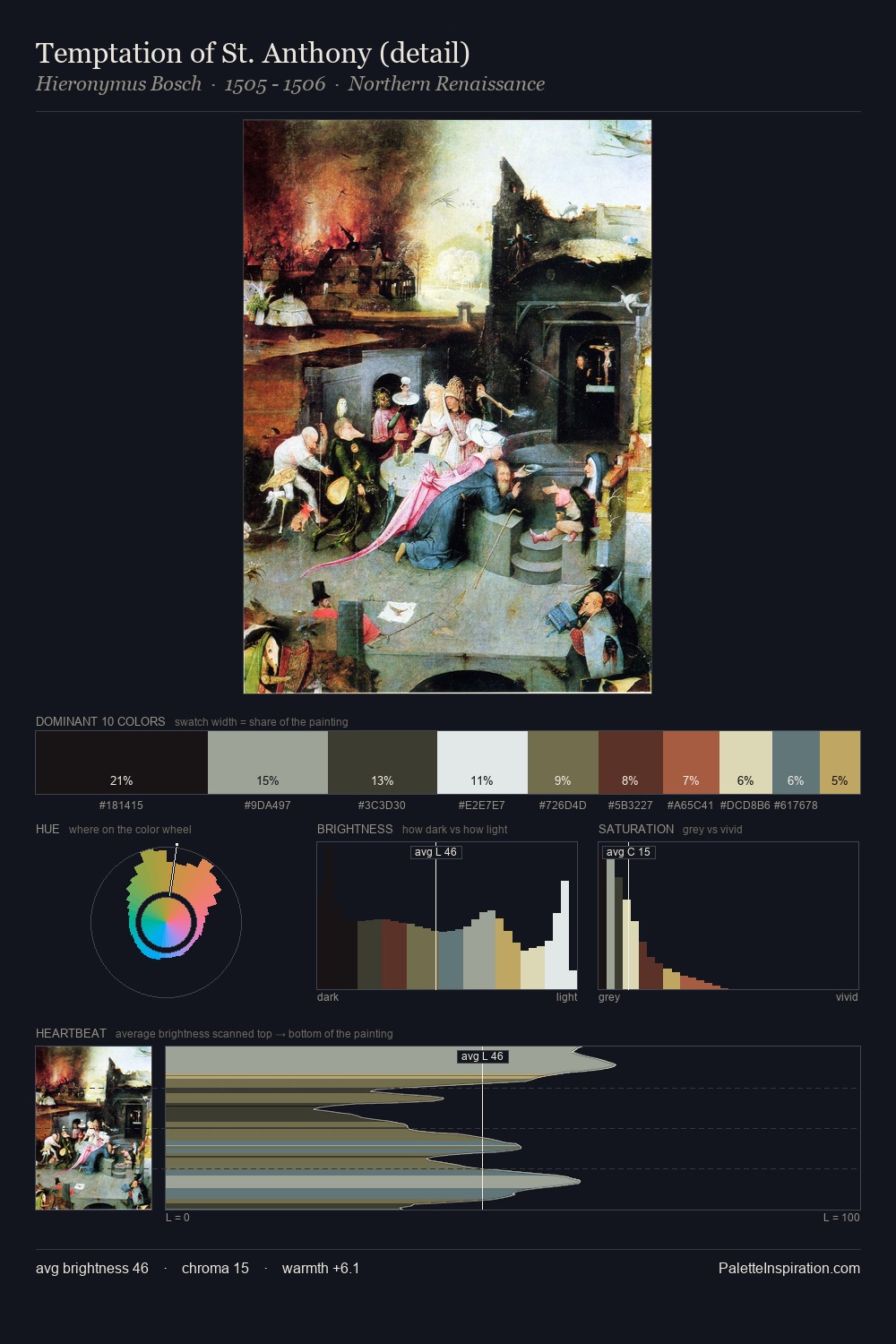
Hugo van der Goes is high in key: pale, luminous, and filled with optical air. Yellow, ochre, sienna: warm hues that Hugo van der Goes deploys as the palette's primary energy. All colours lean toward grey, building depth through value rather than colour punch. At 5.4%, #553526 carries the palette's sharpest chromatic charge: an accent that earns its place precisely because it is withheld. 72 units of value range underpin the palette's structural clarity: the eye always knows where light falls. Hugo van der Goes's palette 1 carries its own internal logic while remaining in conversation with the artist's broader colour intelligence.
Example use cases
- ceramics & pottery
- boutique hospitality
- menswear
- heritage food brands
- craft & artisan brands
I Love This!
Use This Palette
Copy, export, or download for your project
Copy, export, or download for your project
Copy:
Download:
Share: