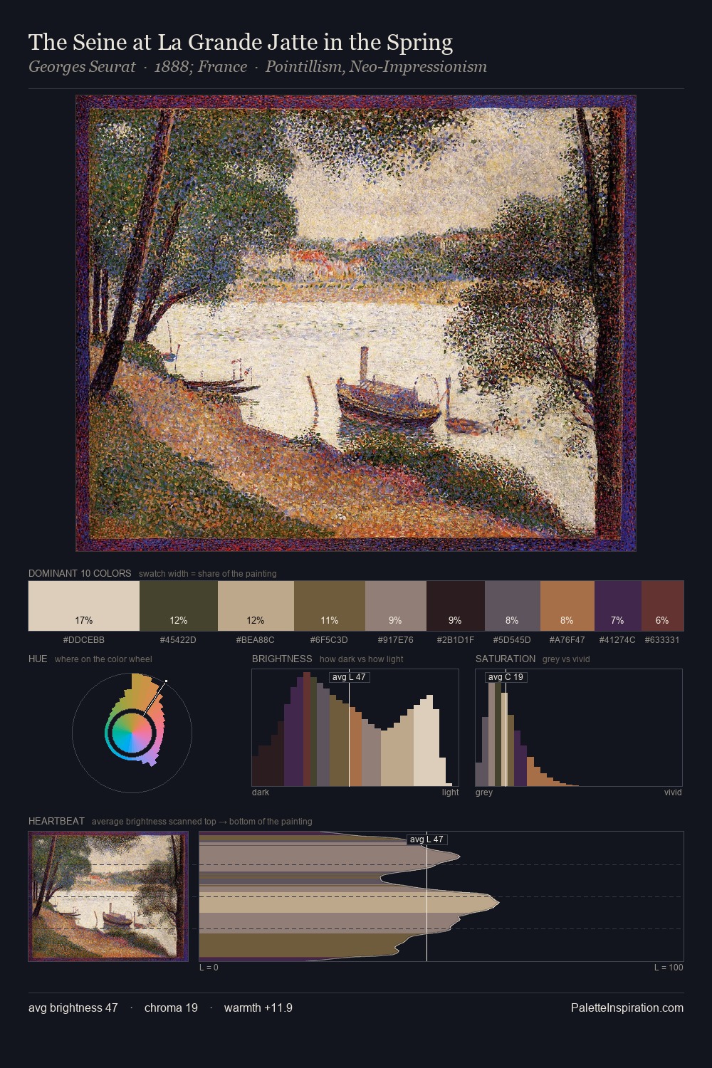
Hermann Schneider Master Palette
Shadowed Gamboge
Shadowed Low-key - values weighted toward shadow, the palette of dim interiors and overcast skies.
Gamboge Deep golden yellow - a traditional warm pigment, rich amber-gold.

Palette Analysis
Hermann Schneider sits in the centre of the value range, lending the palette a sense of even, sustained light. Temperature reads distinctly warm: the reds and earth tones from Hermann Schneider carry the compositional weight. Muted throughout, the palette achieves its effects through value and temperature rather than chromatic force. At 6.7%, #BA7E57 carries the palette's sharpest chromatic charge: an accent that earns its place precisely because it is withheld. 58 units of value range underpin the palette's structural clarity: the eye always knows where light falls. This is the light Hermann Schneider preferred, made measurable.
Example use cases
- ceramics & pottery
- boutique hospitality
- menswear
- heritage food brands
- craft & artisan brands
I Love This!
Use This Palette
Copy, export, or download for your project
Copy, export, or download for your project
Copy:
Download:
Share: