Hermann Ottomar Herzog Palette 7
Tenebrous Bister
Tenebrous Dark and murky - low-key values with obscured form, Baroque in temperament.
Bister Dark warm brown - a traditional ink and wash pigment made from wood soot.

Palette Analysis
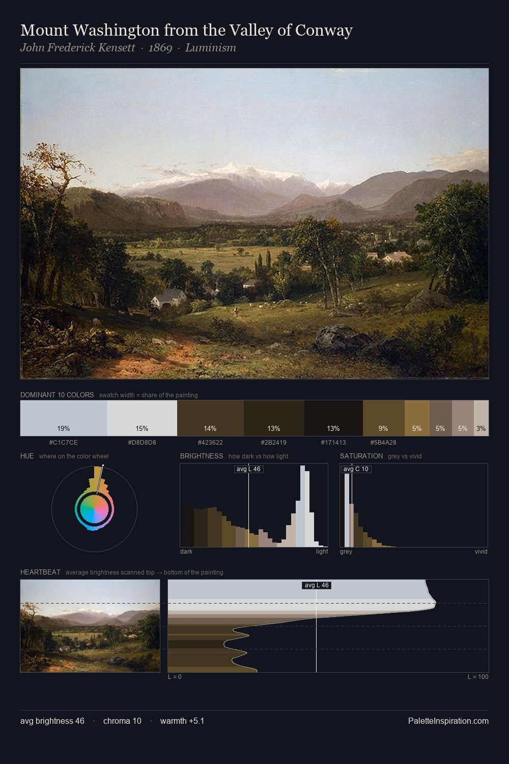
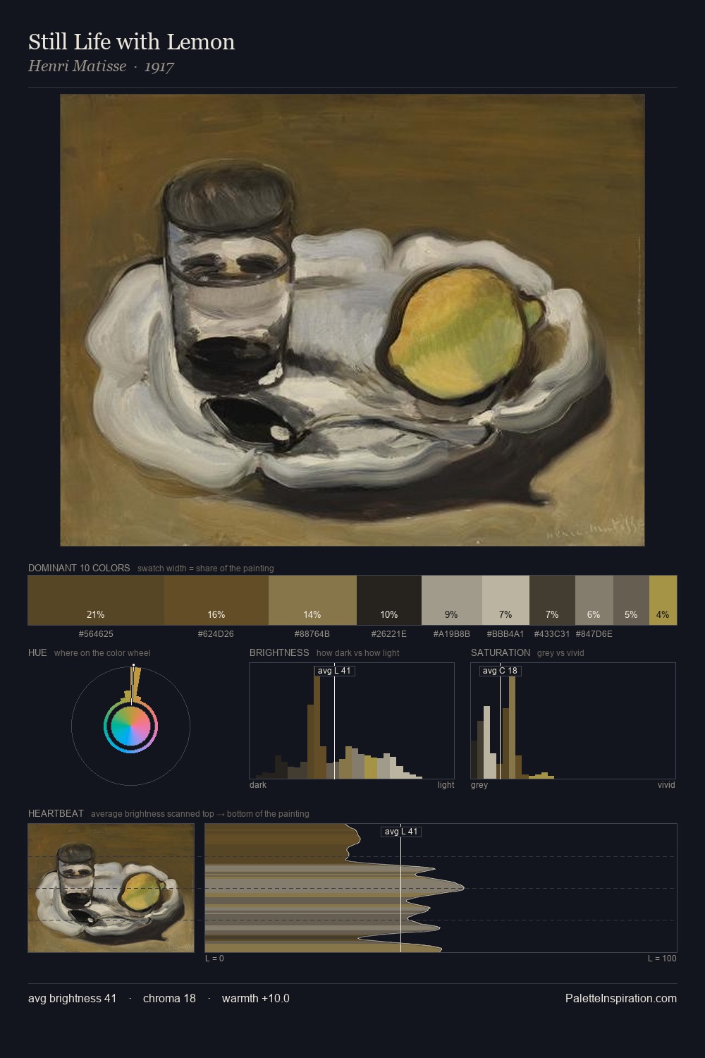
The value structure of Hermann Ottomar Herzog is mid-key: quiet, controlled, and cohesive. Temperature is balanced: the palette pits warm earth against cool sky without declaring a winner. All colours lean toward grey, building depth through value rather than colour punch. #1C1814 claims 28.2% of the surface, functioning as the work's tonal foundation. #90794C delivers the chromatic peak at only 3.4% - a small shot of colour with outsized visual impact. 56 units of value range underpin the palette's structural clarity: the eye always knows where light falls. Palette 7 sits within the larger chromatic argument that Hermann Ottomar Herzog's complete body of work advances.
Example use cases
- theater design
- jewelry brands
- tobacco-adjacent retail
- event branding
- film & entertainment
I Love This!
Use This Palette
Copy, export, or download for your project
Copy, export, or download for your project
Copy:
Download:
Share: