Henryk Rodakowski Palette 1
Luminous Ecru
Luminous Self-illuminated feeling - high-key values with an inner glow quality.
Ecru Unbleached linen - warm mid-neutral, slightly grayed, raw and natural.

Palette Analysis
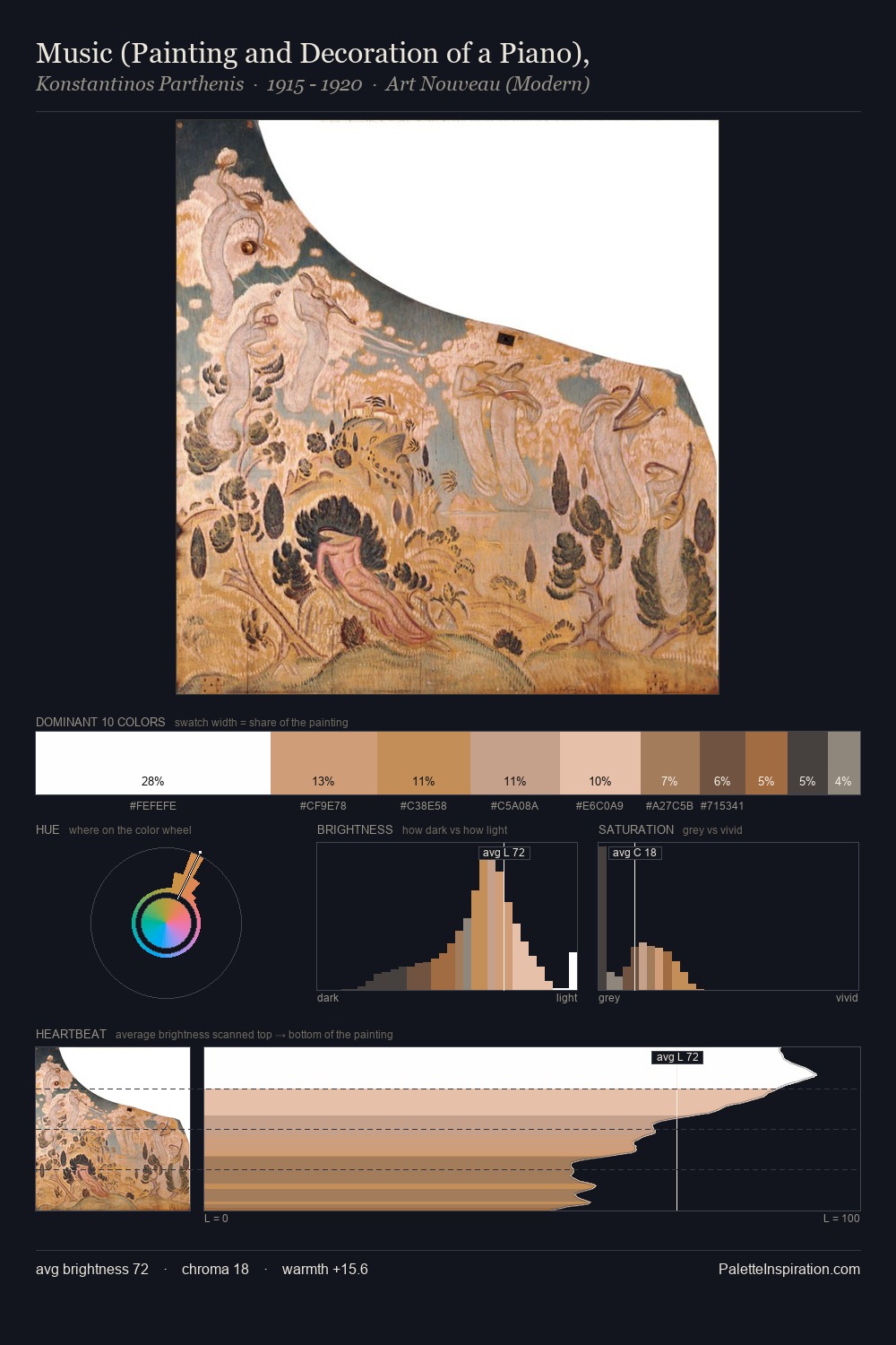
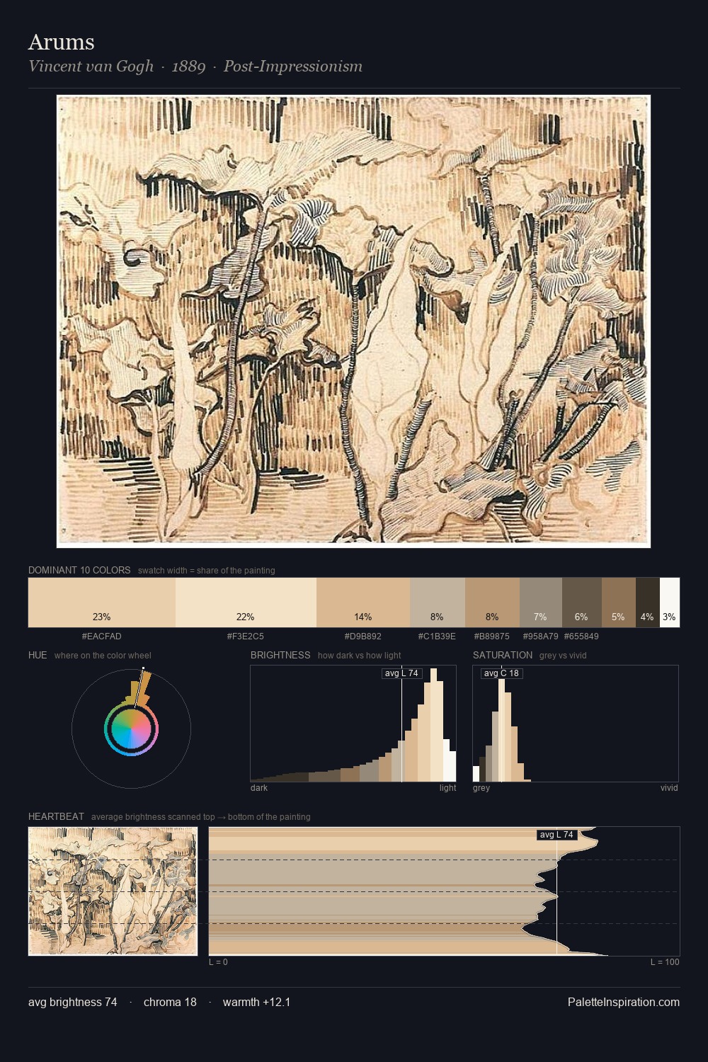
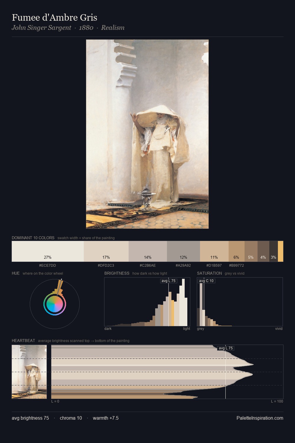
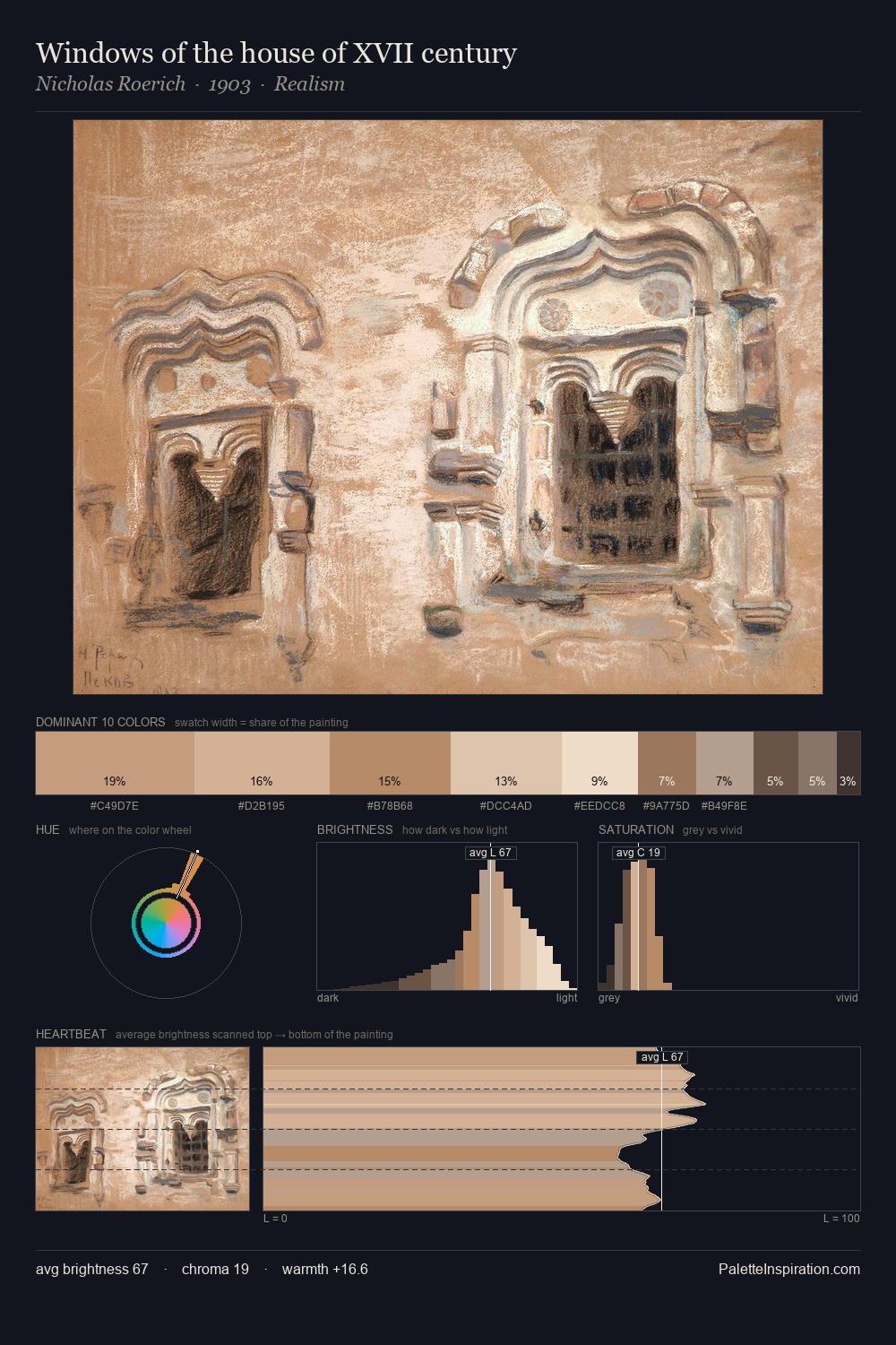
Henryk Rodakowski is high-key - luminous, open, and weighted toward light. Heat pervades this palette; warm chromatic identities outweigh cool ones at almost every weight. All colours lean toward grey, building depth through value rather than colour punch. #BF9271 functions as the palette's exclamation mark: highest chroma, lowest percentage (5.5%). A value spread of 67 units gives the palette both depth and air - shadows are genuinely dark, lights genuinely light. This is palette 1 of Henryk Rodakowski's sequence - a single chapter in a chromatic story told across many works.
Example use cases
- craft & artisan brands
- specialty coffee
- home goods
- lifestyle retail
- ceramics & pottery
I Love This!
Use This Palette
Copy, export, or download for your project
Copy, export, or download for your project
Copy:
Download:
Share: