Henry van de Velde Palette 3
Palette Analysis
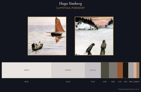
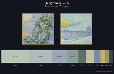
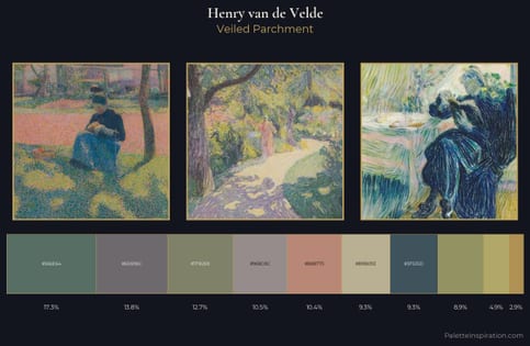
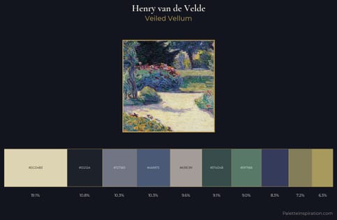
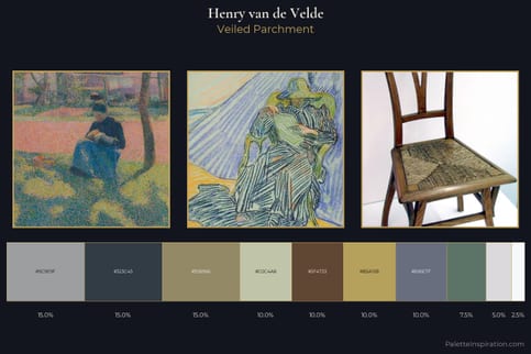
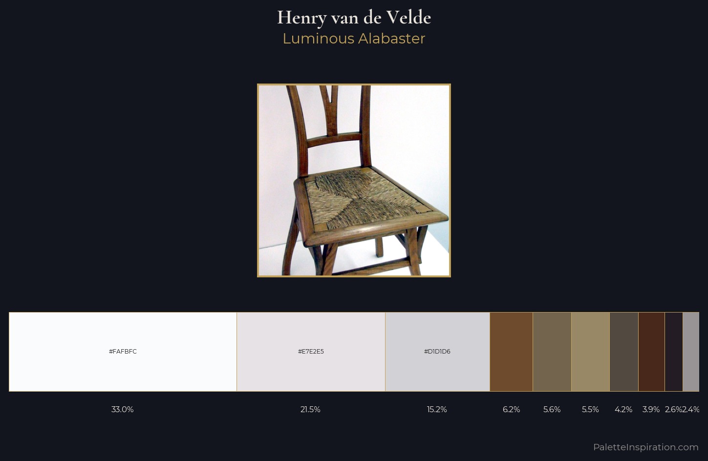
Henry van de Velde is high in key: pale, luminous, and filled with optical air. Henry van de Velde builds on cool foundations: the palette favours the blue-cyan-green arc. The absence of saturated colour is itself an expressive choice: this is a palette of restraint and atmosphere. Henry van de Velde gives 33.0% of the composition to a single #FAFBFC - a decisive chromatic anchor. #6D4B2C delivers the chromatic peak at only 6.2% - a small shot of colour with outsized visual impact. 75 units of value range underpin the palette's structural clarity: the eye always knows where light falls. The palette has the character of outdoor light: cool, mid-bright, with colour rendered faithfully rather than expressively. Henry van de Velde's palette 3 carries its own internal logic while remaining in conversation with the artist's broader colour intelligence.
Example use cases
- print magazines
- beauty brands
- real estate
- high-end packaging
- editorial design
I Love This!
Copy, export, or download for your project