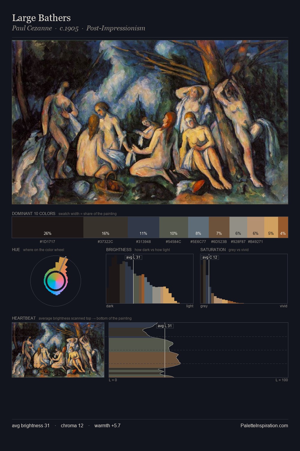
Henry Pickering Palette 3

Palette Analysis
Darkness anchors Henry Pickering; light is rationed, creating dramatic contrast rather than open air. Cool tones set the register here - the blues and greens easily outweigh any warm accents. Saturation is deliberately withheld - the beauty here lies in the near-monochromatic gradations rather than colour difference. #100F0A at 44.0% of the palette: an overwhelming presence that pulls all other colours into its gravitational field. The most saturated colour, #8F5537, is reserved to 2.5% of the surface, where it acts as a focal punctuation. 53 units of value spread create a palette that is varied but unified - contrast in the service of harmony. This tonal restraint is characteristic of the Henry Pickering approach: colour serves light, not the reverse. Henry Pickering's palette 3 carries its own internal logic while remaining in conversation with the artist's broader colour intelligence.
Example use cases
- film & entertainment
- fine dining
- spirits branding
- menswear
- theater design
I Love This!
Copy, export, or download for your project