Henrique Pousao Palette 4
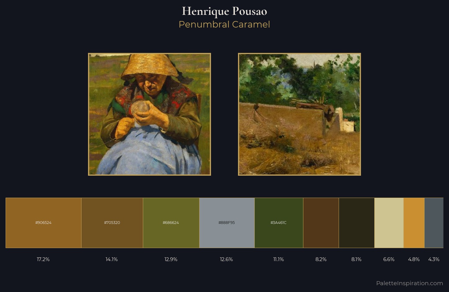
Palette Analysis
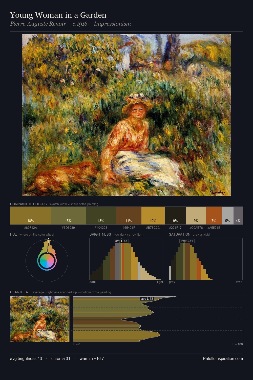
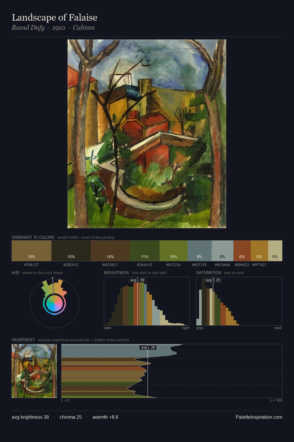
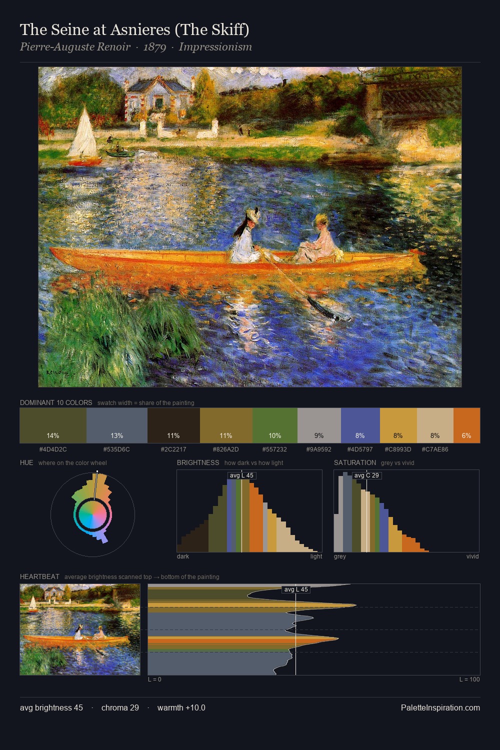
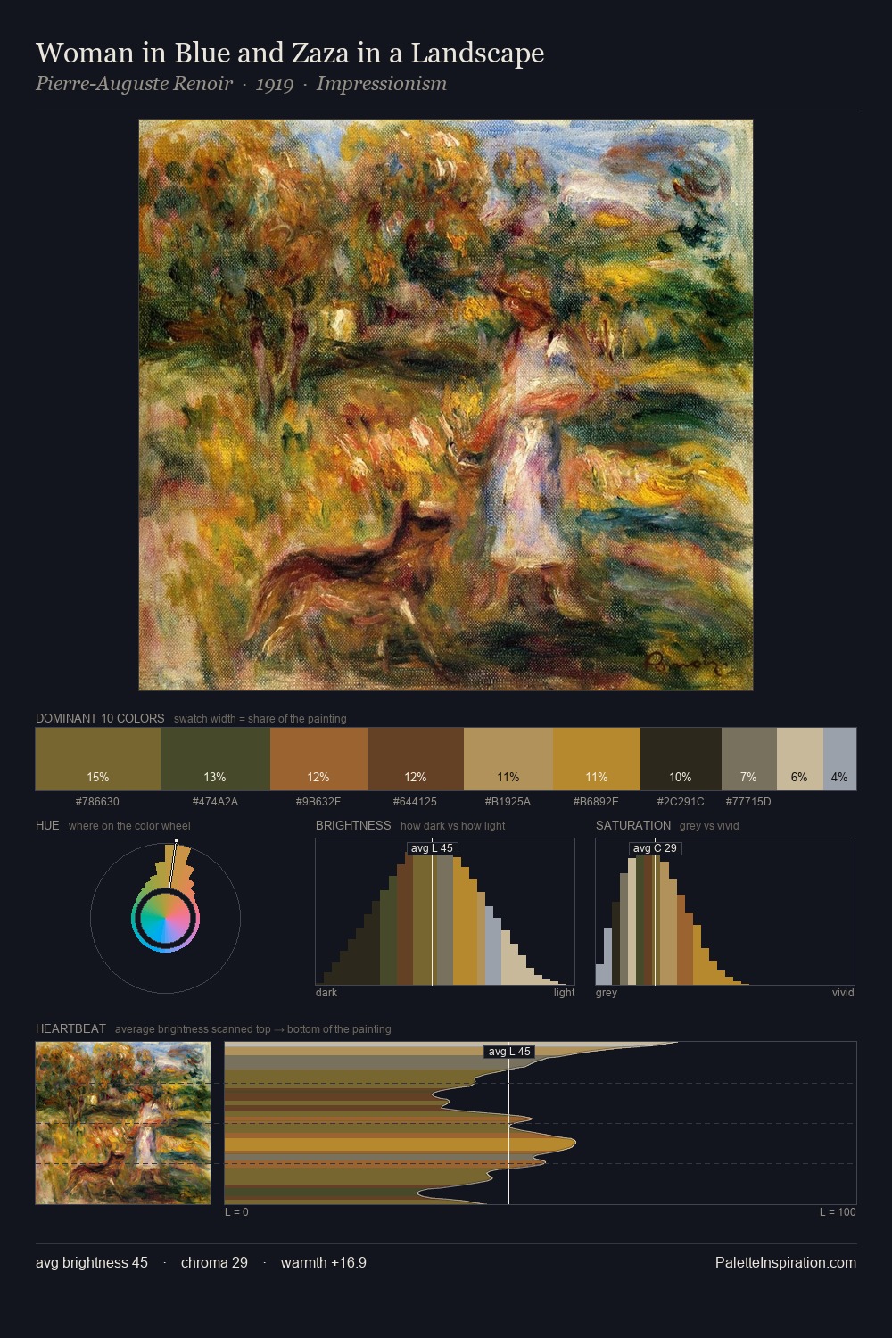
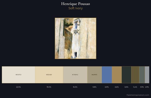
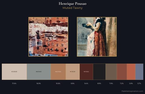
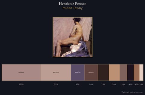
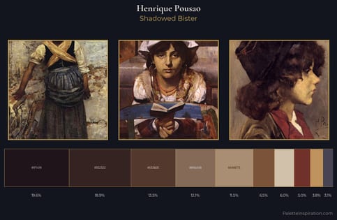
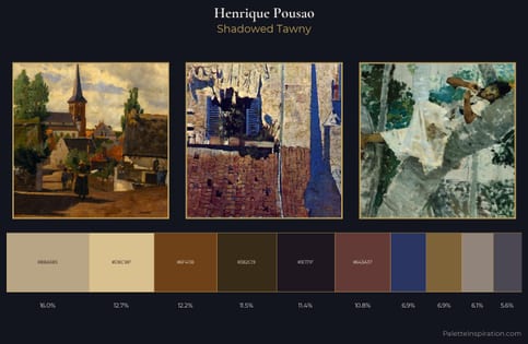
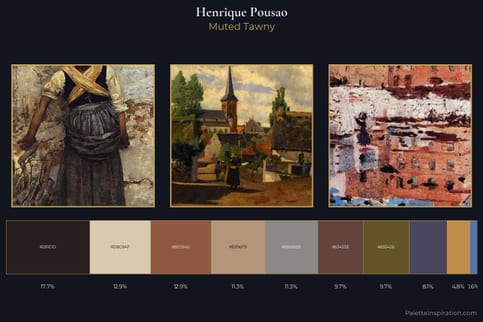
Henrique Pousao distributes its values across the middle register, creating harmony without high contrast. Cool hues prevail: blues, greens, and greys anchor the palette's emotional temperature. Chroma is moderate: colours carry enough saturation to be read as colour, but the palette stops well short of garish intensity. #C98F30 functions as the palette's exclamation mark: highest chroma, lowest percentage (4.8%). 55 units of value range underpin the palette's structural clarity: the eye always knows where light falls. The palette has the character of outdoor light: cool, mid-bright, with colour rendered faithfully rather than expressively. Palette 4 sits within the larger chromatic argument that Henrique Pousao's complete body of work advances.
Example use cases
- music labels
- luxury hospitality
- editorial photography
- leather goods
- premium streaming
I Love This!
Copy, export, or download for your project