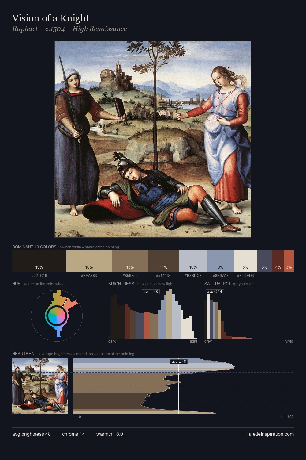
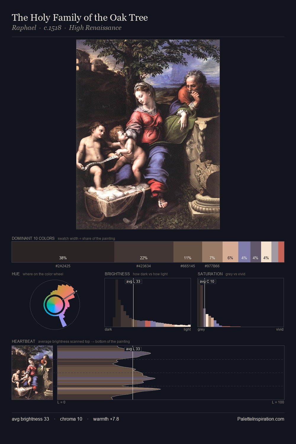
Henri-Paul Motte Master Palette

Palette Analysis
The value structure of Henri-Paul Motte is mid-key: quiet, controlled, and cohesive. Temperature is cool-dominant, with blue and green families claiming the largest areas. Every colour is desaturated; the palette proceeds through near-neutrals and gently-coloured greys. The most saturated colour, #495B7A, is reserved to 7.5% of the surface, where it acts as a focal punctuation. A value spread of 66 units gives the palette both depth and air - shadows are genuinely dark, lights genuinely light. The mid-to-high key, cool bias, and moderate chroma point to outdoor observation - sky and diffused daylight as the dominant light source. The palette is a signature: Henri-Paul Motte's particular sense of value, warmth, and colour weight made legible.
Example use cases
- exhibition design
- foundation branding
- estate management
- art education
- museums & galleries
I Love This!
Copy, export, or download for your project